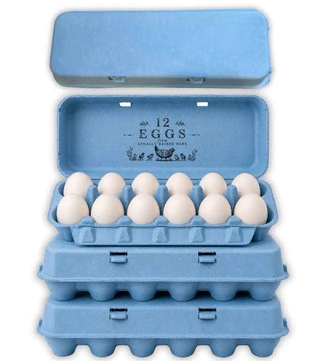
Blue Egg Cartons

  • Shade range from pale sky through mid blue to deep navy
  • Pigment blended into the slurry, so color survives scuffing and shipping
  • Navy holds embossed detail nearly as sharply as black
  • Pale blue pairs with blue and olive shell eggs for a tonal presentation
  • Compostable and plastic free, with no surface coating
  • Disponível em todas as faixas de contagem de células, de 4 a 20
  • OEM and ODM sizing accepted; retained shade standards kept for reorders

Molde público

Soluções de embalagem

Design 3D

Molde personalizado

Blue egg cartons in molded pulp holding pale blue Araucana eggs

Descrição do produto

Especificação Detalhes
Nome da marca BonitoPak
Número do modelo EC-BLU series
Nome do produto Blue Egg Cartons / Blue Pigmented Pulp Cartons
Material Polpa de papel reciclada com pigmento incorporado em pasta líquida
Técnica Moldagem de polpa (prensagem úmida), pigmentação na fase úmida
Contagem de células 4, 6, 10, 12, 18, or 20 cells
Shade Range Pale sky, mid blue, deep navy; custom shades matched
Método de cor O pigmento é incorporado à pasta antes da moldagem, e não aplicado como revestimento superficial
Lightfastness Lower on pale shades; navy most stable
Print Contrast Strong with white on navy; black on pale sky
Impressão do logotipo Estampagem em relevo, em baixo-relevo ou flexográfica
Uso industrial Farm brands, specialty retail, seasonal lines, gift packing
Aplicativo Branded egg lines, blue shell egg presentation, spring ranges
Vantagens Biodegradável, compostável em casa, sem plástico, sem revestimento
Pedido personalizado Aceito
MOQ Confirm with sales; stock blue carries a lower minimum than custom shades

Galeria de Blue Egg Cartons peças

Esta galeria mostra a qualidade excepcional e a atenção aos detalhes que oferecemos em cada projeto. De designs complexos a acabamentos impecáveis, cada imagem reflete nosso compromisso com a excelência em Blue Egg Cartons .

40%

Economia de tempo e custo

Experimente as principais soluções de embalagem que otimizam seus custos e tempo, proporcionando processos eficientes e maximizando seu ROI.

50%

Mais sustentável

Obtenha embalagens ecologicamente corretas com materiais sustentáveis, reduzindo o desperdício e promovendo a responsabilidade ambiental em todas as suas linhas de produtos.

25%

Aumento nas vendas

Aumente o apelo do seu produto nas prateleiras com designs inovadores que aumentam a visibilidade e as vendas nos mercados de varejo e on-line.

100%

Mais confiável

Confie no compromisso da BonitoPak com a qualidade, garantindo que cada produto atenda aos nossos altos padrões com um serviço consistente e confiável.

The shade that fades fastest

Blue carries a technical limitation worth stating before anything else, because it affects where the carton should be used.

Blue pigments rated for compostable packaging are the least lightfast group in the palette. The chemistries that give strong blue without heavy metals are inherently more vulnerable to ultraviolet exposure than reds, yellows, or blacks.

In a retail cold case, under covered market stalls, or anywhere out of direct sun, this never becomes visible. Cartons held in strong direct sunlight for weeks will lighten noticeably, and pale sky blue will go first because there is less pigment present to lose.

Producers selling at outdoor markets in strong sun should either specify navy, which has far more pigment headroom, or keep stock covered between market days. Producers selling into refrigerated retail can ignore this entirely.

We would rather state it than have a buyer discover it in July.

Three shades and what each is for

Pale sky is the softest blue we run and the one most often ordered for a specific reason: it matches the shell. Producers with Araucana, Ameraucana, or Cream Legbar flocks laying blue-green eggs use pale blue cartons for a tonal presentation where the pack and the product sit in the same color family. It is a considered look and it photographs beautifully.

Mid blue is the general purpose shade. Clearly blue at a distance, strong enough to carry a brand identity, and forgiving to produce because the pigment load reduces base fiber influence.

Deep navy behaves closer to black than to blue in every practical respect. It holds embossed detail sharply, takes white and metallic print well, reads as premium rather than as cheerful, and is the most lightfast blue we make.

Blue against the shell color

Blue differs from every other shade in our range on this point, and it is worth thinking through before ordering.

Most carton colors contrast with the eggs. Pink against brown, black against white, green against cream. Contrast makes the eggs stand out when the lid opens.

Blue is the one shade that can match rather than contrast, because blue shell eggs exist. That opens a presentation option nothing else offers: a tonal pack where pale blue carton and pale blue shell read as a single considered product.

It also creates a risk. A mid or navy blue carton holding blue shell eggs flattens them, since the eggs disappear against a stronger version of their own color. Producers with blue laying flocks should specify pale, or move to a contrasting shade entirely.

Brown and white eggs both contrast well against all three blues.

Print and emboss

Navy behaves much like black. White ink reads strongly, metallic effects work, and embossed detail holds sharply because the tonal depth throws a clean shadow.

Pale sky is the opposite. It is light enough that embossing reads softly, and dark inks are needed for printed contrast. Black on pale blue is a clean combination that several farm brands use.

Mid blue sits awkwardly for both. It is too dark for strong black print contrast and too light for white to read cleanly. Producers specifying mid blue should plan on embossing with the understanding that it will read softly, or choose a shade at one end of the range instead.

Navy as a black alternative

Buyers who want the premium weight of black without its severity frequently land on navy, and it is worth understanding what the swap actually changes.

Navy keeps most of black’s advantages: sharp embossing, strong white and metallic print, high shade consistency, and good lightfastness. What it adds is a visible hue under daylight, so the carton reads as a considered color choice rather than as an absence of color.

What it gives up is maximum contrast. White ink on navy is strong but not as stark as white on black, and metallic effects read slightly softer. For most premium lines that trade is worth making.

Seasonal and market use

Blue runs in spring and Easter ranges alongside pink, yellow, and green, and those orders cluster on a fixed deadline. The approval cycle, not production, is what decides whether a seasonal order lands, and buyers who start late end up accepting a stock shade rather than a matched one.

Blue also has a steady non-seasonal market among producers whose brand identity is blue, where the requirement is consistency across years rather than a single run. Those buyers should approve and retain a physical shade standard at first production, since every reorder is then matched against it.

For the full detail on how shade is controlled between batches and across molds, see molded pulp colored egg cartons.

Pairing with format

Navy on molded pulp octagon egg cartons gives a premium gift presentation close to what black achieves.

Pale blue on a molded pulp 6 egg carton suits specialty blue shell lines, which sell in half dozens more often than in twelves.

For a permanent brand identity across the range, the molded pulp dozen egg carton is the volume format to anchor on. Printing specifications are covered at custom printed egg cartons.

The shade that fades fastest

Blue carries a technical limitation worth stating before anything else, because it affects where the carton should be used.

Blue pigments rated for compostable packaging are the least lightfast group in the palette. The chemistries that give strong blue without heavy metals are inherently more vulnerable to ultraviolet exposure than reds, yellows, or blacks.

In a retail cold case, under covered market stalls, or anywhere out of direct sun, this never becomes visible. Cartons held in strong direct sunlight for weeks will lighten noticeably, and pale sky blue will go first because there is less pigment present to lose.

Producers selling at outdoor markets in strong sun should either specify navy, which has far more pigment headroom, or keep stock covered between market days. Producers selling into refrigerated retail can ignore this entirely.

We would rather state it than have a buyer discover it in July.

Three shades and what each is for

Pale sky is the softest blue we run and the one most often ordered for a specific reason: it matches the shell. Producers with Araucana, Ameraucana, or Cream Legbar flocks laying blue-green eggs use pale blue cartons for a tonal presentation where the pack and the product sit in the same color family. It is a considered look and it photographs beautifully.

Mid blue is the general purpose shade. Clearly blue at a distance, strong enough to carry a brand identity, and forgiving to produce because the pigment load reduces base fiber influence.

Deep navy behaves closer to black than to blue in every practical respect. It holds embossed detail sharply, takes white and metallic print well, reads as premium rather than as cheerful, and is the most lightfast blue we make.

Blue against the shell color

Blue differs from every other shade in our range on this point, and it is worth thinking through before ordering.

Most carton colors contrast with the eggs. Pink against brown, black against white, green against cream. Contrast makes the eggs stand out when the lid opens.

Blue is the one shade that can match rather than contrast, because blue shell eggs exist. That opens a presentation option nothing else offers: a tonal pack where pale blue carton and pale blue shell read as a single considered product.

It also creates a risk. A mid or navy blue carton holding blue shell eggs flattens them, since the eggs disappear against a stronger version of their own color. Producers with blue laying flocks should specify pale, or move to a contrasting shade entirely.

Brown and white eggs both contrast well against all three blues.

Print and emboss

Navy behaves much like black. White ink reads strongly, metallic effects work, and embossed detail holds sharply because the tonal depth throws a clean shadow.

Pale sky is the opposite. It is light enough that embossing reads softly, and dark inks are needed for printed contrast. Black on pale blue is a clean combination that several farm brands use.

Mid blue sits awkwardly for both. It is too dark for strong black print contrast and too light for white to read cleanly. Producers specifying mid blue should plan on embossing with the understanding that it will read softly, or choose a shade at one end of the range instead.

Navy as a black alternative

Buyers who want the premium weight of black without its severity frequently land on navy, and it is worth understanding what the swap actually changes.

Navy keeps most of black’s advantages: sharp embossing, strong white and metallic print, high shade consistency, and good lightfastness. What it adds is a visible hue under daylight, so the carton reads as a considered color choice rather than as an absence of color.

What it gives up is maximum contrast. White ink on navy is strong but not as stark as white on black, and metallic effects read slightly softer. For most premium lines that trade is worth making.

Seasonal and market use

Blue runs in spring and Easter ranges alongside pink, yellow, and green, and those orders cluster on a fixed deadline. The approval cycle, not production, is what decides whether a seasonal order lands, and buyers who start late end up accepting a stock shade rather than a matched one.

Blue also has a steady non-seasonal market among producers whose brand identity is blue, where the requirement is consistency across years rather than a single run. Those buyers should approve and retain a physical shade standard at first production, since every reorder is then matched against it.

For the full detail on how shade is controlled between batches and across molds, see molded pulp colored egg cartons.

Pairing with format

Navy on molded pulp octagon egg cartons gives a premium gift presentation close to what black achieves.

Pale blue on a molded pulp 6 egg carton suits specialty blue shell lines, which sell in half dozens more often than in twelves.

For a permanent brand identity across the range, the molded pulp dozen egg carton is the volume format to anchor on. Printing specifications are covered at custom printed egg cartons.

Materiais para Blue Egg Cartons Peças

Empresas e engenheiros líderes confiam no BonitoPak para iterações rápidas e peças duráveis e de alta qualidade. Seja para prototipagem ou produção em escala real, nossa ampla gama de materiais garante que atendamos aos requisitos exclusivos de qualquer Blue Egg Cartons projeto com precisão e rapidez.

Compostable kraft paper is the strongest fiber we form. Made from virgin

Colored pulp is not a separate fiber. It is any of our

Bleached pulp is the material to specify when the part has to

Natural plant fiber covers the non-wood cellulose sources we blend outside the

Corrugated paper as a molded pulp material means recovered cardboard boxes repulped

Straw fiber is made from the stalks left after grain harvest, material

Personalizado, ecológico e confiável

Excelência em embalagens personalizadas e ecologicamente corretas

Totalmente personalizável

Personalize sua embalagem com estilos, tamanhos, cores e acabamentos sob medida para atender a necessidades específicas.

Suporte especializado

A Bonitopak oferece consultoria especializada em design e logística para maximizar a eficiência da embalagem e aumentar o ROI.

Soluções ecológicas

Escolha embalagens sustentáveis e ecologicamente corretas para reduzir o impacto ambiental e apoiar as metas ecológicas de sua marca.

Garantia de qualidade

A Bonitopak garante serviço de alta qualidade e excelência de produto em cada solução de embalagem.

Perguntas frequentes (FAQ)

Blue Egg Cartons

  • Does blue cost more than natural pulp?

    Yes, as all pigmented shades do, and the difference comes from pigment cost plus the line flush required when changing color. Blue sits in the middle of our color range on price, above black on pigment cost per unit of coverage and below custom matched shades.

  • Is navy just black with less pigment?

    No, they use different pigment systems entirely. Navy reads as a dark blue under daylight and shows its blue cast clearly against a true black carton placed beside it. Buyers who want near-black performance with a hint of color choose navy deliberately rather than as a compromise.

  • Can you match a specific Pantone blue?

    We produce a close match and supply a formed physical sample for approval. Exact matching to a printed Pantone reference is not physically achievable in pigmented fiber, since pulp scatters light differently from coated paper. Brands with a strict standard approve a designated pulp equivalent rather than insisting on the ink reference.

  • How much fading should I expect at an outdoor market?

    Visible lightening after sustained direct sun across weeks, with pale sky showing it first and navy showing it last. Cartons used and sold within days never see enough exposure to matter. The problem is stock sitting in sun between market days, which is solved by covering the pile rather than by changing shade.

  • Which blue should I choose if my hens lay blue eggs?

    Pale sky, for a tonal match, or move away from blue entirely for contrast. Avoid mid blue and navy, which are strong enough to flatten a pale blue shell so the eggs stop registering as the distinctive thing they are. Order a sample and seat your actual eggs in it before committing.

Resultado biodegradável

0 dias

7 dias

14 dias

30 dias

Setores especializados

Tendo produzido milhões de peças, a BonitoPak possui profundo conhecimento em diversas aplicações. Nós nos destacamos especialmente em setores que exigem a fabricação de componentes precisos e intrincados. Confie em nós para oferecer experiência e qualidade, independentemente da complexidade.

Soluções de embalagem OEM e ODM

A Bonitopak oferece soluções de embalagem personalizadas (OEM) e pré-projetadas (ODM). Independentemente de você precisar de designs totalmente personalizados ou de embalagens prontas para uso, fornecemos opções de alta qualidade, eficientes e flexíveis para atender às necessidades da sua marca.

Serviços OEM

As soluções de embalagem OEM permitem que você crie produtos totalmente personalizados, projetados e fabricados para atender às suas necessidades específicas. Na Bonitopak, oferecemos suporte abrangente durante todo o processo de design, prototipagem e fabricação, garantindo que sua embalagem reflita a identidade exclusiva de sua marca. Nossos recursos de fabricação de precisão garantem uma produção consistente e de alta qualidade, independentemente da complexidade do projeto. Com serviço de ponta a ponta, cuidamos de tudo, desde o conceito até a entrega, ajudando-o a otimizar suas necessidades de embalagem.

Serviços ODM

As soluções de embalagem ODM oferecem produtos pré-projetados que podem ser adaptados aos requisitos de sua marca. Com a experiência em design inovador e o processo de produção eficiente da Bonitopak, você pode escolher entre uma ampla gama de opções de embalagens prontas para uso. Oferecemos personalização flexível, permitindo que você adicione sua marca e selecione entre vários acabamentos, cores e tamanhos. Essa solução economiza tempo e custos e, ao mesmo tempo, garante embalagens de alta qualidade que atendem aos padrões de sua marca.
Pronto para elevar seu projeto?

Dê vida aos seus projetos com o BonitoPak

Experimente a engenharia de precisão com a BonitoPak. De protótipos detalhados à produção de alto volume, estamos aqui para transformar seus conceitos em realidade. Entre em contato conosco hoje mesmo para discutir as necessidades do seu projeto!

Nossas categorias de produtos

Descubra a gama diversificada de soluções de embalagem da Bonitopak, incluindo bandejas de polpa moldada, embalagens para alimentos, designs personalizados e opções sustentáveis. Cada categoria é criada para oferecer durabilidade, funcionalidade e responsabilidade ambiental, adaptada para atender às suas necessidades específicas.

The shade that fades fastest

Blue carries a technical limitation worth stating before anything else, because it affects where the carton should be used.

Blue pigments rated for compostable packaging are the least lightfast group in the palette. The chemistries that give strong blue without heavy metals are inherently more vulnerable to ultraviolet exposure than reds, yellows, or blacks.

In a retail cold case, under covered market stalls, or anywhere out of direct sun, this never becomes visible. Cartons held in strong direct sunlight for weeks will lighten noticeably, and pale sky blue will go first because there is less pigment present to lose.

Producers selling at outdoor markets in strong sun should either specify navy, which has far more pigment headroom, or keep stock covered between market days. Producers selling into refrigerated retail can ignore this entirely.

We would rather state it than have a buyer discover it in July.

Three shades and what each is for

Pale sky is the softest blue we run and the one most often ordered for a specific reason: it matches the shell. Producers with Araucana, Ameraucana, or Cream Legbar flocks laying blue-green eggs use pale blue cartons for a tonal presentation where the pack and the product sit in the same color family. It is a considered look and it photographs beautifully.

Mid blue is the general purpose shade. Clearly blue at a distance, strong enough to carry a brand identity, and forgiving to produce because the pigment load reduces base fiber influence.

Deep navy behaves closer to black than to blue in every practical respect. It holds embossed detail sharply, takes white and metallic print well, reads as premium rather than as cheerful, and is the most lightfast blue we make.

Blue against the shell color

Blue differs from every other shade in our range on this point, and it is worth thinking through before ordering.

Most carton colors contrast with the eggs. Pink against brown, black against white, green against cream. Contrast makes the eggs stand out when the lid opens.

Blue is the one shade that can match rather than contrast, because blue shell eggs exist. That opens a presentation option nothing else offers: a tonal pack where pale blue carton and pale blue shell read as a single considered product.

It also creates a risk. A mid or navy blue carton holding blue shell eggs flattens them, since the eggs disappear against a stronger version of their own color. Producers with blue laying flocks should specify pale, or move to a contrasting shade entirely.

Brown and white eggs both contrast well against all three blues.

Print and emboss

Navy behaves much like black. White ink reads strongly, metallic effects work, and embossed detail holds sharply because the tonal depth throws a clean shadow.

Pale sky is the opposite. It is light enough that embossing reads softly, and dark inks are needed for printed contrast. Black on pale blue is a clean combination that several farm brands use.

Mid blue sits awkwardly for both. It is too dark for strong black print contrast and too light for white to read cleanly. Producers specifying mid blue should plan on embossing with the understanding that it will read softly, or choose a shade at one end of the range instead.

Navy as a black alternative

Buyers who want the premium weight of black without its severity frequently land on navy, and it is worth understanding what the swap actually changes.

Navy keeps most of black’s advantages: sharp embossing, strong white and metallic print, high shade consistency, and good lightfastness. What it adds is a visible hue under daylight, so the carton reads as a considered color choice rather than as an absence of color.

What it gives up is maximum contrast. White ink on navy is strong but not as stark as white on black, and metallic effects read slightly softer. For most premium lines that trade is worth making.

Seasonal and market use

Blue runs in spring and Easter ranges alongside pink, yellow, and green, and those orders cluster on a fixed deadline. The approval cycle, not production, is what decides whether a seasonal order lands, and buyers who start late end up accepting a stock shade rather than a matched one.

Blue also has a steady non-seasonal market among producers whose brand identity is blue, where the requirement is consistency across years rather than a single run. Those buyers should approve and retain a physical shade standard at first production, since every reorder is then matched against it.

For the full detail on how shade is controlled between batches and across molds, see molded pulp colored egg cartons.

Pairing with format

Navy on molded pulp octagon egg cartons gives a premium gift presentation close to what black achieves.

Pale blue on a molded pulp 6 egg carton suits specialty blue shell lines, which sell in half dozens more often than in twelves.

For a permanent brand identity across the range, the molded pulp dozen egg carton is the volume format to anchor on. Printing specifications are covered at custom printed egg cartons.

Artigos e insights relacionados

Mantenha-se informado com as últimas atualizações sobre tendências de embalagens sustentáveis, percepções do setor e dicas de especialistas em nosso blog. Explore ideias e soluções inovadoras para aprimorar seu conhecimento sobre embalagens.

Por Leo Chan | Redator, BonitoPak | Mais de 20 anos na área de embalagens de polpa moldada. A vodca é

Por Leo Chan | Redator, BonitoPak | Mais de 20 anos na área de embalagens de polpa moldada Quase todas as

Por Leo Chan | Redator, BonitoPak | Mais de 20 anos na área de embalagens de polpa moldada Pesquisar isto

Perguntas frequentes (FAQ)

Blue Egg Cartons

  • Does blue cost more than natural pulp?

    Yes, as all pigmented shades do, and the difference comes from pigment cost plus the line flush required when changing color. Blue sits in the middle of our color range on price, above black on pigment cost per unit of coverage and below custom matched shades.

  • Is navy just black with less pigment?

    No, they use different pigment systems entirely. Navy reads as a dark blue under daylight and shows its blue cast clearly against a true black carton placed beside it. Buyers who want near-black performance with a hint of color choose navy deliberately rather than as a compromise.

  • Can you match a specific Pantone blue?

    We produce a close match and supply a formed physical sample for approval. Exact matching to a printed Pantone reference is not physically achievable in pigmented fiber, since pulp scatters light differently from coated paper. Brands with a strict standard approve a designated pulp equivalent rather than insisting on the ink reference.

  • How much fading should I expect at an outdoor market?

    Visible lightening after sustained direct sun across weeks, with pale sky showing it first and navy showing it last. Cartons used and sold within days never see enough exposure to matter. The problem is stock sitting in sun between market days, which is solved by covering the pile rather than by changing shade.

  • Which blue should I choose if my hens lay blue eggs?

    Pale sky, for a tonal match, or move away from blue entirely for contrast. Avoid mid blue and navy, which are strong enough to flatten a pale blue shell so the eggs stop registering as the distinctive thing they are. Order a sample and seat your actual eggs in it before committing.

Preencha este formulário detalhado