Blue Egg Cartons

  • Shade range from pale sky through mid blue to deep navy
  • Pigment blended into the slurry, so color survives scuffing and shipping
  • Navy holds embossed detail nearly as sharply as black
  • Pale blue pairs with blue and olive shell eggs for a tonal presentation
  • Compostable and plastic free, with no surface coating
  • Available across every cell count from 4 through 20
  • OEM and ODM sizing accepted; retained shade standards kept for reorders

القالب العام

حلول التعبئة والتغليف

تصميم ثلاثي الأبعاد

قالب مخصص حسب الطلب

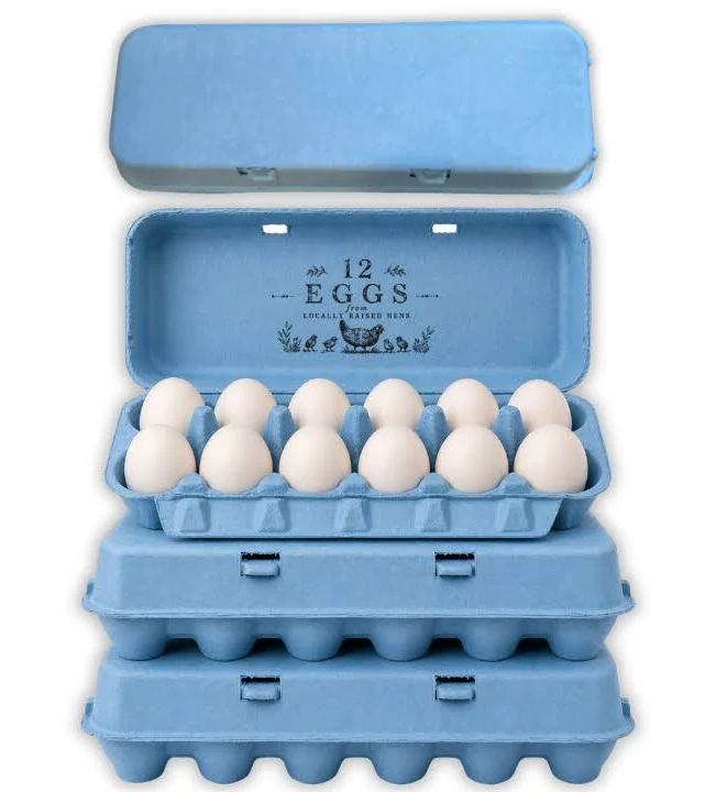
Blue egg cartons in molded pulp holding pale blue Araucana eggs

وصف المنتج

المواصفات التفاصيل
اسم العلامة التجارية بونيتوباك
رقم الموديل EC-BLU series
اسم المنتج Blue Egg Cartons / Blue Pigmented Pulp Cartons
المواد Recycled paper pulp with slurry-blended pigment
التقنية Molded pulp forming (wet-pressed), wet end pigmentation
Cell Count 4, 6, 10, 12, 18, or 20 cells
Shade Range Pale sky, mid blue, deep navy; custom shades matched
Color Method Pigment blended into slurry before forming, not surface coated
Lightfastness Lower on pale shades; navy most stable
Print Contrast Strong with white on navy; black on pale sky
طباعة الشعار Embossed, debossed, or flexographic print
الاستخدام الصناعي Farm brands, specialty retail, seasonal lines, gift packing
التطبيق Branded egg lines, blue shell egg presentation, spring ranges
المزايا Biodegradable, home compostable, plastic free, no coating
طلب مخصص مقبولة
موك Confirm with sales; stock blue carries a lower minimum than custom shades

معرض الصور Blue Egg Cartons الأجزاء

يعرض هذا المعرض الجودة الاستثنائية والاهتمام بالتفاصيل التي نقدمها في كل مشروع. من التصاميم المعقدة إلى اللمسات النهائية الخالية من العيوب، تعكس كل صورة التزامنا بالتميز في Blue Egg Cartons .

40%

التكلفة والوقت الموفر

اختبر حلول التعبئة والتغليف الرائدة التي تعمل على تحسين التكاليف والوقت وتقديم عمليات فعالة وتعظيم العائد على الاستثمار.

50%

أكثر استدامة

حقق تغليفاً صديقاً للبيئة باستخدام مواد مستدامة، مما يقلل من النفايات ويعزز المسؤولية البيئية في جميع خطوط إنتاجك.

25%

الزيادة في المبيعات

عزز من جاذبية منتجاتك على الرفوف بتصميمات مبتكرة تعزز من ظهورها ومبيعاتها في أسواق التجزئة والأسواق الإلكترونية.

100%

أكثر موثوقية

ثق في التزام BonitoPak بالجودة، مما يضمن أن كل منتج يفي بمعاييرنا العالية مع خدمة متسقة وموثوقة.

The shade that fades fastest

Blue carries a technical limitation worth stating before anything else, because it affects where the carton should be used.

Blue pigments rated for compostable packaging are the least lightfast group in the palette. The chemistries that give strong blue without heavy metals are inherently more vulnerable to ultraviolet exposure than reds, yellows, or blacks.

In a retail cold case, under covered market stalls, or anywhere out of direct sun, this never becomes visible. Cartons held in strong direct sunlight for weeks will lighten noticeably, and pale sky blue will go first because there is less pigment present to lose.

Producers selling at outdoor markets in strong sun should either specify navy, which has far more pigment headroom, or keep stock covered between market days. Producers selling into refrigerated retail can ignore this entirely.

We would rather state it than have a buyer discover it in July.

Three shades and what each is for

Pale sky is the softest blue we run and the one most often ordered for a specific reason: it matches the shell. Producers with Araucana, Ameraucana, or Cream Legbar flocks laying blue-green eggs use pale blue cartons for a tonal presentation where the pack and the product sit in the same color family. It is a considered look and it photographs beautifully.

Mid blue is the general purpose shade. Clearly blue at a distance, strong enough to carry a brand identity, and forgiving to produce because the pigment load reduces base fiber influence.

Deep navy behaves closer to black than to blue in every practical respect. It holds embossed detail sharply, takes white and metallic print well, reads as premium rather than as cheerful, and is the most lightfast blue we make.

Blue against the shell color

Blue differs from every other shade in our range on this point, and it is worth thinking through before ordering.

Most carton colors contrast with the eggs. Pink against brown, black against white, green against cream. Contrast makes the eggs stand out when the lid opens.

Blue is the one shade that can match rather than contrast, because blue shell eggs exist. That opens a presentation option nothing else offers: a tonal pack where pale blue carton and pale blue shell read as a single considered product.

It also creates a risk. A mid or navy blue carton holding blue shell eggs flattens them, since the eggs disappear against a stronger version of their own color. Producers with blue laying flocks should specify pale, or move to a contrasting shade entirely.

Brown and white eggs both contrast well against all three blues.

Print and emboss

Navy behaves much like black. White ink reads strongly, metallic effects work, and embossed detail holds sharply because the tonal depth throws a clean shadow.

Pale sky is the opposite. It is light enough that embossing reads softly, and dark inks are needed for printed contrast. Black on pale blue is a clean combination that several farm brands use.

Mid blue sits awkwardly for both. It is too dark for strong black print contrast and too light for white to read cleanly. Producers specifying mid blue should plan on embossing with the understanding that it will read softly, or choose a shade at one end of the range instead.

Navy as a black alternative

Buyers who want the premium weight of black without its severity frequently land on navy, and it is worth understanding what the swap actually changes.

Navy keeps most of black’s advantages: sharp embossing, strong white and metallic print, high shade consistency, and good lightfastness. What it adds is a visible hue under daylight, so the carton reads as a considered color choice rather than as an absence of color.

What it gives up is maximum contrast. White ink on navy is strong but not as stark as white on black, and metallic effects read slightly softer. For most premium lines that trade is worth making.

Seasonal and market use

Blue runs in spring and Easter ranges alongside pink, yellow, and green, and those orders cluster on a fixed deadline. The approval cycle, not production, is what decides whether a seasonal order lands, and buyers who start late end up accepting a stock shade rather than a matched one.

Blue also has a steady non-seasonal market among producers whose brand identity is blue, where the requirement is consistency across years rather than a single run. Those buyers should approve and retain a physical shade standard at first production, since every reorder is then matched against it.

For the full detail on how shade is controlled between batches and across molds, see molded pulp colored egg cartons.

Pairing with format

Navy on molded pulp octagon egg cartons gives a premium gift presentation close to what black achieves.

Pale blue on a molded pulp 6 egg carton suits specialty blue shell lines, which sell in half dozens more often than in twelves.

For a permanent brand identity across the range, the molded pulp dozen egg carton is the volume format to anchor on. Printing specifications are covered at custom printed egg cartons.

The shade that fades fastest

Blue carries a technical limitation worth stating before anything else, because it affects where the carton should be used.

Blue pigments rated for compostable packaging are the least lightfast group in the palette. The chemistries that give strong blue without heavy metals are inherently more vulnerable to ultraviolet exposure than reds, yellows, or blacks.

In a retail cold case, under covered market stalls, or anywhere out of direct sun, this never becomes visible. Cartons held in strong direct sunlight for weeks will lighten noticeably, and pale sky blue will go first because there is less pigment present to lose.

Producers selling at outdoor markets in strong sun should either specify navy, which has far more pigment headroom, or keep stock covered between market days. Producers selling into refrigerated retail can ignore this entirely.

We would rather state it than have a buyer discover it in July.

Three shades and what each is for

Pale sky is the softest blue we run and the one most often ordered for a specific reason: it matches the shell. Producers with Araucana, Ameraucana, or Cream Legbar flocks laying blue-green eggs use pale blue cartons for a tonal presentation where the pack and the product sit in the same color family. It is a considered look and it photographs beautifully.

Mid blue is the general purpose shade. Clearly blue at a distance, strong enough to carry a brand identity, and forgiving to produce because the pigment load reduces base fiber influence.

Deep navy behaves closer to black than to blue in every practical respect. It holds embossed detail sharply, takes white and metallic print well, reads as premium rather than as cheerful, and is the most lightfast blue we make.

Blue against the shell color

Blue differs from every other shade in our range on this point, and it is worth thinking through before ordering.

Most carton colors contrast with the eggs. Pink against brown, black against white, green against cream. Contrast makes the eggs stand out when the lid opens.

Blue is the one shade that can match rather than contrast, because blue shell eggs exist. That opens a presentation option nothing else offers: a tonal pack where pale blue carton and pale blue shell read as a single considered product.

It also creates a risk. A mid or navy blue carton holding blue shell eggs flattens them, since the eggs disappear against a stronger version of their own color. Producers with blue laying flocks should specify pale, or move to a contrasting shade entirely.

Brown and white eggs both contrast well against all three blues.

Print and emboss

Navy behaves much like black. White ink reads strongly, metallic effects work, and embossed detail holds sharply because the tonal depth throws a clean shadow.

Pale sky is the opposite. It is light enough that embossing reads softly, and dark inks are needed for printed contrast. Black on pale blue is a clean combination that several farm brands use.

Mid blue sits awkwardly for both. It is too dark for strong black print contrast and too light for white to read cleanly. Producers specifying mid blue should plan on embossing with the understanding that it will read softly, or choose a shade at one end of the range instead.

Navy as a black alternative

Buyers who want the premium weight of black without its severity frequently land on navy, and it is worth understanding what the swap actually changes.

Navy keeps most of black’s advantages: sharp embossing, strong white and metallic print, high shade consistency, and good lightfastness. What it adds is a visible hue under daylight, so the carton reads as a considered color choice rather than as an absence of color.

What it gives up is maximum contrast. White ink on navy is strong but not as stark as white on black, and metallic effects read slightly softer. For most premium lines that trade is worth making.

Seasonal and market use

Blue runs in spring and Easter ranges alongside pink, yellow, and green, and those orders cluster on a fixed deadline. The approval cycle, not production, is what decides whether a seasonal order lands, and buyers who start late end up accepting a stock shade rather than a matched one.

Blue also has a steady non-seasonal market among producers whose brand identity is blue, where the requirement is consistency across years rather than a single run. Those buyers should approve and retain a physical shade standard at first production, since every reorder is then matched against it.

For the full detail on how shade is controlled between batches and across molds, see molded pulp colored egg cartons.

Pairing with format

Navy on molded pulp octagon egg cartons gives a premium gift presentation close to what black achieves.

Pale blue on a molded pulp 6 egg carton suits specialty blue shell lines, which sell in half dozens more often than in twelves.

For a permanent brand identity across the range, the molded pulp dozen egg carton is the volume format to anchor on. Printing specifications are covered at custom printed egg cartons.

مواد ل Blue Egg Cartons قطع الغيار

تعتمد الشركات الرائدة والمهندسون الرائدون على BonitoPak في التكرارات السريعة والأجزاء المتينة عالية الجودة. سواء كان ذلك للنماذج الأولية أو للإنتاج على نطاق واسع، فإن مجموعتنا الواسعة من المواد تضمن تلبية المتطلبات الفريدة لأي Blue Egg Cartons المشروع بدقة وسرعة.

Compostable kraft paper is the strongest fiber we form. Made from virgin

Colored pulp is not a separate fiber. It is any of our

Bleached pulp is the material to specify when the part has to

Natural plant fiber covers the non-wood cellulose sources we blend outside the

Corrugated paper as a molded pulp material means recovered cardboard boxes repulped

Straw fiber is made from the stalks left after grain harvest, material

صديقة للبيئة وموثوقة ومخصصة وموثوقة

تعبئة وتغليف مخصص وصديق للبيئة بامتياز

قابل للتخصيص بالكامل

خصص عبواتك بأنماط وأحجام وألوان ولمسات نهائية مصممة خصيصًا لتلبية احتياجاتك الخاصة.

دعم الخبراء

تقدم بونيتوباك مشورة الخبراء في مجال التصميم والخدمات اللوجستية لزيادة كفاءة التعبئة والتغليف إلى أقصى حد وتعزيز العائد على الاستثمار.

الحلول البيئية

اختر عبوات مستدامة وصديقة للبيئة لتقليل الأثر البيئي ودعم أهداف علامتك التجارية الخضراء.

ضمان الجودة

تضمن بونيتوباك خدمة عالية الجودة ومنتجات متميزة مع كل حل من حلول التعبئة والتغليف.

الأسئلة المتكررة

Blue Egg Cartons

  • Does blue cost more than natural pulp?

    Yes, as all pigmented shades do, and the difference comes from pigment cost plus the line flush required when changing color. Blue sits in the middle of our color range on price, above black on pigment cost per unit of coverage and below custom matched shades.

  • Is navy just black with less pigment?

    No, they use different pigment systems entirely. Navy reads as a dark blue under daylight and shows its blue cast clearly against a true black carton placed beside it. Buyers who want near-black performance with a hint of color choose navy deliberately rather than as a compromise.

  • Can you match a specific Pantone blue?

    We produce a close match and supply a formed physical sample for approval. Exact matching to a printed Pantone reference is not physically achievable in pigmented fiber, since pulp scatters light differently from coated paper. Brands with a strict standard approve a designated pulp equivalent rather than insisting on the ink reference.

  • How much fading should I expect at an outdoor market?

    Visible lightening after sustained direct sun across weeks, with pale sky showing it first and navy showing it last. Cartons used and sold within days never see enough exposure to matter. The problem is stock sitting in sun between market days, which is solved by covering the pile rather than by changing shade.

  • Which blue should I choose if my hens lay blue eggs?

    Pale sky, for a tonal match, or move away from blue entirely for contrast. Avoid mid blue and navy, which are strong enough to flatten a pale blue shell so the eggs stop registering as the distinctive thing they are. Order a sample and seat your actual eggs in it before committing.

نتيجة قابلة للتحلل الحيوي

0 يوم

7 أيام

14 يوماً

30 يوماً

الصناعات المتخصصة

بعد إنتاج ملايين القطع، تمتلك BonitoPak معرفة عميقة في العديد من التطبيقات. نحن نتفوق بشكل خاص في الصناعات التي تتطلب تصنيع مكونات دقيقة ومعقدة. ثق بنا لتقديم الخبرة والجودة، بغض النظر عن مدى تعقيدها.

حلول التعبئة والتغليف OEM و ODM

تقدم بونيتوباك حلول تغليف مخصصة (OEM) ومصممة مسبقًا (ODM). سواء كنت بحاجة إلى تصميمات مصممة بالكامل أو عبوات جاهزة للاستخدام، فإننا نقدم خيارات عالية الجودة وفعالة ومرنة لتلبية احتياجات علامتك التجارية.

خدمات تصنيع المعدات الأصلية

تتيح لك حلول التعبئة والتغليف لمصنعي المعدات الأصلية إنشاء منتجات مخصصة بالكامل مصممة ومصنعة لتلبية متطلباتك الخاصة. نحن في بونيتوباك نقدم دعمًا شاملاً طوال عملية التصميم والنماذج الأولية والتصنيع، مما يضمن أن تعكس عبواتك الهوية الفريدة لعلامتك التجارية. تضمن قدراتنا التصنيعية الدقيقة إنتاجاً عالي الجودة ومتسقاً، بغض النظر عن مدى تعقيد التصميم. ومن خلال الخدمة المتكاملة، نتعامل مع كل شيء بدءاً من الفكرة وحتى التسليم، مما يساعدك على تبسيط احتياجاتك من التغليف.

خدمات ODM

تقدم حلول التعبئة والتغليف ODM منتجات مصممة مسبقًا يمكن تصميمها وفقًا لمتطلبات علامتك التجارية. بفضل خبرة بونيتوباك في التصميم المبتكر وعملية الإنتاج الفعالة، يمكنك الاختيار من بين مجموعة كبيرة من خيارات التغليف الجاهزة للاستخدام. نحن نوفر تخصيصاً مرناً، مما يسمح لك بإضافة علامتك التجارية والاختيار من بين مختلف التشطيبات والألوان والأحجام. يوفر هذا الحل الوقت والتكلفة مع ضمان تغليف عالي الجودة يلبي معايير علامتك التجارية.
هل أنت مستعد للارتقاء بمشروعك؟

اجعل تصميماتك تنبض بالحياة مع BonitoPak

اختبر الهندسة الدقيقة مع BonitoPak. من النماذج الأولية التفصيلية إلى الإنتاج بكميات كبيرة، نحن هنا لتحويل مفاهيمك إلى واقع ملموس. اتصل بنا اليوم لمناقشة احتياجات مشروعك!

فئات منتجاتنا

اكتشف مجموعة بونيتوباك المتنوعة من حلول التعبئة والتغليف، بما في ذلك صواني اللب المقولبة، وتغليف المواد الغذائية، والتصميمات المخصصة، والخيارات المستدامة. صُممت كل فئة من هذه الفئات من أجل المتانة والأداء الوظيفي والمسؤولية البيئية، وهي مصممة خصيصًا لتلبية احتياجاتك الخاصة.

The shade that fades fastest

Blue carries a technical limitation worth stating before anything else, because it affects where the carton should be used.

Blue pigments rated for compostable packaging are the least lightfast group in the palette. The chemistries that give strong blue without heavy metals are inherently more vulnerable to ultraviolet exposure than reds, yellows, or blacks.

In a retail cold case, under covered market stalls, or anywhere out of direct sun, this never becomes visible. Cartons held in strong direct sunlight for weeks will lighten noticeably, and pale sky blue will go first because there is less pigment present to lose.

Producers selling at outdoor markets in strong sun should either specify navy, which has far more pigment headroom, or keep stock covered between market days. Producers selling into refrigerated retail can ignore this entirely.

We would rather state it than have a buyer discover it in July.

Three shades and what each is for

Pale sky is the softest blue we run and the one most often ordered for a specific reason: it matches the shell. Producers with Araucana, Ameraucana, or Cream Legbar flocks laying blue-green eggs use pale blue cartons for a tonal presentation where the pack and the product sit in the same color family. It is a considered look and it photographs beautifully.

Mid blue is the general purpose shade. Clearly blue at a distance, strong enough to carry a brand identity, and forgiving to produce because the pigment load reduces base fiber influence.

Deep navy behaves closer to black than to blue in every practical respect. It holds embossed detail sharply, takes white and metallic print well, reads as premium rather than as cheerful, and is the most lightfast blue we make.

Blue against the shell color

Blue differs from every other shade in our range on this point, and it is worth thinking through before ordering.

Most carton colors contrast with the eggs. Pink against brown, black against white, green against cream. Contrast makes the eggs stand out when the lid opens.

Blue is the one shade that can match rather than contrast, because blue shell eggs exist. That opens a presentation option nothing else offers: a tonal pack where pale blue carton and pale blue shell read as a single considered product.

It also creates a risk. A mid or navy blue carton holding blue shell eggs flattens them, since the eggs disappear against a stronger version of their own color. Producers with blue laying flocks should specify pale, or move to a contrasting shade entirely.

Brown and white eggs both contrast well against all three blues.

Print and emboss

Navy behaves much like black. White ink reads strongly, metallic effects work, and embossed detail holds sharply because the tonal depth throws a clean shadow.

Pale sky is the opposite. It is light enough that embossing reads softly, and dark inks are needed for printed contrast. Black on pale blue is a clean combination that several farm brands use.

Mid blue sits awkwardly for both. It is too dark for strong black print contrast and too light for white to read cleanly. Producers specifying mid blue should plan on embossing with the understanding that it will read softly, or choose a shade at one end of the range instead.

Navy as a black alternative

Buyers who want the premium weight of black without its severity frequently land on navy, and it is worth understanding what the swap actually changes.

Navy keeps most of black’s advantages: sharp embossing, strong white and metallic print, high shade consistency, and good lightfastness. What it adds is a visible hue under daylight, so the carton reads as a considered color choice rather than as an absence of color.

What it gives up is maximum contrast. White ink on navy is strong but not as stark as white on black, and metallic effects read slightly softer. For most premium lines that trade is worth making.

Seasonal and market use

Blue runs in spring and Easter ranges alongside pink, yellow, and green, and those orders cluster on a fixed deadline. The approval cycle, not production, is what decides whether a seasonal order lands, and buyers who start late end up accepting a stock shade rather than a matched one.

Blue also has a steady non-seasonal market among producers whose brand identity is blue, where the requirement is consistency across years rather than a single run. Those buyers should approve and retain a physical shade standard at first production, since every reorder is then matched against it.

For the full detail on how shade is controlled between batches and across molds, see molded pulp colored egg cartons.

Pairing with format

Navy on molded pulp octagon egg cartons gives a premium gift presentation close to what black achieves.

Pale blue on a molded pulp 6 egg carton suits specialty blue shell lines, which sell in half dozens more often than in twelves.

For a permanent brand identity across the range, the molded pulp dozen egg carton is the volume format to anchor on. Printing specifications are covered at custom printed egg cartons.

مقالات ورؤى ذات صلة

ابق على اطلاع بآخر التحديثات حول اتجاهات التغليف المستدام ورؤى الصناعة ونصائح الخبراء من خلال مدونتنا. استكشف الأفكار والحلول المبتكرة لتعزيز معرفتك بالتعبئة والتغليف.

بقلم ليو تشان | كاتب في BonitoPak | أكثر من 20 عامًا من الخبرة في مجال التغليف المصنوع من اللب المقولب. الفودكا هي

بقلم ليو تشان | كاتب في BonitoPak | أكثر من 20 عامًا من الخبرة في مجال التغليف المصنوع من اللب المقولب تقريبًا كل

بقلم ليو تشان | كاتب في BonitoPak | أكثر من 20 عامًا من الخبرة في مجال التغليف المصنوع من اللب المقولب ابحث في هذا

الأسئلة المتكررة

Blue Egg Cartons

  • Does blue cost more than natural pulp?

    Yes, as all pigmented shades do, and the difference comes from pigment cost plus the line flush required when changing color. Blue sits in the middle of our color range on price, above black on pigment cost per unit of coverage and below custom matched shades.

  • Is navy just black with less pigment?

    No, they use different pigment systems entirely. Navy reads as a dark blue under daylight and shows its blue cast clearly against a true black carton placed beside it. Buyers who want near-black performance with a hint of color choose navy deliberately rather than as a compromise.

  • Can you match a specific Pantone blue?

    We produce a close match and supply a formed physical sample for approval. Exact matching to a printed Pantone reference is not physically achievable in pigmented fiber, since pulp scatters light differently from coated paper. Brands with a strict standard approve a designated pulp equivalent rather than insisting on the ink reference.

  • How much fading should I expect at an outdoor market?

    Visible lightening after sustained direct sun across weeks, with pale sky showing it first and navy showing it last. Cartons used and sold within days never see enough exposure to matter. The problem is stock sitting in sun between market days, which is solved by covering the pile rather than by changing shade.

  • Which blue should I choose if my hens lay blue eggs?

    Pale sky, for a tonal match, or move away from blue entirely for contrast. Avoid mid blue and navy, which are strong enough to flatten a pale blue shell so the eggs stop registering as the distinctive thing they are. Order a sample and seat your actual eggs in it before committing.

املأ هذا النموذج المفصل