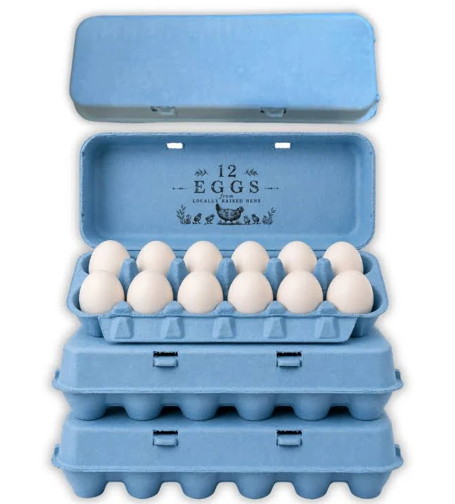
Blue carries a technical limitation worth stating before anything else, because it affects where the carton should be used.
Blue pigments rated for compostable packaging are the least lightfast group in the palette. The chemistries that give strong blue without heavy metals are inherently more vulnerable to ultraviolet exposure than reds, yellows, or blacks.
In a retail cold case, under covered market stalls, or anywhere out of direct sun, this never becomes visible. Cartons held in strong direct sunlight for weeks will lighten noticeably, and pale sky blue will go first because there is less pigment present to lose.
Producers selling at outdoor markets in strong sun should either specify navy, which has far more pigment headroom, or keep stock covered between market days. Producers selling into refrigerated retail can ignore this entirely.
We would rather state it than have a buyer discover it in July.
Three shades and what each is for
Pale sky is the softest blue we run and the one most often ordered for a specific reason: it matches the shell. Producers with Araucana, Ameraucana, or Cream Legbar flocks laying blue-green eggs use pale blue cartons for a tonal presentation where the pack and the product sit in the same color family. It is a considered look and it photographs beautifully.
Mid blue is the general purpose shade. Clearly blue at a distance, strong enough to carry a brand identity, and forgiving to produce because the pigment load reduces base fiber influence.
Deep navy behaves closer to black than to blue in every practical respect. It holds embossed detail sharply, takes white and metallic print well, reads as premium rather than as cheerful, and is the most lightfast blue we make.
Blue against the shell color
Blue differs from every other shade in our range on this point, and it is worth thinking through before ordering.
Most carton colors contrast with the eggs. Pink against brown, black against white, green against cream. Contrast makes the eggs stand out when the lid opens.
Blue is the one shade that can match rather than contrast, because blue shell eggs exist. That opens a presentation option nothing else offers: a tonal pack where pale blue carton and pale blue shell read as a single considered product.
It also creates a risk. A mid or navy blue carton holding blue shell eggs flattens them, since the eggs disappear against a stronger version of their own color. Producers with blue laying flocks should specify pale, or move to a contrasting shade entirely.
Brown and white eggs both contrast well against all three blues.
Print and emboss
Navy behaves much like black. White ink reads strongly, metallic effects work, and embossed detail holds sharply because the tonal depth throws a clean shadow.
Pale sky is the opposite. It is light enough that embossing reads softly, and dark inks are needed for printed contrast. Black on pale blue is a clean combination that several farm brands use.
Mid blue sits awkwardly for both. It is too dark for strong black print contrast and too light for white to read cleanly. Producers specifying mid blue should plan on embossing with the understanding that it will read softly, or choose a shade at one end of the range instead.
Navy as a black alternative
Buyers who want the premium weight of black without its severity frequently land on navy, and it is worth understanding what the swap actually changes.
Navy keeps most of black’s advantages: sharp embossing, strong white and metallic print, high shade consistency, and good lightfastness. What it adds is a visible hue under daylight, so the carton reads as a considered color choice rather than as an absence of color.
What it gives up is maximum contrast. White ink on navy is strong but not as stark as white on black, and metallic effects read slightly softer. For most premium lines that trade is worth making.
Seasonal and market use
Blue runs in spring and Easter ranges alongside pink, yellow, and green, and those orders cluster on a fixed deadline. The approval cycle, not production, is what decides whether a seasonal order lands, and buyers who start late end up accepting a stock shade rather than a matched one.
Blue also has a steady non-seasonal market among producers whose brand identity is blue, where the requirement is consistency across years rather than a single run. Those buyers should approve and retain a physical shade standard at first production, since every reorder is then matched against it.
For the full detail on how shade is controlled between batches and across molds, see molded pulp colored egg cartons.
Pairing with format
Navy on molded pulp octagon egg cartons gives a premium gift presentation close to what black achieves.
Pale blue on a molded pulp 6 egg carton suits specialty blue shell lines, which sell in half dozens more often than in twelves.
For a permanent brand identity across the range, the molded pulp dozen egg carton is the volume format to anchor on. Printing specifications are covered at custom printed egg cartons.