Blue Egg Cartons

  • Shade range from pale sky through mid blue to deep navy
  • Pigment blended into the slurry, so color survives scuffing and shipping
  • Navy holds embossed detail nearly as sharply as black
  • Pale blue pairs with blue and olive shell eggs for a tonal presentation
  • Compostable and plastic free, with no surface coating
  • Available across every cell count from 4 through 20
  • OEM and ODM sizing accepted; retained shade standards kept for reorders

Moule public

Solutions d'emballage

Conception en 3D

Moule personnalisé

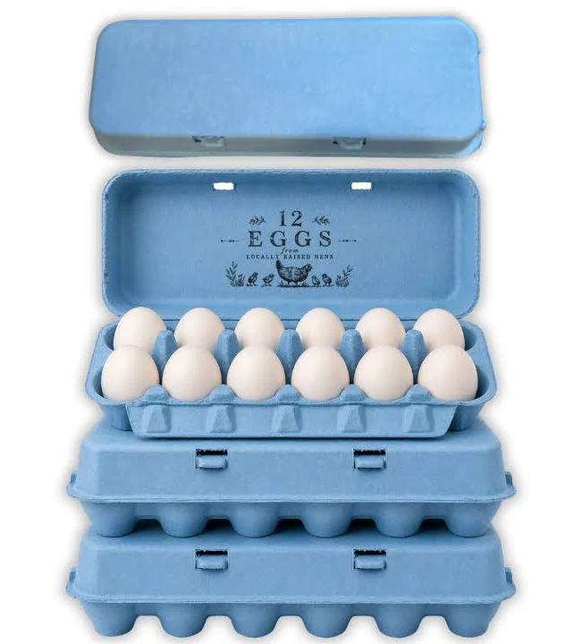
Blue egg cartons in molded pulp holding pale blue Araucana eggs

Description du produit

Spécifications Détails
Nom de la marque BonitoPak
Numéro de modèle EC-BLU series
Nom du produit Blue Egg Cartons / Blue Pigmented Pulp Cartons
Matériau Recycled paper pulp with slurry-blended pigment
Technique Molded pulp forming (wet-pressed), wet end pigmentation
Cell Count 4, 6, 10, 12, 18, or 20 cells
Shade Range Pale sky, mid blue, deep navy; custom shades matched
Color Method Pigment blended into slurry before forming, not surface coated
Lightfastness Lower on pale shades; navy most stable
Print Contrast Strong with white on navy; black on pale sky
Impression de logos Embossed, debossed, or flexographic print
Utilisation industrielle Farm brands, specialty retail, seasonal lines, gift packing
Application Branded egg lines, blue shell egg presentation, spring ranges
Avantages Biodegradable, home compostable, plastic free, no coating
Commande personnalisée Accepté
MOQ Confirm with sales; stock blue carries a lower minimum than custom shades

Galerie de Blue Egg Cartons pièces

Cette galerie présente la qualité exceptionnelle et l'attention portée aux détails que nous apportons à chaque projet. Des conceptions complexes aux finitions impeccables, chaque image reflète notre engagement en faveur de l'excellence dans les domaines suivants Blue Egg Cartons .

40%

Gain de temps et d'argent

Faites l'expérience de solutions d'emballage de pointe qui optimisent vos coûts et votre temps, en fournissant des processus efficaces et en maximisant votre retour sur investissement.

50%

Plus durable

Réalisez des emballages respectueux de l'environnement avec des matériaux durables, en réduisant les déchets et en promouvant la responsabilité environnementale dans toutes vos gammes de produits.

25%

Augmentation des ventes

Améliorez l'attrait de votre produit en rayon grâce à des designs innovants qui augmentent la visibilité et les ventes sur les marchés de détail et en ligne.

100%

Plus fiable

Faites confiance à l'engagement de BonitoPak en matière de qualité, en vous assurant que chaque produit répond à nos normes élevées avec un service constant et fiable.

The shade that fades fastest

Blue carries a technical limitation worth stating before anything else, because it affects where the carton should be used.

Blue pigments rated for compostable packaging are the least lightfast group in the palette. The chemistries that give strong blue without heavy metals are inherently more vulnerable to ultraviolet exposure than reds, yellows, or blacks.

In a retail cold case, under covered market stalls, or anywhere out of direct sun, this never becomes visible. Cartons held in strong direct sunlight for weeks will lighten noticeably, and pale sky blue will go first because there is less pigment present to lose.

Producers selling at outdoor markets in strong sun should either specify navy, which has far more pigment headroom, or keep stock covered between market days. Producers selling into refrigerated retail can ignore this entirely.

We would rather state it than have a buyer discover it in July.

Three shades and what each is for

Pale sky is the softest blue we run and the one most often ordered for a specific reason: it matches the shell. Producers with Araucana, Ameraucana, or Cream Legbar flocks laying blue-green eggs use pale blue cartons for a tonal presentation where the pack and the product sit in the same color family. It is a considered look and it photographs beautifully.

Mid blue is the general purpose shade. Clearly blue at a distance, strong enough to carry a brand identity, and forgiving to produce because the pigment load reduces base fiber influence.

Deep navy behaves closer to black than to blue in every practical respect. It holds embossed detail sharply, takes white and metallic print well, reads as premium rather than as cheerful, and is the most lightfast blue we make.

Blue against the shell color

Blue differs from every other shade in our range on this point, and it is worth thinking through before ordering.

Most carton colors contrast with the eggs. Pink against brown, black against white, green against cream. Contrast makes the eggs stand out when the lid opens.

Blue is the one shade that can match rather than contrast, because blue shell eggs exist. That opens a presentation option nothing else offers: a tonal pack where pale blue carton and pale blue shell read as a single considered product.

It also creates a risk. A mid or navy blue carton holding blue shell eggs flattens them, since the eggs disappear against a stronger version of their own color. Producers with blue laying flocks should specify pale, or move to a contrasting shade entirely.

Brown and white eggs both contrast well against all three blues.

Print and emboss

Navy behaves much like black. White ink reads strongly, metallic effects work, and embossed detail holds sharply because the tonal depth throws a clean shadow.

Pale sky is the opposite. It is light enough that embossing reads softly, and dark inks are needed for printed contrast. Black on pale blue is a clean combination that several farm brands use.

Mid blue sits awkwardly for both. It is too dark for strong black print contrast and too light for white to read cleanly. Producers specifying mid blue should plan on embossing with the understanding that it will read softly, or choose a shade at one end of the range instead.

Navy as a black alternative

Buyers who want the premium weight of black without its severity frequently land on navy, and it is worth understanding what the swap actually changes.

Navy keeps most of black’s advantages: sharp embossing, strong white and metallic print, high shade consistency, and good lightfastness. What it adds is a visible hue under daylight, so the carton reads as a considered color choice rather than as an absence of color.

What it gives up is maximum contrast. White ink on navy is strong but not as stark as white on black, and metallic effects read slightly softer. For most premium lines that trade is worth making.

Seasonal and market use

Blue runs in spring and Easter ranges alongside pink, yellow, and green, and those orders cluster on a fixed deadline. The approval cycle, not production, is what decides whether a seasonal order lands, and buyers who start late end up accepting a stock shade rather than a matched one.

Blue also has a steady non-seasonal market among producers whose brand identity is blue, where the requirement is consistency across years rather than a single run. Those buyers should approve and retain a physical shade standard at first production, since every reorder is then matched against it.

For the full detail on how shade is controlled between batches and across molds, see molded pulp colored egg cartons.

Pairing with format

Navy on molded pulp octagon egg cartons gives a premium gift presentation close to what black achieves.

Pale blue on a molded pulp 6 egg carton suits specialty blue shell lines, which sell in half dozens more often than in twelves.

For a permanent brand identity across the range, the molded pulp dozen egg carton is the volume format to anchor on. Printing specifications are covered at boîtes à œufs personnalisées.

The shade that fades fastest

Blue carries a technical limitation worth stating before anything else, because it affects where the carton should be used.

Blue pigments rated for compostable packaging are the least lightfast group in the palette. The chemistries that give strong blue without heavy metals are inherently more vulnerable to ultraviolet exposure than reds, yellows, or blacks.

In a retail cold case, under covered market stalls, or anywhere out of direct sun, this never becomes visible. Cartons held in strong direct sunlight for weeks will lighten noticeably, and pale sky blue will go first because there is less pigment present to lose.

Producers selling at outdoor markets in strong sun should either specify navy, which has far more pigment headroom, or keep stock covered between market days. Producers selling into refrigerated retail can ignore this entirely.

We would rather state it than have a buyer discover it in July.

Three shades and what each is for

Pale sky is the softest blue we run and the one most often ordered for a specific reason: it matches the shell. Producers with Araucana, Ameraucana, or Cream Legbar flocks laying blue-green eggs use pale blue cartons for a tonal presentation where the pack and the product sit in the same color family. It is a considered look and it photographs beautifully.

Mid blue is the general purpose shade. Clearly blue at a distance, strong enough to carry a brand identity, and forgiving to produce because the pigment load reduces base fiber influence.

Deep navy behaves closer to black than to blue in every practical respect. It holds embossed detail sharply, takes white and metallic print well, reads as premium rather than as cheerful, and is the most lightfast blue we make.

Blue against the shell color

Blue differs from every other shade in our range on this point, and it is worth thinking through before ordering.

Most carton colors contrast with the eggs. Pink against brown, black against white, green against cream. Contrast makes the eggs stand out when the lid opens.

Blue is the one shade that can match rather than contrast, because blue shell eggs exist. That opens a presentation option nothing else offers: a tonal pack where pale blue carton and pale blue shell read as a single considered product.

It also creates a risk. A mid or navy blue carton holding blue shell eggs flattens them, since the eggs disappear against a stronger version of their own color. Producers with blue laying flocks should specify pale, or move to a contrasting shade entirely.

Brown and white eggs both contrast well against all three blues.

Print and emboss

Navy behaves much like black. White ink reads strongly, metallic effects work, and embossed detail holds sharply because the tonal depth throws a clean shadow.

Pale sky is the opposite. It is light enough that embossing reads softly, and dark inks are needed for printed contrast. Black on pale blue is a clean combination that several farm brands use.

Mid blue sits awkwardly for both. It is too dark for strong black print contrast and too light for white to read cleanly. Producers specifying mid blue should plan on embossing with the understanding that it will read softly, or choose a shade at one end of the range instead.

Navy as a black alternative

Buyers who want the premium weight of black without its severity frequently land on navy, and it is worth understanding what the swap actually changes.

Navy keeps most of black’s advantages: sharp embossing, strong white and metallic print, high shade consistency, and good lightfastness. What it adds is a visible hue under daylight, so the carton reads as a considered color choice rather than as an absence of color.

What it gives up is maximum contrast. White ink on navy is strong but not as stark as white on black, and metallic effects read slightly softer. For most premium lines that trade is worth making.

Seasonal and market use

Blue runs in spring and Easter ranges alongside pink, yellow, and green, and those orders cluster on a fixed deadline. The approval cycle, not production, is what decides whether a seasonal order lands, and buyers who start late end up accepting a stock shade rather than a matched one.

Blue also has a steady non-seasonal market among producers whose brand identity is blue, where the requirement is consistency across years rather than a single run. Those buyers should approve and retain a physical shade standard at first production, since every reorder is then matched against it.

For the full detail on how shade is controlled between batches and across molds, see molded pulp colored egg cartons.

Pairing with format

Navy on molded pulp octagon egg cartons gives a premium gift presentation close to what black achieves.

Pale blue on a molded pulp 6 egg carton suits specialty blue shell lines, which sell in half dozens more often than in twelves.

For a permanent brand identity across the range, the molded pulp dozen egg carton is the volume format to anchor on. Printing specifications are covered at boîtes à œufs personnalisées.

Matériaux pour Blue Egg Cartons Pièces détachées

Des entreprises et des ingénieurs de premier plan font confiance à BonitoPak pour des itérations rapides et des pièces durables et de haute qualité. Qu'il s'agisse de prototypage ou de production à grande échelle, notre large gamme de matériaux nous permet de répondre aux exigences uniques de n'importe quelle entreprise. Blue Egg Cartons avec précision et rapidité.

Compostable kraft paper is the strongest fiber we form. Made from virgin

Colored pulp is not a separate fiber. It is any of our

Bleached pulp is the material to specify when the part has to

Natural plant fiber covers the non-wood cellulose sources we blend outside the

Corrugated paper as a molded pulp material means recovered cardboard boxes repulped

Straw fiber is made from the stalks left after grain harvest, material

Personnalisé Écologique Fiable

Excellence en matière d'emballage personnalisé et respectueux de l'environnement

Entièrement personnalisable

Personnalisez votre emballage avec des styles, des tailles, des couleurs et des finitions sur mesure pour répondre à des besoins spécifiques.

Soutien des experts

Bonitopak fournit des conseils experts en matière de conception et de logistique afin de maximiser l'efficacité de l'emballage et d'augmenter le retour sur investissement.

Solutions écologiques

Choisissez des emballages durables et écologiques pour réduire l'impact sur l'environnement et soutenir les objectifs écologiques de votre marque.

Assurance qualité

Bonitopak garantit un service de qualité supérieure et l'excellence du produit pour chaque solution d'emballage.

Questions fréquemment posées

Blue Egg Cartons

  • Does blue cost more than natural pulp?

    Yes, as all pigmented shades do, and the difference comes from pigment cost plus the line flush required when changing color. Blue sits in the middle of our color range on price, above black on pigment cost per unit of coverage and below custom matched shades.

  • Is navy just black with less pigment?

    No, they use different pigment systems entirely. Navy reads as a dark blue under daylight and shows its blue cast clearly against a true black carton placed beside it. Buyers who want near-black performance with a hint of color choose navy deliberately rather than as a compromise.

  • Can you match a specific Pantone blue?

    We produce a close match and supply a formed physical sample for approval. Exact matching to a printed Pantone reference is not physically achievable in pigmented fiber, since pulp scatters light differently from coated paper. Brands with a strict standard approve a designated pulp equivalent rather than insisting on the ink reference.

  • How much fading should I expect at an outdoor market?

    Visible lightening after sustained direct sun across weeks, with pale sky showing it first and navy showing it last. Cartons used and sold within days never see enough exposure to matter. The problem is stock sitting in sun between market days, which is solved by covering the pile rather than by changing shade.

  • Which blue should I choose if my hens lay blue eggs?

    Pale sky, for a tonal match, or move away from blue entirely for contrast. Avoid mid blue and navy, which are strong enough to flatten a pale blue shell so the eggs stop registering as the distinctive thing they are. Order a sample and seat your actual eggs in it before committing.

Biodégradable Résultat

0 jours

7 jours

14 jours

30 jours

Industries spécialisées

Ayant produit des millions de pièces, BonitoPak possède une connaissance approfondie de nombreuses applications. Nous excellons particulièrement dans les industries qui exigent la fabrication de composants précis et complexes. Faites-nous confiance pour vous apporter expertise et qualité, quelle que soit la complexité.

Solutions d'emballage OEM et ODM

Bonitopak propose des solutions d'emballage sur mesure (OEM) et préconçues (ODM). Que vous ayez besoin d'un design entièrement personnalisé ou d'un emballage prêt à l'emploi, nous vous proposons des options de haute qualité, efficaces et flexibles pour répondre aux besoins de votre marque.

Services OEM

Les solutions d'emballage OEM vous permettent de créer des produits entièrement personnalisés, conçus et fabriqués pour répondre à vos besoins spécifiques. Chez Bonitopak, nous offrons un soutien complet tout au long du processus de conception, de prototypage et de fabrication, afin que votre emballage reflète l'identité unique de votre marque. Nos capacités de fabrication de précision garantissent une production de haute qualité et cohérente, quelle que soit la complexité de la conception. Avec un service complet, nous nous occupons de tout, de la conception à la livraison, pour vous aider à rationaliser vos besoins en matière d'emballage.

Services ODM

Les solutions d'emballage ODM offrent des produits préconçus qui peuvent être adaptés aux exigences de votre marque. Grâce à l'expertise de Bonitopak en matière de conception innovante et à son processus de production efficace, vous pouvez choisir parmi une large gamme d'options d'emballage prêtes à l'emploi. Nous offrons une personnalisation flexible, vous permettant d'ajouter votre marque et de choisir parmi différentes finitions, couleurs et tailles. Cette solution permet d'économiser du temps et de l'argent tout en garantissant un emballage de haute qualité qui répond aux normes de votre marque.
Prêt à élever votre projet ?

Donnez vie à vos dessins avec BonitoPak

Faites l'expérience de l'ingénierie de précision avec BonitoPak. Des prototypes détaillés à la production en grande quantité, nous sommes là pour transformer vos concepts en réalité. Contactez-nous dès aujourd'hui pour discuter des besoins de votre projet !

Nos catégories de produits

Découvrez la gamme diversifiée de solutions d'emballage de Bonitopak, y compris les plateaux de pulpe moulée, les emballages alimentaires, les conceptions personnalisées et les options durables. Chaque catégorie est conçue dans un souci de durabilité, de fonctionnalité et de responsabilité environnementale, afin de répondre à vos besoins spécifiques.

The shade that fades fastest

Blue carries a technical limitation worth stating before anything else, because it affects where the carton should be used.

Blue pigments rated for compostable packaging are the least lightfast group in the palette. The chemistries that give strong blue without heavy metals are inherently more vulnerable to ultraviolet exposure than reds, yellows, or blacks.

In a retail cold case, under covered market stalls, or anywhere out of direct sun, this never becomes visible. Cartons held in strong direct sunlight for weeks will lighten noticeably, and pale sky blue will go first because there is less pigment present to lose.

Producers selling at outdoor markets in strong sun should either specify navy, which has far more pigment headroom, or keep stock covered between market days. Producers selling into refrigerated retail can ignore this entirely.

We would rather state it than have a buyer discover it in July.

Three shades and what each is for

Pale sky is the softest blue we run and the one most often ordered for a specific reason: it matches the shell. Producers with Araucana, Ameraucana, or Cream Legbar flocks laying blue-green eggs use pale blue cartons for a tonal presentation where the pack and the product sit in the same color family. It is a considered look and it photographs beautifully.

Mid blue is the general purpose shade. Clearly blue at a distance, strong enough to carry a brand identity, and forgiving to produce because the pigment load reduces base fiber influence.

Deep navy behaves closer to black than to blue in every practical respect. It holds embossed detail sharply, takes white and metallic print well, reads as premium rather than as cheerful, and is the most lightfast blue we make.

Blue against the shell color

Blue differs from every other shade in our range on this point, and it is worth thinking through before ordering.

Most carton colors contrast with the eggs. Pink against brown, black against white, green against cream. Contrast makes the eggs stand out when the lid opens.

Blue is the one shade that can match rather than contrast, because blue shell eggs exist. That opens a presentation option nothing else offers: a tonal pack where pale blue carton and pale blue shell read as a single considered product.

It also creates a risk. A mid or navy blue carton holding blue shell eggs flattens them, since the eggs disappear against a stronger version of their own color. Producers with blue laying flocks should specify pale, or move to a contrasting shade entirely.

Brown and white eggs both contrast well against all three blues.

Print and emboss

Navy behaves much like black. White ink reads strongly, metallic effects work, and embossed detail holds sharply because the tonal depth throws a clean shadow.

Pale sky is the opposite. It is light enough that embossing reads softly, and dark inks are needed for printed contrast. Black on pale blue is a clean combination that several farm brands use.

Mid blue sits awkwardly for both. It is too dark for strong black print contrast and too light for white to read cleanly. Producers specifying mid blue should plan on embossing with the understanding that it will read softly, or choose a shade at one end of the range instead.

Navy as a black alternative

Buyers who want the premium weight of black without its severity frequently land on navy, and it is worth understanding what the swap actually changes.

Navy keeps most of black’s advantages: sharp embossing, strong white and metallic print, high shade consistency, and good lightfastness. What it adds is a visible hue under daylight, so the carton reads as a considered color choice rather than as an absence of color.

What it gives up is maximum contrast. White ink on navy is strong but not as stark as white on black, and metallic effects read slightly softer. For most premium lines that trade is worth making.

Seasonal and market use

Blue runs in spring and Easter ranges alongside pink, yellow, and green, and those orders cluster on a fixed deadline. The approval cycle, not production, is what decides whether a seasonal order lands, and buyers who start late end up accepting a stock shade rather than a matched one.

Blue also has a steady non-seasonal market among producers whose brand identity is blue, where the requirement is consistency across years rather than a single run. Those buyers should approve and retain a physical shade standard at first production, since every reorder is then matched against it.

For the full detail on how shade is controlled between batches and across molds, see molded pulp colored egg cartons.

Pairing with format

Navy on molded pulp octagon egg cartons gives a premium gift presentation close to what black achieves.

Pale blue on a molded pulp 6 egg carton suits specialty blue shell lines, which sell in half dozens more often than in twelves.

For a permanent brand identity across the range, the molded pulp dozen egg carton is the volume format to anchor on. Printing specifications are covered at boîtes à œufs personnalisées.

Articles et réflexions connexes

Restez informé des dernières mises à jour sur les tendances en matière d'emballage durable, les perspectives du secteur et les conseils d'experts grâce à notre blog. Explorez des idées et des solutions innovantes pour améliorer vos connaissances en matière d'emballage.

Par Leo Chan | Rédacteur, BonitoPak | Plus de 20 ans d'expérience dans le domaine des emballages en pâte moulée. La vodka, c'est

Par Leo Chan | Rédacteur, BonitoPak | Plus de 20 ans d'expérience dans le domaine des emballages en pâte moulée Presque tous les

Par Leo Chan | Rédacteur, BonitoPak | Plus de 20 ans d'expérience dans le domaine des emballages en pâte moulée Rechercher ceci

Questions fréquemment posées

Blue Egg Cartons

  • Does blue cost more than natural pulp?

    Yes, as all pigmented shades do, and the difference comes from pigment cost plus the line flush required when changing color. Blue sits in the middle of our color range on price, above black on pigment cost per unit of coverage and below custom matched shades.

  • Is navy just black with less pigment?

    No, they use different pigment systems entirely. Navy reads as a dark blue under daylight and shows its blue cast clearly against a true black carton placed beside it. Buyers who want near-black performance with a hint of color choose navy deliberately rather than as a compromise.

  • Can you match a specific Pantone blue?

    We produce a close match and supply a formed physical sample for approval. Exact matching to a printed Pantone reference is not physically achievable in pigmented fiber, since pulp scatters light differently from coated paper. Brands with a strict standard approve a designated pulp equivalent rather than insisting on the ink reference.

  • How much fading should I expect at an outdoor market?

    Visible lightening after sustained direct sun across weeks, with pale sky showing it first and navy showing it last. Cartons used and sold within days never see enough exposure to matter. The problem is stock sitting in sun between market days, which is solved by covering the pile rather than by changing shade.

  • Which blue should I choose if my hens lay blue eggs?

    Pale sky, for a tonal match, or move away from blue entirely for contrast. Avoid mid blue and navy, which are strong enough to flatten a pale blue shell so the eggs stop registering as the distinctive thing they are. Order a sample and seat your actual eggs in it before committing.

Remplir ce formulaire détaillé