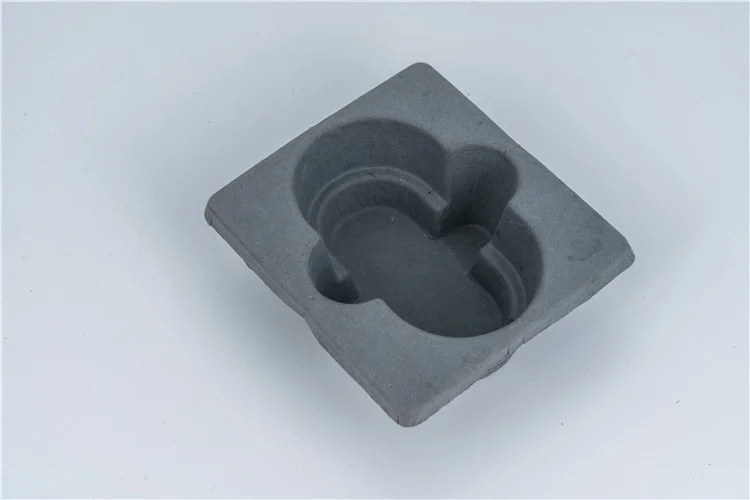
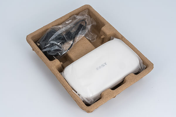
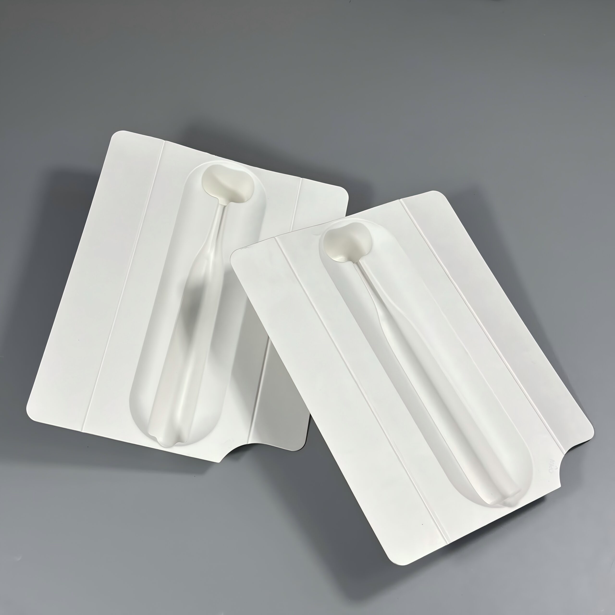
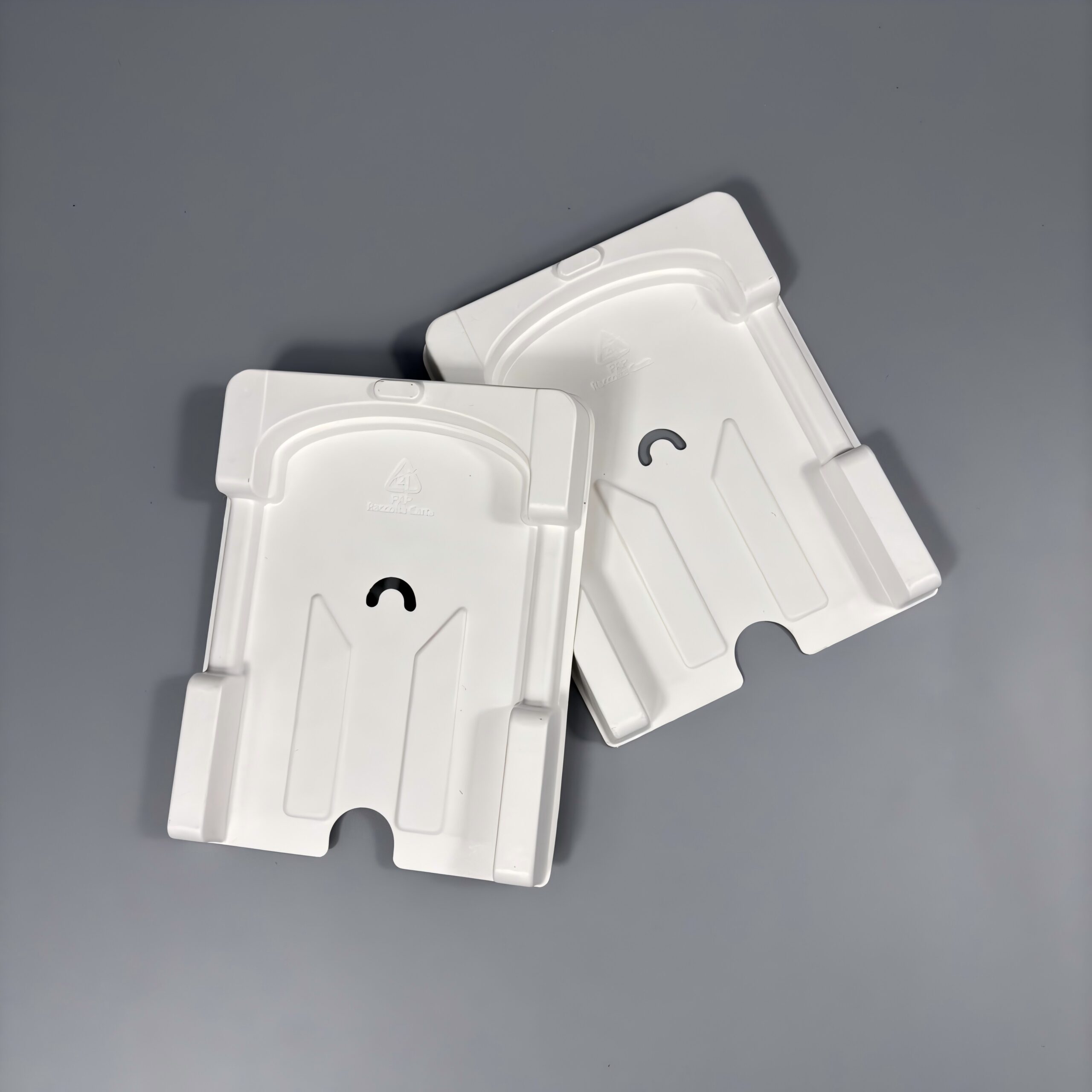
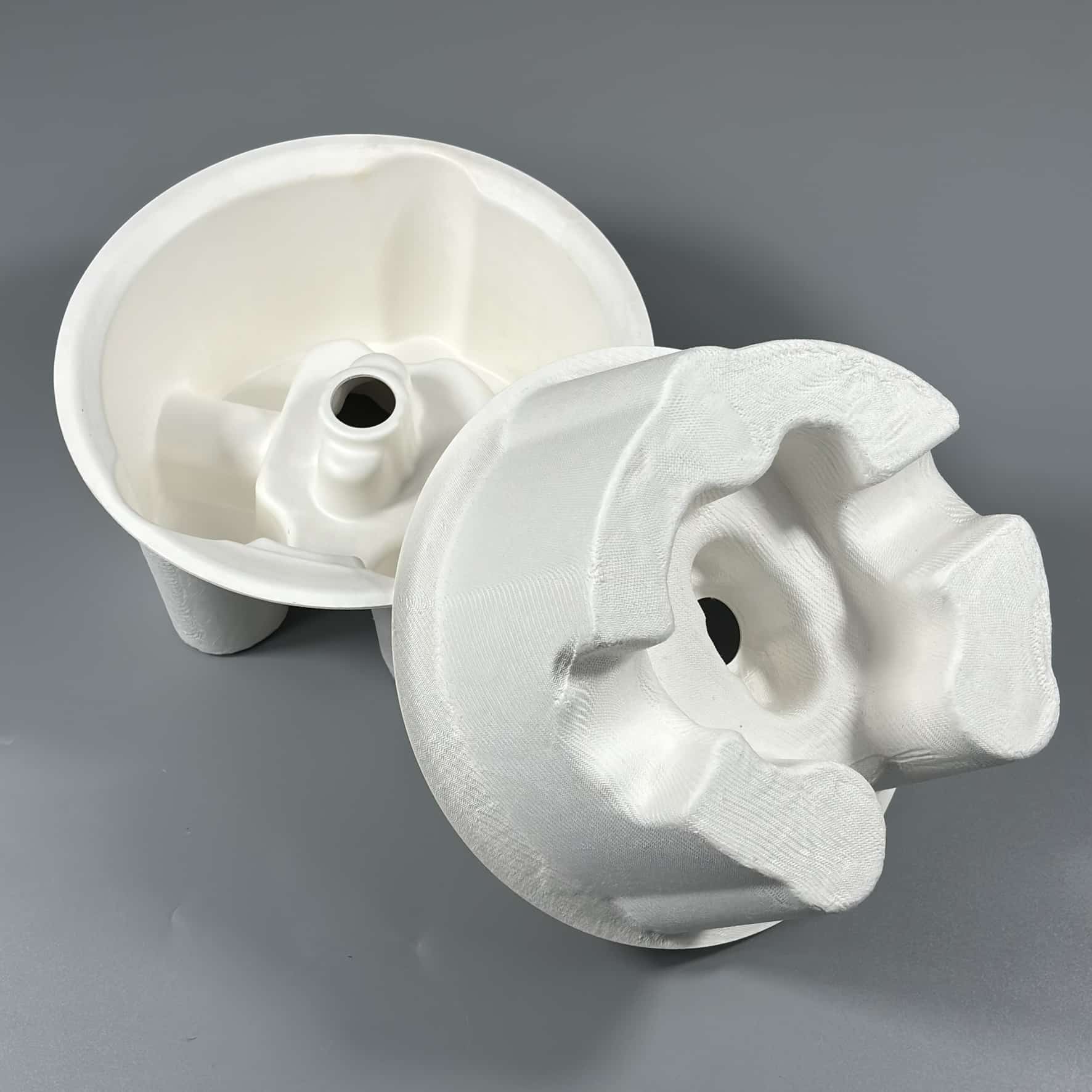
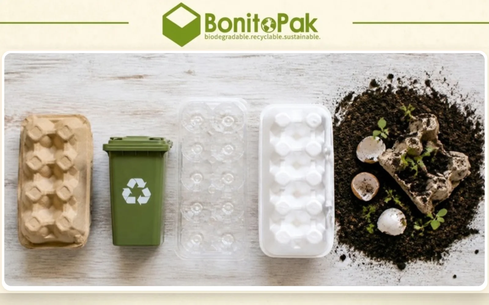
バガス、竹、再生紙などの生分解性素材を使用したウェットプレス加工は、滑らかな仕上がり、保護、クッション性、省スペースで環境に優しいパッケージを提供する。
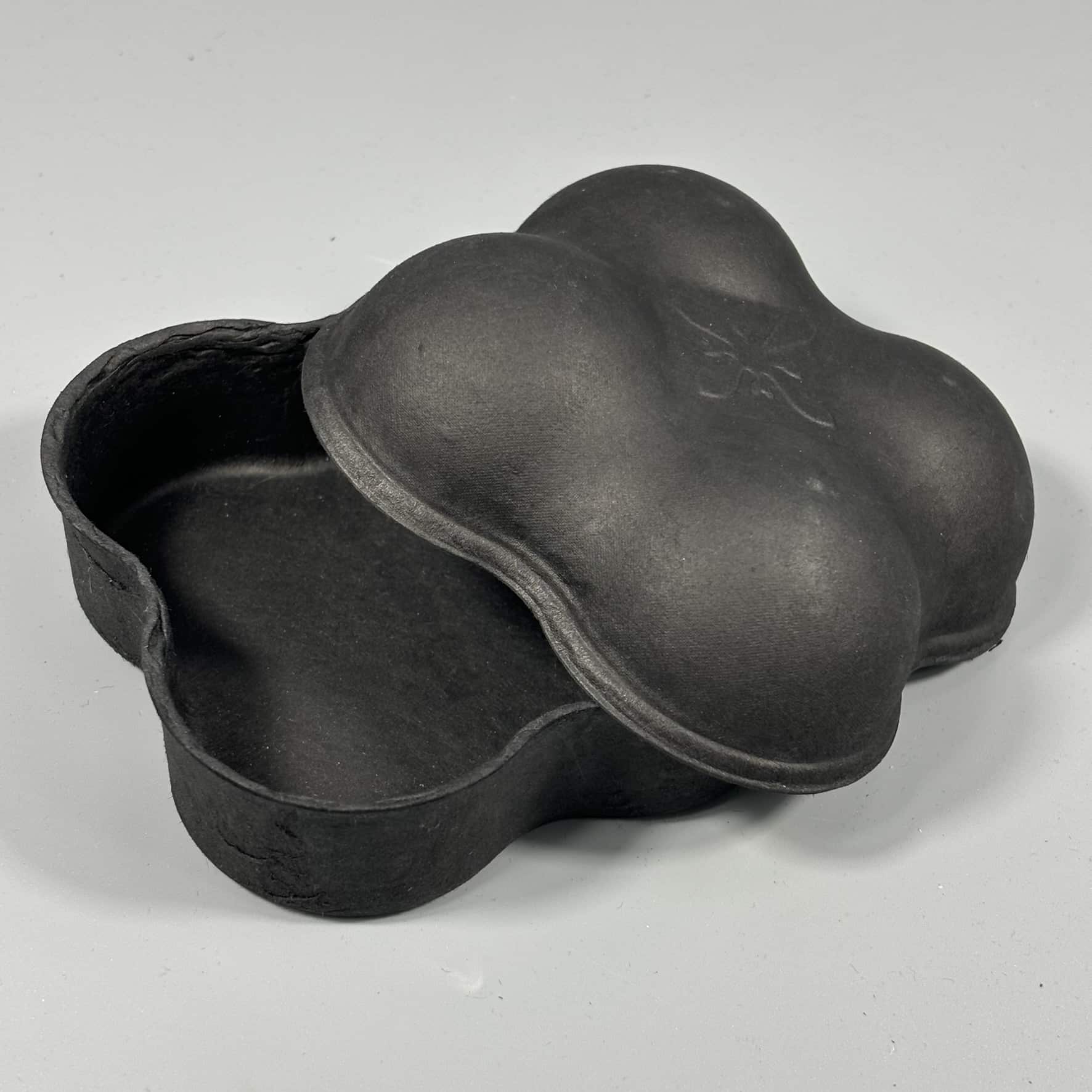
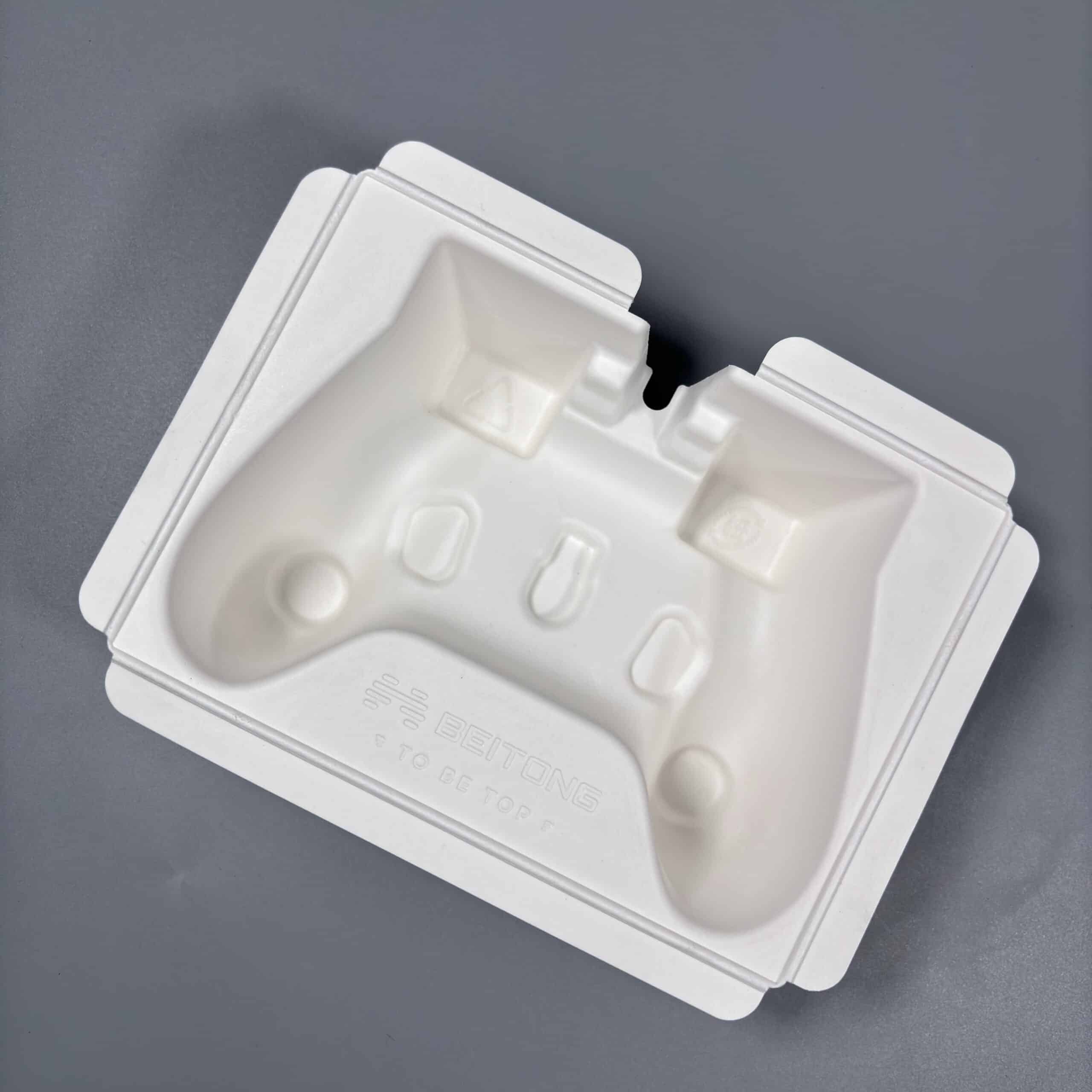
プラスチックや発泡スチロールに代わる成型パルプ製品は、リサイクル可能で生分解性のオプションを提供します。特注の形状、色、環境に優しい表面加工も可能です。社内で試作と製造を行い、手頃な価格で持続可能なパッケージを提供します。
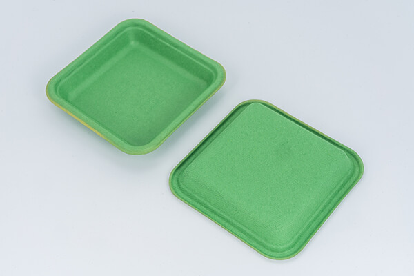
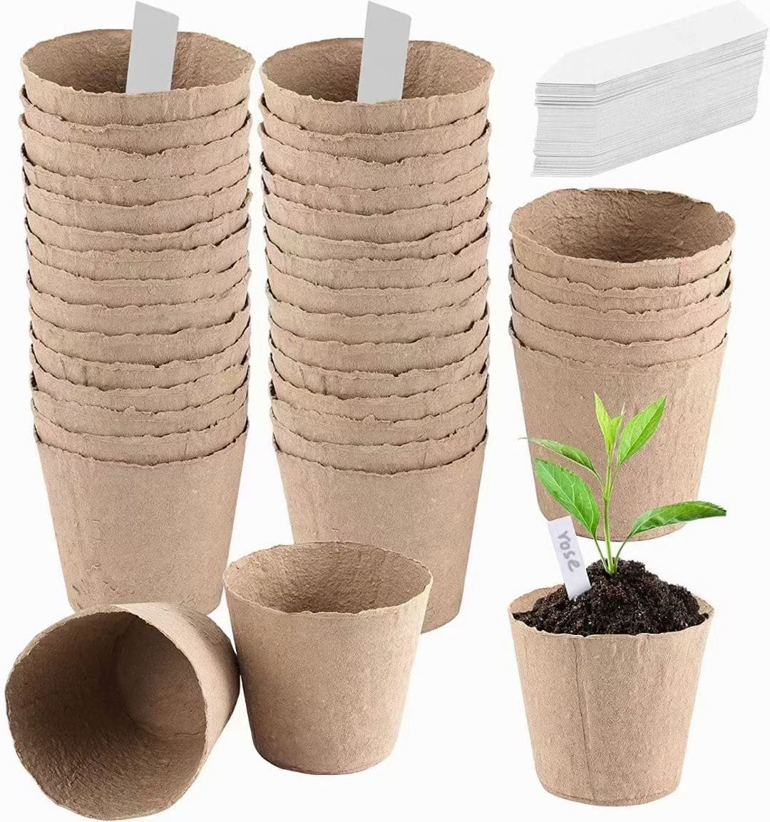
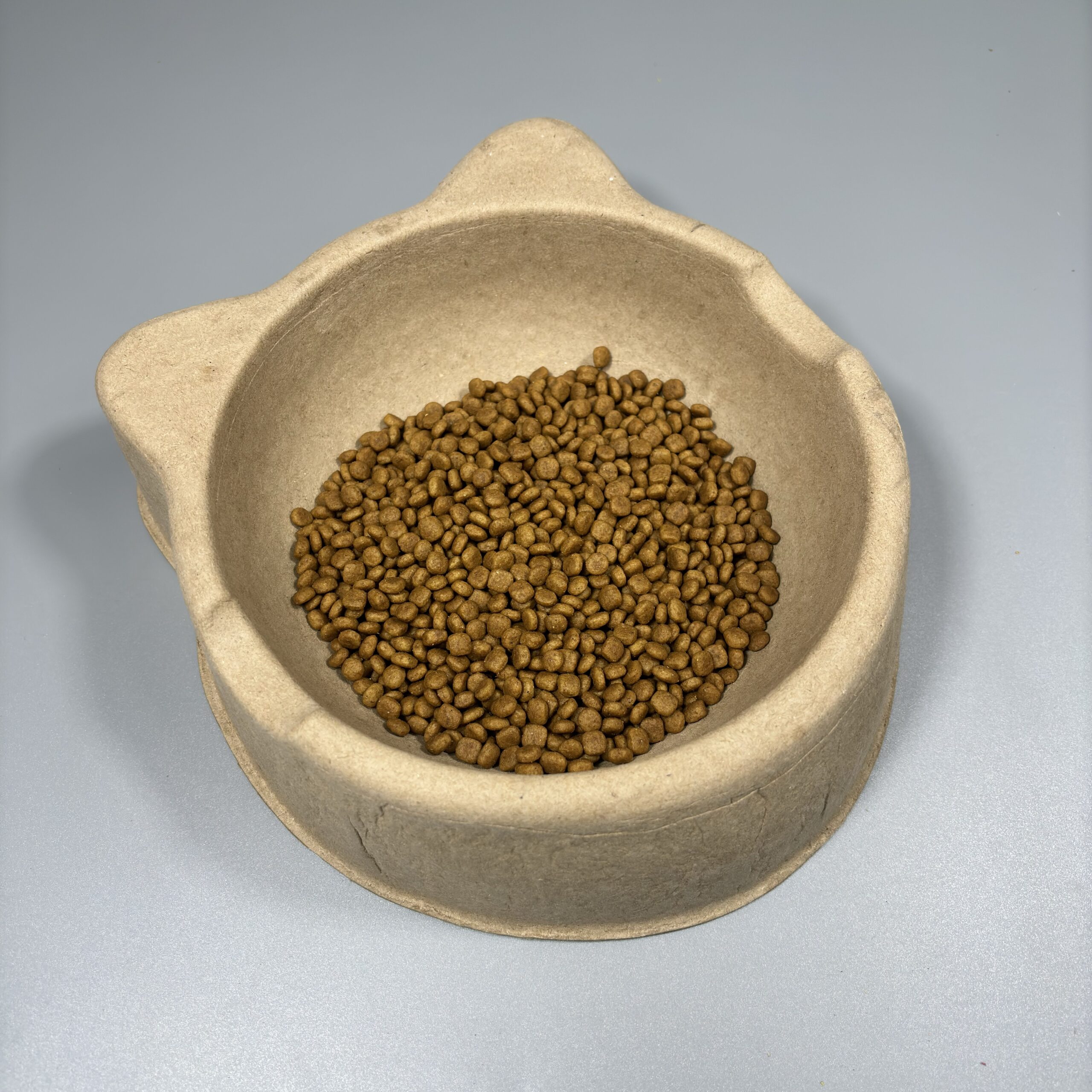
バガス、わら、竹から作られた植物繊維食器は、生分解性、堆肥化可能、防水性、耐油性、電子レンジ対応。認定を受け、リサイクル可能で、環境にやさしいスタッキングもできます。
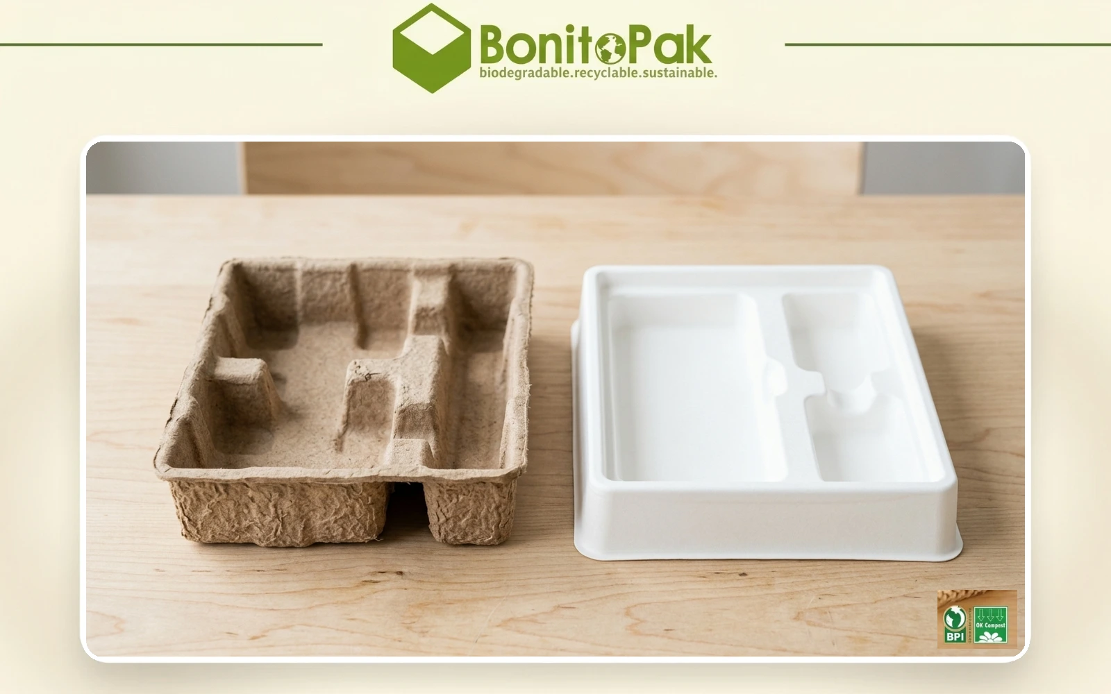
100%の再生材料から作られたドライプレス紙パルプトレーは、プラスチックに代わる環境にやさしく、費用対効果の高い製品です。クッション性、耐熱性、積み重ねが可能で、最大20%のスペースを節約できます。
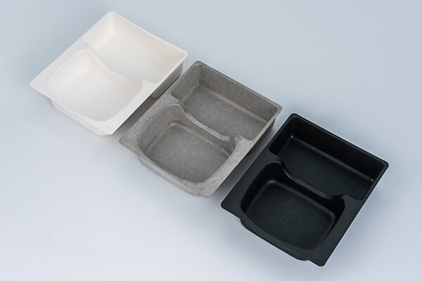
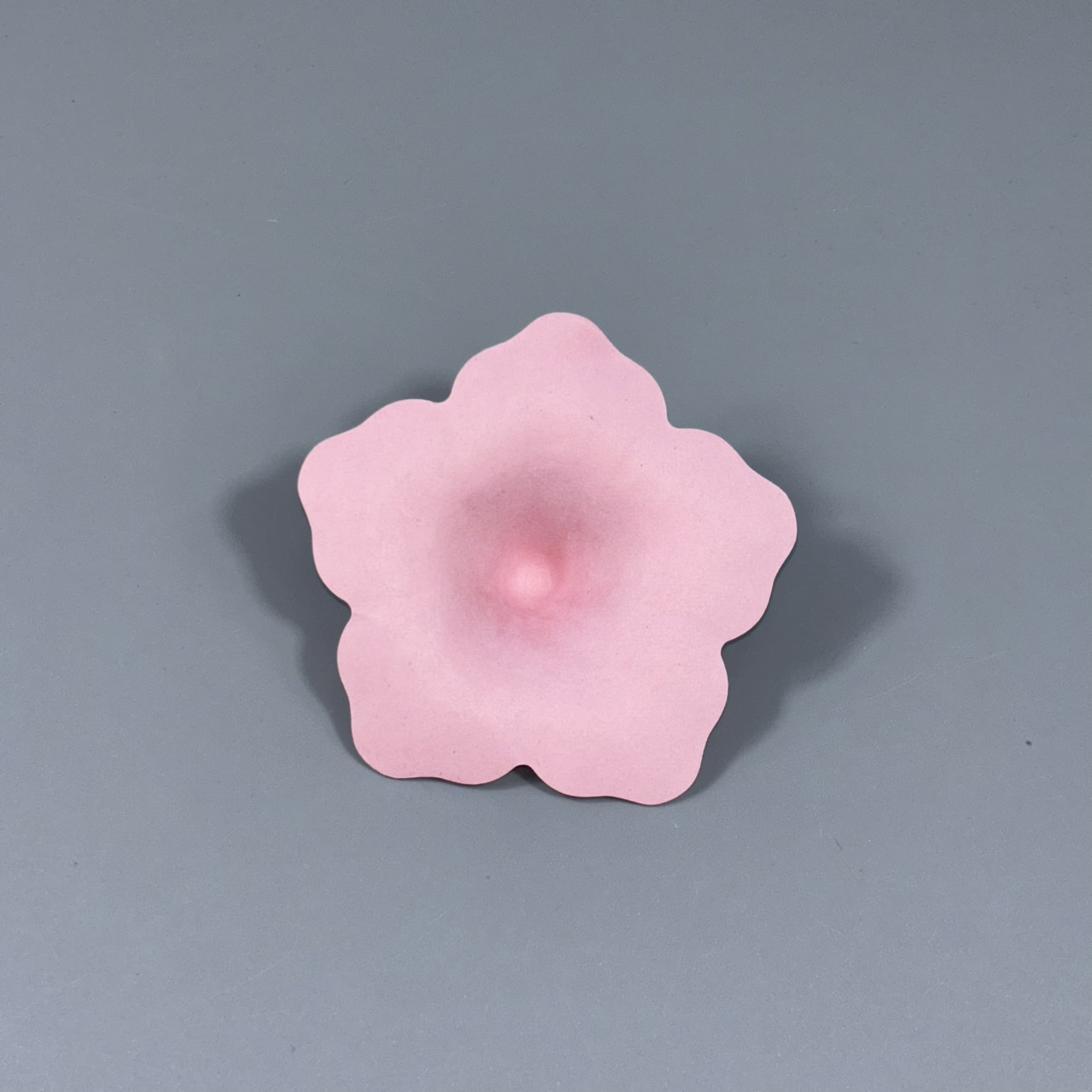
ボニトパックは、95%の色精度で、ホワイト、ナチュラル、ブラックを含む6色の成形パルプを提供しています。環境にやさしい方法で、安全な漂白を実現しています。ナチュラルとホワイトは食品に最適で、その他はトレイ包装に適しています。
Buyers searching for vintage egg cartons are usually looking for a specific physical shape rather than a printed graphic, and suppliers who treat the request as a print job get it wrong.
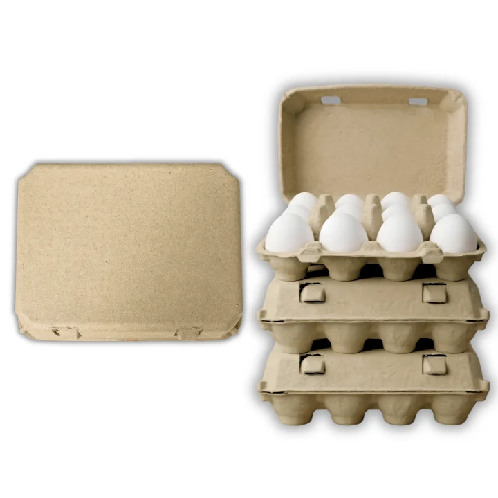
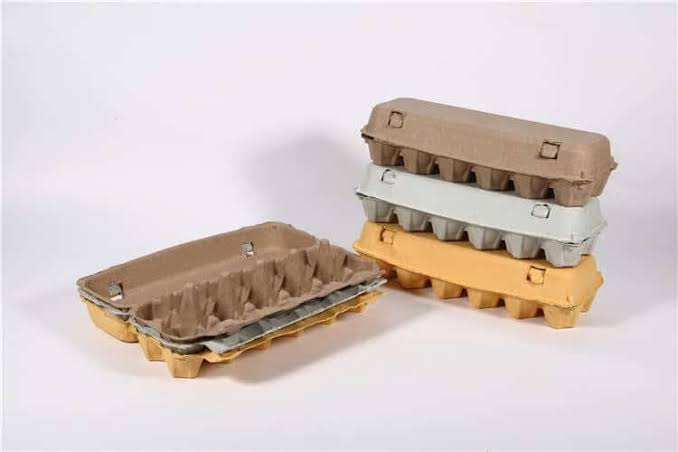
Egg cartons made through the middle of the twentieth century had a flat top. The lid was a squared panel with straight sides, folding down onto a base with a single deep hinge. Domed and contoured lids came later, driven by material savings and by automatic packing equipment that needed a self locating shape.
The flat top is the vintage carton. Print style contributes, but a domed modern carton with a retro typeface still looks modern, because the silhouette is what the eye reads first.
Our vintage molds reproduce the flat top geometry, including the squared shoulder where the lid meets the base and the deeper single fold hinge that lets the lid lay fully back.
The flat top has a practical advantage that has nothing to do with nostalgia. It is the best print surface in egg packaging.
A domed lid curves in two directions, which means printed artwork distorts toward the edges and registration is harder to hold. A flat panel prints like a sheet. Fine detail holds, straight lines stay straight, and edge to edge coverage is achievable.
For a producer who wants their farm name reproduced properly rather than approximately, the flat top is the correct specification regardless of whether they care about the retro association. Several of our customers order it purely for the print quality.
The panel on a twelve cell vintage carton runs roughly 320 square centimeters of usable flat area, which is generous enough for a full illustrated design rather than a logo and a line of text.
A single deep fold hinge is more fragile than the multiple shallow creases used on modern cartons, and it needs more fiber to survive repeated opening.
We compensate by running additional wall thickness through the hinge zone, which adds a small amount of material per carton. The payoff is a lid that lays fully flat when opened, presenting the eggs as a display rather than propping the lid at an angle.
At a farmers market that difference is worth the extra grams. A carton that opens flat on a table shows twelve eggs to a passing customer. A carton with a lid standing up hides half of them.
Buyers should note that the deep hinge is the wear point on this format. Cartons opened and closed repeatedly for display, then sold, will show hinge fatigue. Producers who display eggs loose and pack at the point of sale avoid the issue entirely.
Bright saturated color undermines the vintage effect. The shades that work are muted.
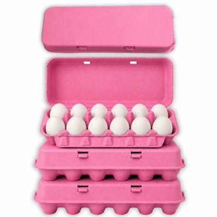
Natural pulp is the most authentic, since it is what the originals were, and it needs no pigment at all. Beyond that, muted greens, faded blues, and warm off-whites read as period. Bright pink and vivid purple do not, however well they perform on modern formats.
Print color follows the same logic. Single color printing in a dark ink on natural pulp is close to how these cartons were actually produced, since multi-color printing on egg cartons was uncommon until much later. A one color design also costs less to print, which is a rare case where the authentic choice is also the cheaper one.
Vintage cartons have a secondary market that surprises most producers.
Food stylists and photographers buy them as props, since a flat top carton signals farm and heritage in a single frame. Restaurants use them for table presentation. Craft and education buyers use them for the shape rather than the function.
These are low volume buyers, but they order consistently and they do not negotiate on price, since the carton is a small line item against a larger production. Producers with an online storefront often find prop sales cover a meaningful share of their minimum order.
Vintage is a positioning choice rather than a functional one. A producer choosing it is trading efficiency for identity.
The pragmatic setup runs a dozen egg carton in modern profile for volume and wholesale accounts, with vintage reserved for direct sales where the customer sees the pack. A 6 egg carton in vintage profile works well for premium and gift lines.
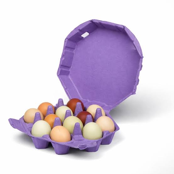
Producers wanting distinctiveness through shape rather than period style should compare octagon egg cartons. Those combining vintage profile with a brand shade should read カラー卵パック for the pigment detail first.
Buyers searching for vintage egg cartons are usually looking for a specific physical shape rather than a printed graphic, and suppliers who treat the request as a print job get it wrong.
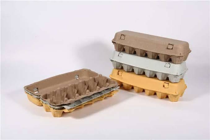
Egg cartons made through the middle of the twentieth century had a flat top. The lid was a squared panel with straight sides, folding down onto a base with a single deep hinge. Domed and contoured lids came later, driven by material savings and by automatic packing equipment that needed a self locating shape.
The flat top is the vintage carton. Print style contributes, but a domed modern carton with a retro typeface still looks modern, because the silhouette is what the eye reads first.
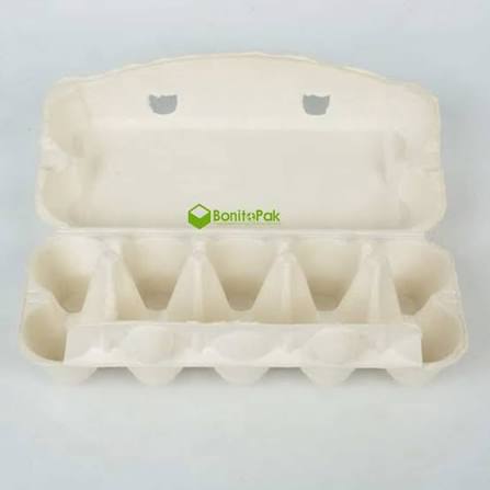
Our vintage molds reproduce the flat top geometry, including the squared shoulder where the lid meets the base and the deeper single fold hinge that lets the lid lay fully back.
The flat top has a practical advantage that has nothing to do with nostalgia. It is the best print surface in egg packaging.
A domed lid curves in two directions, which means printed artwork distorts toward the edges and registration is harder to hold. A flat panel prints like a sheet. Fine detail holds, straight lines stay straight, and edge to edge coverage is achievable.
For a producer who wants their farm name reproduced properly rather than approximately, the flat top is the correct specification regardless of whether they care about the retro association. Several of our customers order it purely for the print quality.
The panel on a twelve cell vintage carton runs roughly 320 square centimeters of usable flat area, which is generous enough for a full illustrated design rather than a logo and a line of text.
A single deep fold hinge is more fragile than the multiple shallow creases used on modern cartons, and it needs more fiber to survive repeated opening.
We compensate by running additional wall thickness through the hinge zone, which adds a small amount of material per carton. The payoff is a lid that lays fully flat when opened, presenting the eggs as a display rather than propping the lid at an angle.
At a farmers market that difference is worth the extra grams. A carton that opens flat on a table shows twelve eggs to a passing customer. A carton with a lid standing up hides half of them.
Buyers should note that the deep hinge is the wear point on this format. Cartons opened and closed repeatedly for display, then sold, will show hinge fatigue. Producers who display eggs loose and pack at the point of sale avoid the issue entirely.
Bright saturated color undermines the vintage effect. The shades that work are muted.
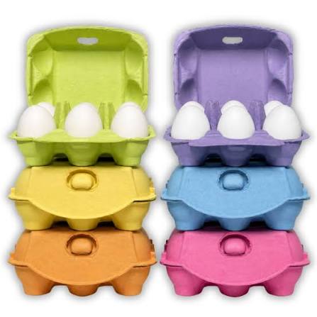
Natural pulp is the most authentic, since it is what the originals were, and it needs no pigment at all. Beyond that, muted greens, faded blues, and warm off-whites read as period. Bright pink and vivid purple do not, however well they perform on modern formats.
Print color follows the same logic. Single color printing in a dark ink on natural pulp is close to how these cartons were actually produced, since multi-color printing on egg cartons was uncommon until much later. A one color design also costs less to print, which is a rare case where the authentic choice is also the cheaper one.
Vintage cartons have a secondary market that surprises most producers.
Food stylists and photographers buy them as props, since a flat top carton signals farm and heritage in a single frame. Restaurants use them for table presentation. Craft and education buyers use them for the shape rather than the function.
These are low volume buyers, but they order consistently and they do not negotiate on price, since the carton is a small line item against a larger production. Producers with an online storefront often find prop sales cover a meaningful share of their minimum order.
Vintage is a positioning choice rather than a functional one. A producer choosing it is trading efficiency for identity.
The pragmatic setup runs a dozen egg carton in modern profile for volume and wholesale accounts, with vintage reserved for direct sales where the customer sees the pack. A 6 egg carton in vintage profile works well for premium and gift lines.
Producers wanting distinctiveness through shape rather than period style should compare octagon egg cartons. Those combining vintage profile with a brand shade should read カラー卵パック for the pigment detail first.
24時間以内に対応し、迅速で明確なコミュニケーション、オーダーメイドのソリューション、時間とコストを節約する効率的なサービスを提供します。
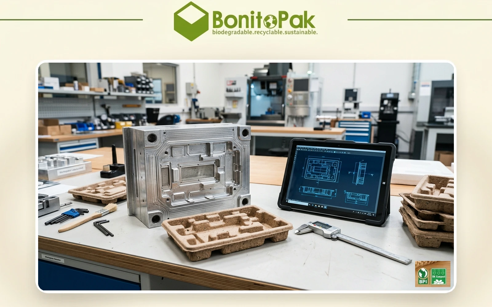
社内で設計、エンジニアリング、製造を行っているため、迅速な金型製作が可能で、サンプルは7日、生産用金型は8日で完成する。
当社の熟練したR&Dエンジニアは、設計、試作、金型製作に優れており、ブリスター、ブリキ缶、印刷箱など、完全なパッケージング・ソリューションを提供しています。
訓練を受けたスタッフが100%検査、抜き取り検査、品質管理を行い、高い水準を確保し、不良品を減らし、コストを削減する。
合理的な受注スケジュールを提供し、お客様と調整しながら問題を迅速に解決し、最善のソリューションを確保します。
経験豊富なアフターセールス・チームがスムーズなコミュニケーションを図り、交換や発送、配送に関する問題を解決し、クレームゼロを目指します。