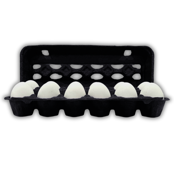
That sounds counterintuitive for the most dramatic shade in the range, but it follows directly from how pigmented pulp works.
Recycled fiber arrives gray-brown and varies batch to batch depending on the waste stream. Every pigment has to work against that moving base. Light tints show the variation, which is why pink is the hardest shade we produce.
Black overwhelms it. The pigment load is high enough that incoming fiber color has almost no influence on the finished shade. A grayer batch and a warmer batch produce the same black.
The practical consequence for buyers is consistency. Black reorders match the original more reliably than any other shade, which matters for a brand running the same carton across years rather than a single seasonal run.
Why embossing works best here
Embossed detail is read through shadow, not through color contrast. The mark is the same material as the carton around it, so what the eye picks up is the way light falls into and out of the raised or recessed area.
Shadow depth depends on how much tonal range the surface has. A pale surface reflects light into its own shadows and softens them. A dark surface absorbs that bounced light, so the shadow stays dark and the edge of the emboss stays sharp.
Black has more tonal depth than anything else we produce. An embossed logo on black reads clearly at a distance where the same logo on natural pulp is barely visible.
For a producer who wants permanent branding with no per unit print cost, black plus embossing is the strongest combination in the catalog.
Print behavior
Black is a limited print substrate with two very strong options.
White ink is the workhorse. Maximum contrast, clean reproduction, and it photographs well, which matters for producers selling through social channels where the pack appears in images.
Metallic and foil effects read dramatically on black in a way they do not on lighter pulp, where they compete with the base brightness. Gold and copper on black is a common specification for gift and premium lines.
What does not work is any dark ink, and any design relying on tonal gradation. Black is an absolute floor, so there is nothing below it to build shading against.
Colored inks other than white and metallic generally come out muddy, because ink sitting on a black absorbent surface loses most of its chroma. Designs needing color should specify a lighter carton.
Soil and scuff behavior
Dark packaging shows marks differently from pale packaging, and the difference is not what most buyers expect.
Black hides the gray scuffing that pale cartons pick up from handling and from sliding against each other in a case. A natural pulp carton that has moved through distribution often arrives looking handled. A black one does not.
What black does show is dust and dried moisture spotting, which sit lighter than the surface. Cartons stored in a dusty environment will need more care in presentation than natural pulp would. For refrigerated retail and indoor market selling this never arises, and the scuff advantage is what dominates.
Where black sells
Black carries specific associations in food retail that work for and against it.
It reads premium, which is why gift, hospitality, and high end specialty grocery are the natural channels. A black carton on a market table against a row of gray ones is an immediate signal of a producer who has made a decision.
It also reads as unusual for eggs specifically, since consumers associate egg packaging with natural fiber tones. That cuts both ways. For a premium line it is differentiation. For a mainstream line it can read as incongruous, and producers selling on value should not reach for it.
Black also conceals the eggs visually more than a pale carton does when the lid is open, which matters for producers whose shell color is part of the product. Blue and olive shells from Ameraucana and Olive Egger flocks pop against black. White eggs do too. Brown eggs sit flatter against it.
Pairing with format
Black works hardest on premium formats.
On molded pulp octagon egg cartons it produces the strongest premium presentation we can make in fiber, since an unusual shape and an unusual shade reinforce each other.
On a molded pulp 6 egg carton it suits a premium half dozen line sold alongside standard packaging.
On a molded pulp dozen egg carton it works as a permanent brand identity for producers positioning above the category.
For the full pigment detail, shade control, and how color is held across reorders, see molded pulp colored egg cartons. For embossing and printing specifications, see boîtes à œufs personnalisées.