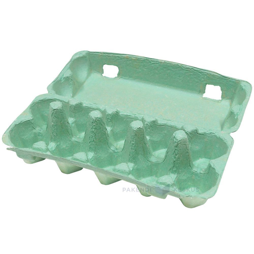
Green Egg Cartons

  • Shade range from pale sage through mid green to deep forest
  • Pigment blended into the slurry, so color survives scuffing and shipping
  • The shade most associated with organic, pasture raised, and free range lines
  • Forest green holds embossed detail sharply, close to navy performance
  • Compostable and plastic free, with no surface coating
  • Available across every cell count from 4 through 20
  • OEM and ODM sizing accepted; retained shade standards kept for reorders

Moule public

Solutions d'emballage

Conception en 3D

Moule personnalisé

Green egg cartons in molded pulp holding brown eggs with the lid open

Description du produit

Spécifications Détails
Nom de la marque BonitoPak
Numéro de modèle EC-GRN series
Nom du produit Green Egg Cartons / Green Pigmented Pulp Cartons
Matériau Recycled paper pulp with slurry-blended pigment
Technique Molded pulp forming (wet-pressed), wet end pigmentation
Cell Count 4, 6, 10, 12, 18, or 20 cells
Shade Range Pale sage, mid green, deep forest; custom shades matched
Color Method Pigment blended into slurry before forming, not surface coated
Lightfastness Good across the range; forest most stable
Print Contrast Strong with white on forest; black or cream on sage
Impression de logos Embossed, debossed, or flexographic print
Utilisation industrielle Organic producers, pasture raised brands, farm direct, specialty grocery
Application Organic and free range lines, farm brand identity, seasonal ranges
Avantages Biodegradable, home compostable, plastic free, no coating
Commande personnalisée Accepté
MOQ Confirm with sales; stock green carries a lower minimum than custom shades

Galerie de Green Egg Cartons pièces

Cette galerie présente la qualité exceptionnelle et l'attention portée aux détails que nous apportons à chaque projet. Des conceptions complexes aux finitions impeccables, chaque image reflète notre engagement en faveur de l'excellence dans les domaines suivants Green Egg Cartons .

40%

Gain de temps et d'argent

Faites l'expérience de solutions d'emballage de pointe qui optimisent vos coûts et votre temps, en fournissant des processus efficaces et en maximisant votre retour sur investissement.

50%

Plus durable

Réalisez des emballages respectueux de l'environnement avec des matériaux durables, en réduisant les déchets et en promouvant la responsabilité environnementale dans toutes vos gammes de produits.

25%

Augmentation des ventes

Améliorez l'attrait de votre produit en rayon grâce à des designs innovants qui augmentent la visibilité et les ventes sur les marchés de détail et en ligne.

100%

Plus fiable

Faites confiance à l'engagement de BonitoPak en matière de qualité, en vous assurant que chaque produit répond à nos normes élevées avec un service constant et fiable.

The shade that carries a meaning

Every carton color is a design decision. Green is the only one that is also a claim, and that creates both an opportunity and a compliance question.

Shoppers read green packaging as a signal about how the product was produced. In eggs specifically, it maps onto organic, free range, and pasture raised, because those are the categories the color has been used for across decades of food retail.

For a producer who genuinely holds those credentials, green does work that no other shade does. It communicates the positioning before the shopper reads a word, which is the whole point of packaging color.

For a producer who does not hold them, green risks implying a claim the product cannot support. Several jurisdictions treat implied environmental and welfare claims through packaging design as within the scope of advertising regulation, not outside it. The color alone is unlikely to trigger action, but green plus suggestive imagery plus vague wording has drawn attention in multiple markets.

Our advice is straightforward: use green if the claim is true and stated, and choose a different shade if it is not. We are not in a position to assess your certification, and we supply the carton either way, but the risk sits with the producer and it is worth naming.

Three shades and what each is for

Pale sage is muted and soft, closer to a gray-green than a bright one. It reads as understated and premium rather than as an environmental signal, which makes it the safest green for producers who want the tone without the implied claim. It also sits well against natural pulp in a mixed range.

Mid green is the clearest organic signal in the palette. It is what most buyers mean when they ask for green, and it is the shade that does the communicating work described above.

Deep forest behaves more like navy than like green. Strong emboss performance, good white print contrast, and a premium rather than natural reading. Heritage and estate brands use it more than organic producers do.

Shell color interaction

Green is the most forgiving shade in the range for shell color, which is a practical advantage for producers running mixed flocks.

Brown eggs against green is the combination most buyers picture, and it works because the two sit on opposite sides of the color wheel without clashing. It looks agricultural in the intended sense.

White eggs against forest green produce strong contrast and a clean, graphic result.

Blue and olive shells against sage produce a tonal effect similar to the pale blue option, since olive shells carry a green cast themselves. Producers with Olive Egger flocks often specify sage for exactly this.

There is no shell color that looks poor in a green carton, which cannot be said of pink or pale blue.

Print and emboss behavior

Forest green holds embossed detail nearly as well as navy, for the same reason: tonal depth lets the shadow stay dark at the edge of the mark.

Sage is light enough that embossing reads softly, and it needs a dark ink for printed contrast. Black on sage is clean. Cream or off-white on sage is a softer combination that heritage brands use.

Mid green sits in the same awkward middle that mid blue does, too dark for strong black contrast and too light for white to read cleanly. Buyers specifying mid green for its signal value should plan on a printed label or a bold single color design rather than relying on subtle emboss.

Green against the rest of a range

Green is the shade most often ordered as part of a two color system rather than alone, and the pairings that work are worth knowing.

Sage with natural pulp is the most common. The two sit close enough to read as a family, which lets a producer run an organic line and a standard line that look related rather than unrelated.

Forest with cream or white gives a stronger separation for producers who want their premium tier to be visibly distinct.

The pairing to avoid is mid green with sage, where the two are close enough that shoppers read them as the same product in inconsistent packaging rather than as two tiers.

Where green sells hardest

Organic and pasture raised retail is the obvious channel, and green is close to a default there.

Farmers markets are the second, where green reads as agricultural and sits comfortably against produce on an adjacent stall.

Specialty grocery uses sage and forest for premium lines, where the understated end of the range signals quality rather than category.

The channel where green works least is commodity retail, where it competes against established national brands that already own the color in the shopper’s memory.

Pairing with format

Green works across the whole range. For organic lines the molded pulp dozen egg carton is the volume anchor, with the molded pulp 6 egg carton for premium and smaller packs.

Sage on molded pulp vintage egg cartons is one of the most requested combinations we run, since the muted shade and the retro profile reinforce each other for farm direct sellers.

For the full pigment and shade control detail see molded pulp colored egg cartons, and for print specifications see boîtes à œufs personnalisées.

The shade that carries a meaning

Every carton color is a design decision. Green is the only one that is also a claim, and that creates both an opportunity and a compliance question.

Shoppers read green packaging as a signal about how the product was produced. In eggs specifically, it maps onto organic, free range, and pasture raised, because those are the categories the color has been used for across decades of food retail.

For a producer who genuinely holds those credentials, green does work that no other shade does. It communicates the positioning before the shopper reads a word, which is the whole point of packaging color.

For a producer who does not hold them, green risks implying a claim the product cannot support. Several jurisdictions treat implied environmental and welfare claims through packaging design as within the scope of advertising regulation, not outside it. The color alone is unlikely to trigger action, but green plus suggestive imagery plus vague wording has drawn attention in multiple markets.

Our advice is straightforward: use green if the claim is true and stated, and choose a different shade if it is not. We are not in a position to assess your certification, and we supply the carton either way, but the risk sits with the producer and it is worth naming.

Three shades and what each is for

Pale sage is muted and soft, closer to a gray-green than a bright one. It reads as understated and premium rather than as an environmental signal, which makes it the safest green for producers who want the tone without the implied claim. It also sits well against natural pulp in a mixed range.

Mid green is the clearest organic signal in the palette. It is what most buyers mean when they ask for green, and it is the shade that does the communicating work described above.

Deep forest behaves more like navy than like green. Strong emboss performance, good white print contrast, and a premium rather than natural reading. Heritage and estate brands use it more than organic producers do.

Shell color interaction

Green is the most forgiving shade in the range for shell color, which is a practical advantage for producers running mixed flocks.

Brown eggs against green is the combination most buyers picture, and it works because the two sit on opposite sides of the color wheel without clashing. It looks agricultural in the intended sense.

White eggs against forest green produce strong contrast and a clean, graphic result.

Blue and olive shells against sage produce a tonal effect similar to the pale blue option, since olive shells carry a green cast themselves. Producers with Olive Egger flocks often specify sage for exactly this.

There is no shell color that looks poor in a green carton, which cannot be said of pink or pale blue.

Print and emboss behavior

Forest green holds embossed detail nearly as well as navy, for the same reason: tonal depth lets the shadow stay dark at the edge of the mark.

Sage is light enough that embossing reads softly, and it needs a dark ink for printed contrast. Black on sage is clean. Cream or off-white on sage is a softer combination that heritage brands use.

Mid green sits in the same awkward middle that mid blue does, too dark for strong black contrast and too light for white to read cleanly. Buyers specifying mid green for its signal value should plan on a printed label or a bold single color design rather than relying on subtle emboss.

Green against the rest of a range

Green is the shade most often ordered as part of a two color system rather than alone, and the pairings that work are worth knowing.

Sage with natural pulp is the most common. The two sit close enough to read as a family, which lets a producer run an organic line and a standard line that look related rather than unrelated.

Forest with cream or white gives a stronger separation for producers who want their premium tier to be visibly distinct.

The pairing to avoid is mid green with sage, where the two are close enough that shoppers read them as the same product in inconsistent packaging rather than as two tiers.

Where green sells hardest

Organic and pasture raised retail is the obvious channel, and green is close to a default there.

Farmers markets are the second, where green reads as agricultural and sits comfortably against produce on an adjacent stall.

Specialty grocery uses sage and forest for premium lines, where the understated end of the range signals quality rather than category.

The channel where green works least is commodity retail, where it competes against established national brands that already own the color in the shopper’s memory.

Pairing with format

Green works across the whole range. For organic lines the molded pulp dozen egg carton is the volume anchor, with the molded pulp 6 egg carton for premium and smaller packs.

Sage on molded pulp vintage egg cartons is one of the most requested combinations we run, since the muted shade and the retro profile reinforce each other for farm direct sellers.

For the full pigment and shade control detail see molded pulp colored egg cartons, and for print specifications see boîtes à œufs personnalisées.

Matériaux pour Green Egg Cartons Pièces détachées

Des entreprises et des ingénieurs de premier plan font confiance à BonitoPak pour des itérations rapides et des pièces durables et de haute qualité. Qu'il s'agisse de prototypage ou de production à grande échelle, notre large gamme de matériaux nous permet de répondre aux exigences uniques de n'importe quelle entreprise. Green Egg Cartons avec précision et rapidité.

Compostable kraft paper is the strongest fiber we form. Made from virgin

Colored pulp is not a separate fiber. It is any of our

Bleached pulp is the material to specify when the part has to

Natural plant fiber covers the non-wood cellulose sources we blend outside the

Corrugated paper as a molded pulp material means recovered cardboard boxes repulped

Straw fiber is made from the stalks left after grain harvest, material

Personnalisé Écologique Fiable

Excellence en matière d'emballage personnalisé et respectueux de l'environnement

Entièrement personnalisable

Personnalisez votre emballage avec des styles, des tailles, des couleurs et des finitions sur mesure pour répondre à des besoins spécifiques.

Soutien des experts

Bonitopak fournit des conseils experts en matière de conception et de logistique afin de maximiser l'efficacité de l'emballage et d'augmenter le retour sur investissement.

Solutions écologiques

Choisissez des emballages durables et écologiques pour réduire l'impact sur l'environnement et soutenir les objectifs écologiques de votre marque.

Assurance qualité

Bonitopak garantit un service de qualité supérieure et l'excellence du produit pour chaque solution d'emballage.

Questions fréquemment posées

Green Egg Cartons

  • Is green available in the vintage flat top profile?

    Yes, and sage in particular is one of the combinations we run most often. The muted shade suits the period profile better than a bright green does, since mid century cartons were produced in natural fiber tones rather than saturated colors.

  • Can you match the green used by a specific brand?

    We match to a Pantone reference or a physical sample as closely as pigmented fiber allows, and we send a formed sample for approval before production. Exact ink matching is not achievable in pulp. If the reference is a competitor’s carton rather than a printed standard, send us the physical carton and we will match against it directly.

  • Will green fade faster than other shades?

     It sits better than blue and worse than black. Green pigments rated for compostable use have moderate lightfastness, so forest holds up well and sage shows lightening soonest under sustained direct sun. In refrigerated retail none of the range is affected.

  • Which green do most organic producers choose?

     Mid green, because it is the shade that carries the category signal most clearly. Producers positioning above the category on quality rather than on method more often choose sage or forest, which read as premium rather than as organic.

  • Does a green carton help an organic certification claim?

    No. Certification is granted on production practice and audited independently, and packaging color has no bearing on it. What green does is communicate a claim you already hold more quickly at the shelf. The certification mark itself still has to appear on the pack according to your certifier’s rules.

Biodégradable Résultat

0 jours

7 jours

14 jours

30 jours

Industries spécialisées

Ayant produit des millions de pièces, BonitoPak possède une connaissance approfondie de nombreuses applications. Nous excellons particulièrement dans les industries qui exigent la fabrication de composants précis et complexes. Faites-nous confiance pour vous apporter expertise et qualité, quelle que soit la complexité.

Solutions d'emballage OEM et ODM

Bonitopak propose des solutions d'emballage sur mesure (OEM) et préconçues (ODM). Que vous ayez besoin d'un design entièrement personnalisé ou d'un emballage prêt à l'emploi, nous vous proposons des options de haute qualité, efficaces et flexibles pour répondre aux besoins de votre marque.

Services OEM

Les solutions d'emballage OEM vous permettent de créer des produits entièrement personnalisés, conçus et fabriqués pour répondre à vos besoins spécifiques. Chez Bonitopak, nous offrons un soutien complet tout au long du processus de conception, de prototypage et de fabrication, afin que votre emballage reflète l'identité unique de votre marque. Nos capacités de fabrication de précision garantissent une production de haute qualité et cohérente, quelle que soit la complexité de la conception. Avec un service complet, nous nous occupons de tout, de la conception à la livraison, pour vous aider à rationaliser vos besoins en matière d'emballage.

Services ODM

Les solutions d'emballage ODM offrent des produits préconçus qui peuvent être adaptés aux exigences de votre marque. Grâce à l'expertise de Bonitopak en matière de conception innovante et à son processus de production efficace, vous pouvez choisir parmi une large gamme d'options d'emballage prêtes à l'emploi. Nous offrons une personnalisation flexible, vous permettant d'ajouter votre marque et de choisir parmi différentes finitions, couleurs et tailles. Cette solution permet d'économiser du temps et de l'argent tout en garantissant un emballage de haute qualité qui répond aux normes de votre marque.
Prêt à élever votre projet ?

Donnez vie à vos dessins avec BonitoPak

Faites l'expérience de l'ingénierie de précision avec BonitoPak. Des prototypes détaillés à la production en grande quantité, nous sommes là pour transformer vos concepts en réalité. Contactez-nous dès aujourd'hui pour discuter des besoins de votre projet !

Nos catégories de produits

Découvrez la gamme diversifiée de solutions d'emballage de Bonitopak, y compris les plateaux de pulpe moulée, les emballages alimentaires, les conceptions personnalisées et les options durables. Chaque catégorie est conçue dans un souci de durabilité, de fonctionnalité et de responsabilité environnementale, afin de répondre à vos besoins spécifiques.

The shade that carries a meaning

Every carton color is a design decision. Green is the only one that is also a claim, and that creates both an opportunity and a compliance question.

Shoppers read green packaging as a signal about how the product was produced. In eggs specifically, it maps onto organic, free range, and pasture raised, because those are the categories the color has been used for across decades of food retail.

For a producer who genuinely holds those credentials, green does work that no other shade does. It communicates the positioning before the shopper reads a word, which is the whole point of packaging color.

For a producer who does not hold them, green risks implying a claim the product cannot support. Several jurisdictions treat implied environmental and welfare claims through packaging design as within the scope of advertising regulation, not outside it. The color alone is unlikely to trigger action, but green plus suggestive imagery plus vague wording has drawn attention in multiple markets.

Our advice is straightforward: use green if the claim is true and stated, and choose a different shade if it is not. We are not in a position to assess your certification, and we supply the carton either way, but the risk sits with the producer and it is worth naming.

Three shades and what each is for

Pale sage is muted and soft, closer to a gray-green than a bright one. It reads as understated and premium rather than as an environmental signal, which makes it the safest green for producers who want the tone without the implied claim. It also sits well against natural pulp in a mixed range.

Mid green is the clearest organic signal in the palette. It is what most buyers mean when they ask for green, and it is the shade that does the communicating work described above.

Deep forest behaves more like navy than like green. Strong emboss performance, good white print contrast, and a premium rather than natural reading. Heritage and estate brands use it more than organic producers do.

Shell color interaction

Green is the most forgiving shade in the range for shell color, which is a practical advantage for producers running mixed flocks.

Brown eggs against green is the combination most buyers picture, and it works because the two sit on opposite sides of the color wheel without clashing. It looks agricultural in the intended sense.

White eggs against forest green produce strong contrast and a clean, graphic result.

Blue and olive shells against sage produce a tonal effect similar to the pale blue option, since olive shells carry a green cast themselves. Producers with Olive Egger flocks often specify sage for exactly this.

There is no shell color that looks poor in a green carton, which cannot be said of pink or pale blue.

Print and emboss behavior

Forest green holds embossed detail nearly as well as navy, for the same reason: tonal depth lets the shadow stay dark at the edge of the mark.

Sage is light enough that embossing reads softly, and it needs a dark ink for printed contrast. Black on sage is clean. Cream or off-white on sage is a softer combination that heritage brands use.

Mid green sits in the same awkward middle that mid blue does, too dark for strong black contrast and too light for white to read cleanly. Buyers specifying mid green for its signal value should plan on a printed label or a bold single color design rather than relying on subtle emboss.

Green against the rest of a range

Green is the shade most often ordered as part of a two color system rather than alone, and the pairings that work are worth knowing.

Sage with natural pulp is the most common. The two sit close enough to read as a family, which lets a producer run an organic line and a standard line that look related rather than unrelated.

Forest with cream or white gives a stronger separation for producers who want their premium tier to be visibly distinct.

The pairing to avoid is mid green with sage, where the two are close enough that shoppers read them as the same product in inconsistent packaging rather than as two tiers.

Where green sells hardest

Organic and pasture raised retail is the obvious channel, and green is close to a default there.

Farmers markets are the second, where green reads as agricultural and sits comfortably against produce on an adjacent stall.

Specialty grocery uses sage and forest for premium lines, where the understated end of the range signals quality rather than category.

The channel where green works least is commodity retail, where it competes against established national brands that already own the color in the shopper’s memory.

Pairing with format

Green works across the whole range. For organic lines the molded pulp dozen egg carton is the volume anchor, with the molded pulp 6 egg carton for premium and smaller packs.

Sage on molded pulp vintage egg cartons is one of the most requested combinations we run, since the muted shade and the retro profile reinforce each other for farm direct sellers.

For the full pigment and shade control detail see molded pulp colored egg cartons, and for print specifications see boîtes à œufs personnalisées.

Articles et réflexions connexes

Restez informé des dernières mises à jour sur les tendances en matière d'emballage durable, les perspectives du secteur et les conseils d'experts grâce à notre blog. Explorez des idées et des solutions innovantes pour améliorer vos connaissances en matière d'emballage.

Par Leo Chan | Rédacteur, BonitoPak | Plus de 20 ans d'expérience dans le domaine des emballages en pâte moulée. La vodka, c'est

Par Leo Chan | Rédacteur, BonitoPak | Plus de 20 ans d'expérience dans le domaine des emballages en pâte moulée Presque tous les

Par Leo Chan | Rédacteur, BonitoPak | Plus de 20 ans d'expérience dans le domaine des emballages en pâte moulée Rechercher ceci

Questions fréquemment posées

Green Egg Cartons

  • Is green available in the vintage flat top profile?

    Yes, and sage in particular is one of the combinations we run most often. The muted shade suits the period profile better than a bright green does, since mid century cartons were produced in natural fiber tones rather than saturated colors.

  • Can you match the green used by a specific brand?

    We match to a Pantone reference or a physical sample as closely as pigmented fiber allows, and we send a formed sample for approval before production. Exact ink matching is not achievable in pulp. If the reference is a competitor’s carton rather than a printed standard, send us the physical carton and we will match against it directly.

  • Will green fade faster than other shades?

     It sits better than blue and worse than black. Green pigments rated for compostable use have moderate lightfastness, so forest holds up well and sage shows lightening soonest under sustained direct sun. In refrigerated retail none of the range is affected.

  • Which green do most organic producers choose?

     Mid green, because it is the shade that carries the category signal most clearly. Producers positioning above the category on quality rather than on method more often choose sage or forest, which read as premium rather than as organic.

  • Does a green carton help an organic certification claim?

    No. Certification is granted on production practice and audited independently, and packaging color has no bearing on it. What green does is communicate a claim you already hold more quickly at the shelf. The certification mark itself still has to appear on the pack according to your certifier’s rules.

Remplir ce formulaire détaillé