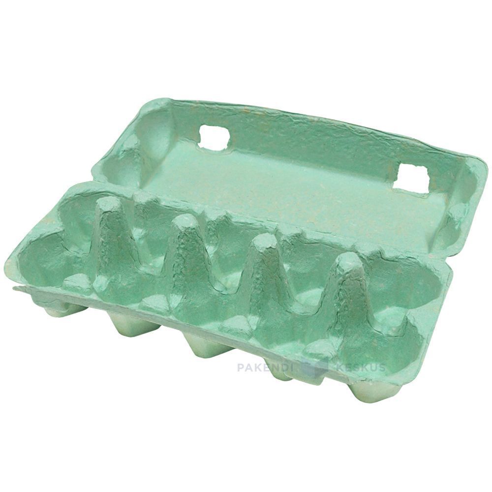
Green Egg Cartons

  • Shade range from pale sage through mid green to deep forest
  • Pigment blended into the slurry, so color survives scuffing and shipping
  • The shade most associated with organic, pasture raised, and free range lines
  • Forest green holds embossed detail sharply, close to navy performance
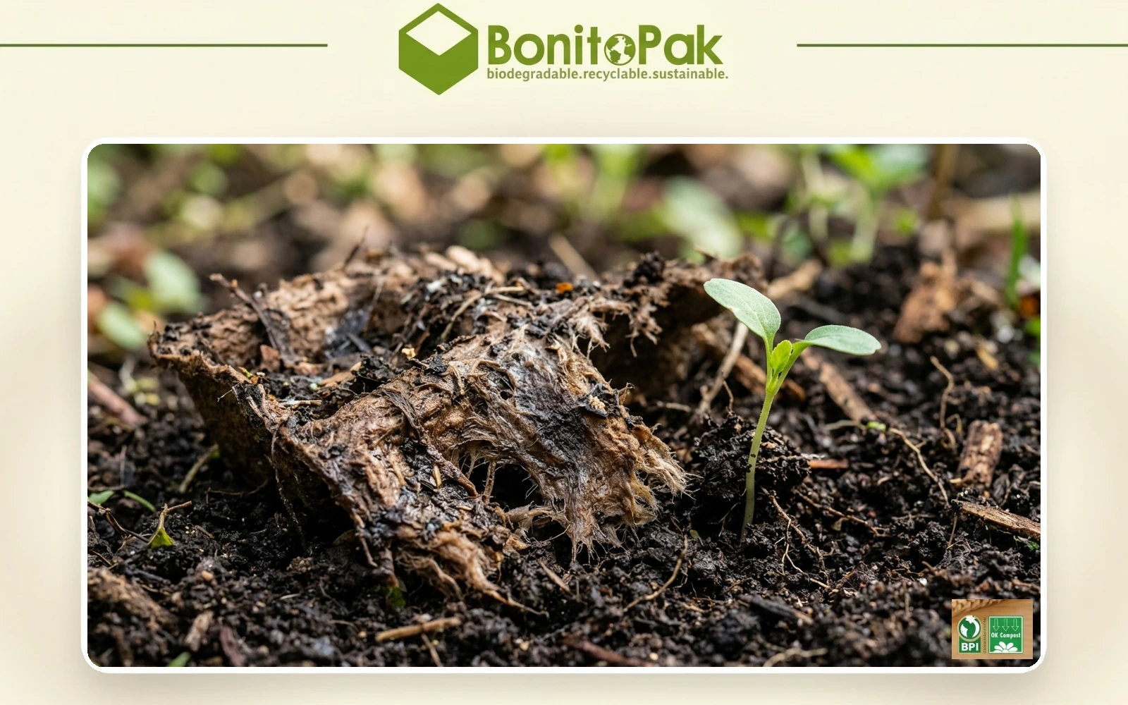
  • Compostable and plastic free, with no surface coating
  • Disponível em todas as faixas de contagem de células, de 4 a 20
  • OEM and ODM sizing accepted; retained shade standards kept for reorders

Molde público

Soluções de embalagem

Design 3D

Molde personalizado

Green egg cartons in molded pulp holding brown eggs with the lid open

Descrição do produto

Especificação Detalhes
Nome da marca BonitoPak
Número do modelo EC-GRN series
Nome do produto Green Egg Cartons / Green Pigmented Pulp Cartons
Material Polpa de papel reciclada com pigmento incorporado em pasta líquida
Técnica Moldagem de polpa (prensagem úmida), pigmentação na fase úmida
Contagem de células 4, 6, 10, 12, 18, or 20 cells
Shade Range Pale sage, mid green, deep forest; custom shades matched
Método de cor O pigmento é incorporado à pasta antes da moldagem, e não aplicado como revestimento superficial
Lightfastness Good across the range; forest most stable
Print Contrast Strong with white on forest; black or cream on sage
Impressão do logotipo Estampagem em relevo, em baixo-relevo ou flexográfica
Uso industrial Organic producers, pasture raised brands, farm direct, specialty grocery
Aplicativo Organic and free range lines, farm brand identity, seasonal ranges
Vantagens Biodegradável, compostável em casa, sem plástico, sem revestimento
Pedido personalizado Aceito
MOQ Confirm with sales; stock green carries a lower minimum than custom shades

Galeria de Green Egg Cartons peças

Esta galeria mostra a qualidade excepcional e a atenção aos detalhes que oferecemos em cada projeto. De designs complexos a acabamentos impecáveis, cada imagem reflete nosso compromisso com a excelência em Green Egg Cartons .

40%

Economia de tempo e custo

Experimente as principais soluções de embalagem que otimizam seus custos e tempo, proporcionando processos eficientes e maximizando seu ROI.

50%

Mais sustentável

Obtenha embalagens ecologicamente corretas com materiais sustentáveis, reduzindo o desperdício e promovendo a responsabilidade ambiental em todas as suas linhas de produtos.

25%

Aumento nas vendas

Aumente o apelo do seu produto nas prateleiras com designs inovadores que aumentam a visibilidade e as vendas nos mercados de varejo e on-line.

100%

Mais confiável

Confie no compromisso da BonitoPak com a qualidade, garantindo que cada produto atenda aos nossos altos padrões com um serviço consistente e confiável.

The shade that carries a meaning

Every carton color is a design decision. Green is the only one that is also a claim, and that creates both an opportunity and a compliance question.

Shoppers read green packaging as a signal about how the product was produced. In eggs specifically, it maps onto organic, free range, and pasture raised, because those are the categories the color has been used for across decades of food retail.

For a producer who genuinely holds those credentials, green does work that no other shade does. It communicates the positioning before the shopper reads a word, which is the whole point of packaging color.

For a producer who does not hold them, green risks implying a claim the product cannot support. Several jurisdictions treat implied environmental and welfare claims through packaging design as within the scope of advertising regulation, not outside it. The color alone is unlikely to trigger action, but green plus suggestive imagery plus vague wording has drawn attention in multiple markets.

Our advice is straightforward: use green if the claim is true and stated, and choose a different shade if it is not. We are not in a position to assess your certification, and we supply the carton either way, but the risk sits with the producer and it is worth naming.

Three shades and what each is for

Pale sage is muted and soft, closer to a gray-green than a bright one. It reads as understated and premium rather than as an environmental signal, which makes it the safest green for producers who want the tone without the implied claim. It also sits well against natural pulp in a mixed range.

Mid green is the clearest organic signal in the palette. It is what most buyers mean when they ask for green, and it is the shade that does the communicating work described above.

Deep forest behaves more like navy than like green. Strong emboss performance, good white print contrast, and a premium rather than natural reading. Heritage and estate brands use it more than organic producers do.

Shell color interaction

Green is the most forgiving shade in the range for shell color, which is a practical advantage for producers running mixed flocks.

Brown eggs against green is the combination most buyers picture, and it works because the two sit on opposite sides of the color wheel without clashing. It looks agricultural in the intended sense.

White eggs against forest green produce strong contrast and a clean, graphic result.

Blue and olive shells against sage produce a tonal effect similar to the pale blue option, since olive shells carry a green cast themselves. Producers with Olive Egger flocks often specify sage for exactly this.

There is no shell color that looks poor in a green carton, which cannot be said of pink or pale blue.

Print and emboss behavior

Forest green holds embossed detail nearly as well as navy, for the same reason: tonal depth lets the shadow stay dark at the edge of the mark.

Sage is light enough that embossing reads softly, and it needs a dark ink for printed contrast. Black on sage is clean. Cream or off-white on sage is a softer combination that heritage brands use.

Mid green sits in the same awkward middle that mid blue does, too dark for strong black contrast and too light for white to read cleanly. Buyers specifying mid green for its signal value should plan on a printed label or a bold single color design rather than relying on subtle emboss.

Green against the rest of a range

Green is the shade most often ordered as part of a two color system rather than alone, and the pairings that work are worth knowing.

Sage with natural pulp is the most common. The two sit close enough to read as a family, which lets a producer run an organic line and a standard line that look related rather than unrelated.

Forest with cream or white gives a stronger separation for producers who want their premium tier to be visibly distinct.

The pairing to avoid is mid green with sage, where the two are close enough that shoppers read them as the same product in inconsistent packaging rather than as two tiers.

Where green sells hardest

Organic and pasture raised retail is the obvious channel, and green is close to a default there.

Farmers markets are the second, where green reads as agricultural and sits comfortably against produce on an adjacent stall.

Specialty grocery uses sage and forest for premium lines, where the understated end of the range signals quality rather than category.

The channel where green works least is commodity retail, where it competes against established national brands that already own the color in the shopper’s memory.

Pairing with format

Green works across the whole range. For organic lines the molded pulp dozen egg carton is the volume anchor, with the molded pulp 6 egg carton for premium and smaller packs.

Sage on molded pulp vintage egg cartons is one of the most requested combinations we run, since the muted shade and the retro profile reinforce each other for farm direct sellers.

For the full pigment and shade control detail see molded pulp colored egg cartons, and for print specifications see custom printed egg cartons.

The shade that carries a meaning

Every carton color is a design decision. Green is the only one that is also a claim, and that creates both an opportunity and a compliance question.

Shoppers read green packaging as a signal about how the product was produced. In eggs specifically, it maps onto organic, free range, and pasture raised, because those are the categories the color has been used for across decades of food retail.

For a producer who genuinely holds those credentials, green does work that no other shade does. It communicates the positioning before the shopper reads a word, which is the whole point of packaging color.

For a producer who does not hold them, green risks implying a claim the product cannot support. Several jurisdictions treat implied environmental and welfare claims through packaging design as within the scope of advertising regulation, not outside it. The color alone is unlikely to trigger action, but green plus suggestive imagery plus vague wording has drawn attention in multiple markets.

Our advice is straightforward: use green if the claim is true and stated, and choose a different shade if it is not. We are not in a position to assess your certification, and we supply the carton either way, but the risk sits with the producer and it is worth naming.

Three shades and what each is for

Pale sage is muted and soft, closer to a gray-green than a bright one. It reads as understated and premium rather than as an environmental signal, which makes it the safest green for producers who want the tone without the implied claim. It also sits well against natural pulp in a mixed range.

Mid green is the clearest organic signal in the palette. It is what most buyers mean when they ask for green, and it is the shade that does the communicating work described above.

Deep forest behaves more like navy than like green. Strong emboss performance, good white print contrast, and a premium rather than natural reading. Heritage and estate brands use it more than organic producers do.

Shell color interaction

Green is the most forgiving shade in the range for shell color, which is a practical advantage for producers running mixed flocks.

Brown eggs against green is the combination most buyers picture, and it works because the two sit on opposite sides of the color wheel without clashing. It looks agricultural in the intended sense.

White eggs against forest green produce strong contrast and a clean, graphic result.

Blue and olive shells against sage produce a tonal effect similar to the pale blue option, since olive shells carry a green cast themselves. Producers with Olive Egger flocks often specify sage for exactly this.

There is no shell color that looks poor in a green carton, which cannot be said of pink or pale blue.

Print and emboss behavior

Forest green holds embossed detail nearly as well as navy, for the same reason: tonal depth lets the shadow stay dark at the edge of the mark.

Sage is light enough that embossing reads softly, and it needs a dark ink for printed contrast. Black on sage is clean. Cream or off-white on sage is a softer combination that heritage brands use.

Mid green sits in the same awkward middle that mid blue does, too dark for strong black contrast and too light for white to read cleanly. Buyers specifying mid green for its signal value should plan on a printed label or a bold single color design rather than relying on subtle emboss.

Green against the rest of a range

Green is the shade most often ordered as part of a two color system rather than alone, and the pairings that work are worth knowing.

Sage with natural pulp is the most common. The two sit close enough to read as a family, which lets a producer run an organic line and a standard line that look related rather than unrelated.

Forest with cream or white gives a stronger separation for producers who want their premium tier to be visibly distinct.

The pairing to avoid is mid green with sage, where the two are close enough that shoppers read them as the same product in inconsistent packaging rather than as two tiers.

Where green sells hardest

Organic and pasture raised retail is the obvious channel, and green is close to a default there.

Farmers markets are the second, where green reads as agricultural and sits comfortably against produce on an adjacent stall.

Specialty grocery uses sage and forest for premium lines, where the understated end of the range signals quality rather than category.

The channel where green works least is commodity retail, where it competes against established national brands that already own the color in the shopper’s memory.

Pairing with format

Green works across the whole range. For organic lines the molded pulp dozen egg carton is the volume anchor, with the molded pulp 6 egg carton for premium and smaller packs.

Sage on molded pulp vintage egg cartons is one of the most requested combinations we run, since the muted shade and the retro profile reinforce each other for farm direct sellers.

For the full pigment and shade control detail see molded pulp colored egg cartons, and for print specifications see custom printed egg cartons.

Materiais para Green Egg Cartons Peças

Empresas e engenheiros líderes confiam no BonitoPak para iterações rápidas e peças duráveis e de alta qualidade. Seja para prototipagem ou produção em escala real, nossa ampla gama de materiais garante que atendamos aos requisitos exclusivos de qualquer Green Egg Cartons projeto com precisão e rapidez.

Compostable kraft paper is the strongest fiber we form. Made from virgin

Colored pulp is not a separate fiber. It is any of our

Bleached pulp is the material to specify when the part has to

Natural plant fiber covers the non-wood cellulose sources we blend outside the

Corrugated paper as a molded pulp material means recovered cardboard boxes repulped

Straw fiber is made from the stalks left after grain harvest, material

Personalizado, ecológico e confiável

Excelência em embalagens personalizadas e ecologicamente corretas

Totalmente personalizável

Personalize sua embalagem com estilos, tamanhos, cores e acabamentos sob medida para atender a necessidades específicas.

Suporte especializado

A Bonitopak oferece consultoria especializada em design e logística para maximizar a eficiência da embalagem e aumentar o ROI.

Soluções ecológicas

Escolha embalagens sustentáveis e ecologicamente corretas para reduzir o impacto ambiental e apoiar as metas ecológicas de sua marca.

Garantia de qualidade

A Bonitopak garante serviço de alta qualidade e excelência de produto em cada solução de embalagem.

Perguntas frequentes (FAQ)

Green Egg Cartons

  • Is green available in the vintage flat top profile?

    Yes, and sage in particular is one of the combinations we run most often. The muted shade suits the period profile better than a bright green does, since mid century cartons were produced in natural fiber tones rather than saturated colors.

  • Can you match the green used by a specific brand?

    We match to a Pantone reference or a physical sample as closely as pigmented fiber allows, and we send a formed sample for approval before production. Exact ink matching is not achievable in pulp. If the reference is a competitor’s carton rather than a printed standard, send us the physical carton and we will match against it directly.

  • Will green fade faster than other shades?

     It sits better than blue and worse than black. Green pigments rated for compostable use have moderate lightfastness, so forest holds up well and sage shows lightening soonest under sustained direct sun. In refrigerated retail none of the range is affected.

  • Which green do most organic producers choose?

     Mid green, because it is the shade that carries the category signal most clearly. Producers positioning above the category on quality rather than on method more often choose sage or forest, which read as premium rather than as organic.

  • Does a green carton help an organic certification claim?

    No. Certification is granted on production practice and audited independently, and packaging color has no bearing on it. What green does is communicate a claim you already hold more quickly at the shelf. The certification mark itself still has to appear on the pack according to your certifier’s rules.

Resultado biodegradável

0 dias

7 dias

14 dias

30 dias

Setores especializados

Tendo produzido milhões de peças, a BonitoPak possui profundo conhecimento em diversas aplicações. Nós nos destacamos especialmente em setores que exigem a fabricação de componentes precisos e intrincados. Confie em nós para oferecer experiência e qualidade, independentemente da complexidade.

Soluções de embalagem OEM e ODM

A Bonitopak oferece soluções de embalagem personalizadas (OEM) e pré-projetadas (ODM). Independentemente de você precisar de designs totalmente personalizados ou de embalagens prontas para uso, fornecemos opções de alta qualidade, eficientes e flexíveis para atender às necessidades da sua marca.

Serviços OEM

As soluções de embalagem OEM permitem que você crie produtos totalmente personalizados, projetados e fabricados para atender às suas necessidades específicas. Na Bonitopak, oferecemos suporte abrangente durante todo o processo de design, prototipagem e fabricação, garantindo que sua embalagem reflita a identidade exclusiva de sua marca. Nossos recursos de fabricação de precisão garantem uma produção consistente e de alta qualidade, independentemente da complexidade do projeto. Com serviço de ponta a ponta, cuidamos de tudo, desde o conceito até a entrega, ajudando-o a otimizar suas necessidades de embalagem.

Serviços ODM

As soluções de embalagem ODM oferecem produtos pré-projetados que podem ser adaptados aos requisitos de sua marca. Com a experiência em design inovador e o processo de produção eficiente da Bonitopak, você pode escolher entre uma ampla gama de opções de embalagens prontas para uso. Oferecemos personalização flexível, permitindo que você adicione sua marca e selecione entre vários acabamentos, cores e tamanhos. Essa solução economiza tempo e custos e, ao mesmo tempo, garante embalagens de alta qualidade que atendem aos padrões de sua marca.
Pronto para elevar seu projeto?

Dê vida aos seus projetos com o BonitoPak

Experimente a engenharia de precisão com a BonitoPak. De protótipos detalhados à produção de alto volume, estamos aqui para transformar seus conceitos em realidade. Entre em contato conosco hoje mesmo para discutir as necessidades do seu projeto!

Nossas categorias de produtos

Descubra a gama diversificada de soluções de embalagem da Bonitopak, incluindo bandejas de polpa moldada, embalagens para alimentos, designs personalizados e opções sustentáveis. Cada categoria é criada para oferecer durabilidade, funcionalidade e responsabilidade ambiental, adaptada para atender às suas necessidades específicas.

The shade that carries a meaning

Every carton color is a design decision. Green is the only one that is also a claim, and that creates both an opportunity and a compliance question.

Shoppers read green packaging as a signal about how the product was produced. In eggs specifically, it maps onto organic, free range, and pasture raised, because those are the categories the color has been used for across decades of food retail.

For a producer who genuinely holds those credentials, green does work that no other shade does. It communicates the positioning before the shopper reads a word, which is the whole point of packaging color.

For a producer who does not hold them, green risks implying a claim the product cannot support. Several jurisdictions treat implied environmental and welfare claims through packaging design as within the scope of advertising regulation, not outside it. The color alone is unlikely to trigger action, but green plus suggestive imagery plus vague wording has drawn attention in multiple markets.

Our advice is straightforward: use green if the claim is true and stated, and choose a different shade if it is not. We are not in a position to assess your certification, and we supply the carton either way, but the risk sits with the producer and it is worth naming.

Three shades and what each is for

Pale sage is muted and soft, closer to a gray-green than a bright one. It reads as understated and premium rather than as an environmental signal, which makes it the safest green for producers who want the tone without the implied claim. It also sits well against natural pulp in a mixed range.

Mid green is the clearest organic signal in the palette. It is what most buyers mean when they ask for green, and it is the shade that does the communicating work described above.

Deep forest behaves more like navy than like green. Strong emboss performance, good white print contrast, and a premium rather than natural reading. Heritage and estate brands use it more than organic producers do.

Shell color interaction

Green is the most forgiving shade in the range for shell color, which is a practical advantage for producers running mixed flocks.

Brown eggs against green is the combination most buyers picture, and it works because the two sit on opposite sides of the color wheel without clashing. It looks agricultural in the intended sense.

White eggs against forest green produce strong contrast and a clean, graphic result.

Blue and olive shells against sage produce a tonal effect similar to the pale blue option, since olive shells carry a green cast themselves. Producers with Olive Egger flocks often specify sage for exactly this.

There is no shell color that looks poor in a green carton, which cannot be said of pink or pale blue.

Print and emboss behavior

Forest green holds embossed detail nearly as well as navy, for the same reason: tonal depth lets the shadow stay dark at the edge of the mark.

Sage is light enough that embossing reads softly, and it needs a dark ink for printed contrast. Black on sage is clean. Cream or off-white on sage is a softer combination that heritage brands use.

Mid green sits in the same awkward middle that mid blue does, too dark for strong black contrast and too light for white to read cleanly. Buyers specifying mid green for its signal value should plan on a printed label or a bold single color design rather than relying on subtle emboss.

Green against the rest of a range

Green is the shade most often ordered as part of a two color system rather than alone, and the pairings that work are worth knowing.

Sage with natural pulp is the most common. The two sit close enough to read as a family, which lets a producer run an organic line and a standard line that look related rather than unrelated.

Forest with cream or white gives a stronger separation for producers who want their premium tier to be visibly distinct.

The pairing to avoid is mid green with sage, where the two are close enough that shoppers read them as the same product in inconsistent packaging rather than as two tiers.

Where green sells hardest

Organic and pasture raised retail is the obvious channel, and green is close to a default there.

Farmers markets are the second, where green reads as agricultural and sits comfortably against produce on an adjacent stall.

Specialty grocery uses sage and forest for premium lines, where the understated end of the range signals quality rather than category.

The channel where green works least is commodity retail, where it competes against established national brands that already own the color in the shopper’s memory.

Pairing with format

Green works across the whole range. For organic lines the molded pulp dozen egg carton is the volume anchor, with the molded pulp 6 egg carton for premium and smaller packs.

Sage on molded pulp vintage egg cartons is one of the most requested combinations we run, since the muted shade and the retro profile reinforce each other for farm direct sellers.

For the full pigment and shade control detail see molded pulp colored egg cartons, and for print specifications see custom printed egg cartons.

Artigos e insights relacionados

Mantenha-se informado com as últimas atualizações sobre tendências de embalagens sustentáveis, percepções do setor e dicas de especialistas em nosso blog. Explore ideias e soluções inovadoras para aprimorar seu conhecimento sobre embalagens.

Por Leo Chan | Redator, BonitoPak | Mais de 20 anos na área de embalagens de polpa moldada. A vodca é

Por Leo Chan | Redator, BonitoPak | Mais de 20 anos na área de embalagens de polpa moldada Quase todas as

Por Leo Chan | Redator, BonitoPak | Mais de 20 anos na área de embalagens de polpa moldada Pesquisar isto

Perguntas frequentes (FAQ)

Green Egg Cartons

  • Is green available in the vintage flat top profile?

    Yes, and sage in particular is one of the combinations we run most often. The muted shade suits the period profile better than a bright green does, since mid century cartons were produced in natural fiber tones rather than saturated colors.

  • Can you match the green used by a specific brand?

    We match to a Pantone reference or a physical sample as closely as pigmented fiber allows, and we send a formed sample for approval before production. Exact ink matching is not achievable in pulp. If the reference is a competitor’s carton rather than a printed standard, send us the physical carton and we will match against it directly.

  • Will green fade faster than other shades?

     It sits better than blue and worse than black. Green pigments rated for compostable use have moderate lightfastness, so forest holds up well and sage shows lightening soonest under sustained direct sun. In refrigerated retail none of the range is affected.

  • Which green do most organic producers choose?

     Mid green, because it is the shade that carries the category signal most clearly. Producers positioning above the category on quality rather than on method more often choose sage or forest, which read as premium rather than as organic.

  • Does a green carton help an organic certification claim?

    No. Certification is granted on production practice and audited independently, and packaging color has no bearing on it. What green does is communicate a claim you already hold more quickly at the shelf. The certification mark itself still has to appear on the pack according to your certifier’s rules.

Preencha este formulário detalhado