Every carton color is a design decision. Green is the only one that is also a claim, and that creates both an opportunity and a compliance question.
Shoppers read green packaging as a signal about how the product was produced. In eggs specifically, it maps onto organic, free range, and pasture raised, because those are the categories the color has been used for across decades of food retail.
For a producer who genuinely holds those credentials, green does work that no other shade does. It communicates the positioning before the shopper reads a word, which is the whole point of packaging color.
For a producer who does not hold them, green risks implying a claim the product cannot support. Several jurisdictions treat implied environmental and welfare claims through packaging design as within the scope of advertising regulation, not outside it. The color alone is unlikely to trigger action, but green plus suggestive imagery plus vague wording has drawn attention in multiple markets.
Our advice is straightforward: use green if the claim is true and stated, and choose a different shade if it is not. We are not in a position to assess your certification, and we supply the carton either way, but the risk sits with the producer and it is worth naming.
Three shades and what each is for
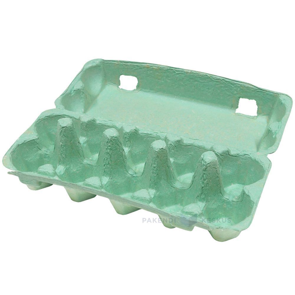
Pale sage is muted and soft, closer to a gray-green than a bright one. It reads as understated and premium rather than as an environmental signal, which makes it the safest green for producers who want the tone without the implied claim. It also sits well against natural pulp in a mixed range.
Mid green is the clearest organic signal in the palette. It is what most buyers mean when they ask for green, and it is the shade that does the communicating work described above.
Deep forest behaves more like navy than like green. Strong emboss performance, good white print contrast, and a premium rather than natural reading. Heritage and estate brands use it more than organic producers do.
Shell color interaction
Green is the most forgiving shade in the range for shell color, which is a practical advantage for producers running mixed flocks.
Brown eggs against green is the combination most buyers picture, and it works because the two sit on opposite sides of the color wheel without clashing. It looks agricultural in the intended sense.
White eggs against forest green produce strong contrast and a clean, graphic result.
Blue and olive shells against sage produce a tonal effect similar to the pale blue option, since olive shells carry a green cast themselves. Producers with Olive Egger flocks often specify sage for exactly this.
There is no shell color that looks poor in a green carton, which cannot be said of pink or pale blue.
Print and emboss behavior
Forest green holds embossed detail nearly as well as navy, for the same reason: tonal depth lets the shadow stay dark at the edge of the mark.
Sage is light enough that embossing reads softly, and it needs a dark ink for printed contrast. Black on sage is clean. Cream or off-white on sage is a softer combination that heritage brands use.
Mid green sits in the same awkward middle that mid blue does, too dark for strong black contrast and too light for white to read cleanly. Buyers specifying mid green for its signal value should plan on a printed label or a bold single color design rather than relying on subtle emboss.
Green against the rest of a range
Green is the shade most often ordered as part of a two color system rather than alone, and the pairings that work are worth knowing.
Sage with natural pulp is the most common. The two sit close enough to read as a family, which lets a producer run an organic line and a standard line that look related rather than unrelated.
Forest with cream or white gives a stronger separation for producers who want their premium tier to be visibly distinct.
The pairing to avoid is mid green with sage, where the two are close enough that shoppers read them as the same product in inconsistent packaging rather than as two tiers.
Where green sells hardest
Organic and pasture raised retail is the obvious channel, and green is close to a default there.
Farmers markets are the second, where green reads as agricultural and sits comfortably against produce on an adjacent stall.
Specialty grocery uses sage and forest for premium lines, where the understated end of the range signals quality rather than category.
The channel where green works least is commodity retail, where it competes against established national brands that already own the color in the shopper’s memory.
Pairing with format
Green works across the whole range. For organic lines the molded pulp dozen egg carton is the volume anchor, with the molded pulp 6 egg carton for premium and smaller packs.
Sage on molded pulp vintage egg cartons is one of the most requested combinations we run, since the muted shade and the retro profile reinforce each other for farm direct sellers.
For the full pigment and shade control detail see molded pulp colored egg cartons, and for print specifications see custom printed egg cartons.