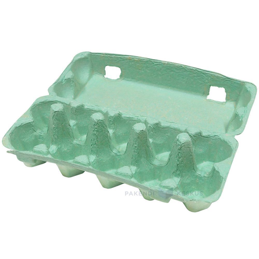
Green Egg Cartons

  • Shade range from pale sage through mid green to deep forest
  • Pigment blended into the slurry, so color survives scuffing and shipping
  • The shade most associated with organic, pasture raised, and free range lines
  • Forest green holds embossed detail sharply, close to navy performance
  • Compostable and plastic free, with no surface coating
  • Available across every cell count from 4 through 20
  • OEM and ODM sizing accepted; retained shade standards kept for reorders

Öffentliche Schimmelpilze

Verpackungslösungen

3D-Entwurf

Kundenspezifische Form

Green egg cartons in molded pulp holding brown eggs with the lid open

Beschreibung des Produkts

Spezifikation Einzelheiten
Markenname BonitoPak
Modellnummer EC-GRN series
Produktname Green Egg Cartons / Green Pigmented Pulp Cartons
Material Recycled paper pulp with slurry-blended pigment
Technik Molded pulp forming (wet-pressed), wet end pigmentation
Cell Count 4, 6, 10, 12, 18, or 20 cells
Shade Range Pale sage, mid green, deep forest; custom shades matched
Color Method Pigment blended into slurry before forming, not surface coated
Lightfastness Good across the range; forest most stable
Print Contrast Strong with white on forest; black or cream on sage
Logo-Druck Embossed, debossed, or flexographic print
Industrielle Nutzung Organic producers, pasture raised brands, farm direct, specialty grocery
Anmeldung Organic and free range lines, farm brand identity, seasonal ranges
Vorteile Biodegradable, home compostable, plastic free, no coating
Individuelle Bestellung Angenommen
MOQ Confirm with sales; stock green carries a lower minimum than custom shades

Galerie der Green Egg Cartons Teile

Diese Galerie zeigt die außergewöhnliche Qualität und die Liebe zum Detail, die wir bei jedem Projekt zeigen. Von komplexen Entwürfen bis hin zu makellosen Oberflächen spiegelt jedes Bild unser Engagement für hervorragende Leistungen in Green Egg Cartons .

40%

Kosten- und Zeitersparnis

Erleben Sie führende Verpackungslösungen, die Ihre Kosten und Ihren Zeitaufwand optimieren, für effiziente Prozesse sorgen und Ihren ROI maximieren.

50%

Mehr Nachhaltigkeit

Erzielen Sie umweltfreundliche Verpackungen mit nachhaltigen Materialien, reduzieren Sie den Abfall und fördern Sie die Umweltverantwortung für Ihre Produktlinien.

25%

Steigerung des Umsatzes

Steigern Sie die Attraktivität Ihrer Produkte in den Regalen mit innovativen Designs, die die Sichtbarkeit und den Absatz sowohl im Einzelhandel als auch auf dem Online-Markt steigern.

100%

Zuverlässiger

Vertrauen Sie auf das Qualitätsbewusstsein von BonitoPak, das sicherstellt, dass jedes Produkt unseren hohen Standards entspricht und einen beständigen, zuverlässigen Service bietet.

The shade that carries a meaning

Every carton color is a design decision. Green is the only one that is also a claim, and that creates both an opportunity and a compliance question.

Shoppers read green packaging as a signal about how the product was produced. In eggs specifically, it maps onto organic, free range, and pasture raised, because those are the categories the color has been used for across decades of food retail.

For a producer who genuinely holds those credentials, green does work that no other shade does. It communicates the positioning before the shopper reads a word, which is the whole point of packaging color.

For a producer who does not hold them, green risks implying a claim the product cannot support. Several jurisdictions treat implied environmental and welfare claims through packaging design as within the scope of advertising regulation, not outside it. The color alone is unlikely to trigger action, but green plus suggestive imagery plus vague wording has drawn attention in multiple markets.

Our advice is straightforward: use green if the claim is true and stated, and choose a different shade if it is not. We are not in a position to assess your certification, and we supply the carton either way, but the risk sits with the producer and it is worth naming.

Three shades and what each is for

Pale sage is muted and soft, closer to a gray-green than a bright one. It reads as understated and premium rather than as an environmental signal, which makes it the safest green for producers who want the tone without the implied claim. It also sits well against natural pulp in a mixed range.

Mid green is the clearest organic signal in the palette. It is what most buyers mean when they ask for green, and it is the shade that does the communicating work described above.

Deep forest behaves more like navy than like green. Strong emboss performance, good white print contrast, and a premium rather than natural reading. Heritage and estate brands use it more than organic producers do.

Shell color interaction

Green is the most forgiving shade in the range for shell color, which is a practical advantage for producers running mixed flocks.

Brown eggs against green is the combination most buyers picture, and it works because the two sit on opposite sides of the color wheel without clashing. It looks agricultural in the intended sense.

White eggs against forest green produce strong contrast and a clean, graphic result.

Blue and olive shells against sage produce a tonal effect similar to the pale blue option, since olive shells carry a green cast themselves. Producers with Olive Egger flocks often specify sage for exactly this.

There is no shell color that looks poor in a green carton, which cannot be said of pink or pale blue.

Print and emboss behavior

Forest green holds embossed detail nearly as well as navy, for the same reason: tonal depth lets the shadow stay dark at the edge of the mark.

Sage is light enough that embossing reads softly, and it needs a dark ink for printed contrast. Black on sage is clean. Cream or off-white on sage is a softer combination that heritage brands use.

Mid green sits in the same awkward middle that mid blue does, too dark for strong black contrast and too light for white to read cleanly. Buyers specifying mid green for its signal value should plan on a printed label or a bold single color design rather than relying on subtle emboss.

Green against the rest of a range

Green is the shade most often ordered as part of a two color system rather than alone, and the pairings that work are worth knowing.

Sage with natural pulp is the most common. The two sit close enough to read as a family, which lets a producer run an organic line and a standard line that look related rather than unrelated.

Forest with cream or white gives a stronger separation for producers who want their premium tier to be visibly distinct.

The pairing to avoid is mid green with sage, where the two are close enough that shoppers read them as the same product in inconsistent packaging rather than as two tiers.

Where green sells hardest

Organic and pasture raised retail is the obvious channel, and green is close to a default there.

Farmers markets are the second, where green reads as agricultural and sits comfortably against produce on an adjacent stall.

Specialty grocery uses sage and forest for premium lines, where the understated end of the range signals quality rather than category.

The channel where green works least is commodity retail, where it competes against established national brands that already own the color in the shopper’s memory.

Pairing with format

Green works across the whole range. For organic lines the molded pulp dozen egg carton is the volume anchor, with the molded pulp 6 egg carton for premium and smaller packs.

Sage on molded pulp vintage egg cartons is one of the most requested combinations we run, since the muted shade and the retro profile reinforce each other for farm direct sellers.

For the full pigment and shade control detail see molded pulp colored egg cartons, and for print specifications see individuell bedruckte Eierkartons.

The shade that carries a meaning

Every carton color is a design decision. Green is the only one that is also a claim, and that creates both an opportunity and a compliance question.

Shoppers read green packaging as a signal about how the product was produced. In eggs specifically, it maps onto organic, free range, and pasture raised, because those are the categories the color has been used for across decades of food retail.

For a producer who genuinely holds those credentials, green does work that no other shade does. It communicates the positioning before the shopper reads a word, which is the whole point of packaging color.

For a producer who does not hold them, green risks implying a claim the product cannot support. Several jurisdictions treat implied environmental and welfare claims through packaging design as within the scope of advertising regulation, not outside it. The color alone is unlikely to trigger action, but green plus suggestive imagery plus vague wording has drawn attention in multiple markets.

Our advice is straightforward: use green if the claim is true and stated, and choose a different shade if it is not. We are not in a position to assess your certification, and we supply the carton either way, but the risk sits with the producer and it is worth naming.

Three shades and what each is for

Pale sage is muted and soft, closer to a gray-green than a bright one. It reads as understated and premium rather than as an environmental signal, which makes it the safest green for producers who want the tone without the implied claim. It also sits well against natural pulp in a mixed range.

Mid green is the clearest organic signal in the palette. It is what most buyers mean when they ask for green, and it is the shade that does the communicating work described above.

Deep forest behaves more like navy than like green. Strong emboss performance, good white print contrast, and a premium rather than natural reading. Heritage and estate brands use it more than organic producers do.

Shell color interaction

Green is the most forgiving shade in the range for shell color, which is a practical advantage for producers running mixed flocks.

Brown eggs against green is the combination most buyers picture, and it works because the two sit on opposite sides of the color wheel without clashing. It looks agricultural in the intended sense.

White eggs against forest green produce strong contrast and a clean, graphic result.

Blue and olive shells against sage produce a tonal effect similar to the pale blue option, since olive shells carry a green cast themselves. Producers with Olive Egger flocks often specify sage for exactly this.

There is no shell color that looks poor in a green carton, which cannot be said of pink or pale blue.

Print and emboss behavior

Forest green holds embossed detail nearly as well as navy, for the same reason: tonal depth lets the shadow stay dark at the edge of the mark.

Sage is light enough that embossing reads softly, and it needs a dark ink for printed contrast. Black on sage is clean. Cream or off-white on sage is a softer combination that heritage brands use.

Mid green sits in the same awkward middle that mid blue does, too dark for strong black contrast and too light for white to read cleanly. Buyers specifying mid green for its signal value should plan on a printed label or a bold single color design rather than relying on subtle emboss.

Green against the rest of a range

Green is the shade most often ordered as part of a two color system rather than alone, and the pairings that work are worth knowing.

Sage with natural pulp is the most common. The two sit close enough to read as a family, which lets a producer run an organic line and a standard line that look related rather than unrelated.

Forest with cream or white gives a stronger separation for producers who want their premium tier to be visibly distinct.

The pairing to avoid is mid green with sage, where the two are close enough that shoppers read them as the same product in inconsistent packaging rather than as two tiers.

Where green sells hardest

Organic and pasture raised retail is the obvious channel, and green is close to a default there.

Farmers markets are the second, where green reads as agricultural and sits comfortably against produce on an adjacent stall.

Specialty grocery uses sage and forest for premium lines, where the understated end of the range signals quality rather than category.

The channel where green works least is commodity retail, where it competes against established national brands that already own the color in the shopper’s memory.

Pairing with format

Green works across the whole range. For organic lines the molded pulp dozen egg carton is the volume anchor, with the molded pulp 6 egg carton for premium and smaller packs.

Sage on molded pulp vintage egg cartons is one of the most requested combinations we run, since the muted shade and the retro profile reinforce each other for farm direct sellers.

For the full pigment and shade control detail see molded pulp colored egg cartons, and for print specifications see individuell bedruckte Eierkartons.

Materialien für Green Egg Cartons Teile

Führende Unternehmen und Ingenieure verlassen sich auf BonitoPak, wenn es um schnelle Iterationen und langlebige, hochwertige Teile geht. Ob für die Herstellung von Prototypen oder für die Serienproduktion, unsere breite Palette an Materialien stellt sicher, dass wir die einzigartigen Anforderungen eines jeden Unternehmens erfüllen. Green Egg Cartons Projekt mit Präzision und Schnelligkeit.

Kompostierbares Kraftpapier ist die festeste Faser, die wir herstellen. Hergestellt aus Frischfaser

Farbiger Zellstoff ist keine eigenständige Faser. Es handelt sich dabei um einen unserer

Gebleichter Zellstoff ist das zu spezifizierende Material, wenn das Bauteil

Der Begriff „natürliche Pflanzenfasern“ umfasst die nicht aus Holz stammenden Zellulosequellen, die wir außerhalb der

Wellpappe als Formmasse bezeichnet wiederverwertete Kartons, die zu Zellstoff zerkleinert wurden

Strohfasern werden aus den nach der Getreideernte übrig gebliebenen Stängeln hergestellt, Material

Individuell Umweltfreundlich Zuverlässig

Maßgeschneiderte, umweltfreundliche Verpackung auf höchstem Niveau

Vollständig anpassbar

Passen Sie Ihre Verpackungen mit maßgeschneiderten Stilen, Größen, Farben und Veredelungen an Ihre spezifischen Bedürfnisse an.

Unterstützung durch Experten

Bonitopak bietet fachkundige Design- und Logistikberatung, um die Verpackungseffizienz zu maximieren und den ROI zu steigern.

Öko-Lösungen

Entscheiden Sie sich für nachhaltige, umweltfreundliche Verpackungen, um die Umweltbelastung zu reduzieren und die grünen Ziele Ihrer Marke zu unterstützen.

Qualitätssicherung

Bonitopak garantiert bei jeder Verpackungslösung einen erstklassigen Service und ein hervorragendes Produkt.

Häufig gestellte Fragen

Green Egg Cartons

  • Is green available in the vintage flat top profile?

    Yes, and sage in particular is one of the combinations we run most often. The muted shade suits the period profile better than a bright green does, since mid century cartons were produced in natural fiber tones rather than saturated colors.

  • Can you match the green used by a specific brand?

    We match to a Pantone reference or a physical sample as closely as pigmented fiber allows, and we send a formed sample for approval before production. Exact ink matching is not achievable in pulp. If the reference is a competitor’s carton rather than a printed standard, send us the physical carton and we will match against it directly.

  • Will green fade faster than other shades?

     It sits better than blue and worse than black. Green pigments rated for compostable use have moderate lightfastness, so forest holds up well and sage shows lightening soonest under sustained direct sun. In refrigerated retail none of the range is affected.

  • Which green do most organic producers choose?

     Mid green, because it is the shade that carries the category signal most clearly. Producers positioning above the category on quality rather than on method more often choose sage or forest, which read as premium rather than as organic.

  • Does a green carton help an organic certification claim?

    No. Certification is granted on production practice and audited independently, and packaging color has no bearing on it. What green does is communicate a claim you already hold more quickly at the shelf. The certification mark itself still has to appear on the pack according to your certifier’s rules.

Biologisch abbaubar Ergebnis

0 Tage

7 Tage

14 Tage

30 Tage

Spezialisierte Industrien

Durch die Herstellung von Millionen von Teilen verfügt BonitoPak über umfassende Kenntnisse in zahlreichen Anwendungen. Wir zeichnen uns besonders in Branchen aus, die eine präzise und komplizierte Komponentenfertigung erfordern. Vertrauen Sie darauf, dass wir unabhängig von der Komplexität Fachwissen und Qualität liefern.

OEM- und ODM-Verpackungslösungen

Bonitopak bietet sowohl kundenspezifische (OEM) als auch vorgefertigte (ODM) Verpackungslösungen an. Ganz gleich, ob Sie vollständig maßgeschneiderte Designs oder gebrauchsfertige Verpackungen benötigen, wir bieten hochwertige, effiziente und flexible Optionen, um die Anforderungen Ihrer Marke zu erfüllen.

OEM-Dienste

OEM-Verpackungslösungen ermöglichen es Ihnen, vollständig maßgeschneiderte Produkte zu entwerfen und herzustellen, die Ihren spezifischen Anforderungen entsprechen. Wir von Bonitopak bieten umfassende Unterstützung während des gesamten Design-, Prototyping- und Fertigungsprozesses, damit Ihre Verpackung die einzigartige Identität Ihrer Marke widerspiegelt. Unsere Präzisionsfertigungskapazitäten garantieren eine hochwertige und konsistente Produktion, unabhängig von der Komplexität des Designs. Mit unserem End-to-End-Service kümmern wir uns um alles, vom Konzept bis zur Auslieferung, und helfen Ihnen, Ihren Verpackungsbedarf zu optimieren.

ODM-Dienste

ODM-Verpackungslösungen bieten vorgefertigte Produkte, die auf die Anforderungen Ihrer Marke zugeschnitten werden können. Mit dem innovativen Design-Know-how und dem effizienten Produktionsprozess von Bonitopak können Sie aus einer breiten Palette von gebrauchsfertigen Verpackungsoptionen wählen. Wir bieten flexible Anpassungsmöglichkeiten, die es Ihnen ermöglichen, Ihr Markenzeichen hinzuzufügen und aus verschiedenen Veredelungen, Farben und Größen zu wählen. Diese Lösung spart Zeit und Kosten und gewährleistet gleichzeitig eine hochwertige Verpackung, die Ihren Markenstandards entspricht.
Sind Sie bereit, Ihr Projekt aufzuwerten?

Erwecken Sie Ihre Entwürfe mit BonitoPak zum Leben

Erleben Sie Präzisionstechnik mit BonitoPak. Von detaillierten Prototypen bis hin zur Großserienproduktion - wir sind da, um Ihre Konzepte in die Realität umzusetzen. Kontaktieren Sie uns noch heute, um Ihre Projektanforderungen zu besprechen!

Unsere Produktkategorien

Entdecken Sie das vielfältige Angebot an Verpackungslösungen von Bonitopak, darunter geformte Zellstoffschalen, Lebensmittelverpackungen, kundenspezifische Designs und nachhaltige Optionen. Jede Kategorie ist auf Langlebigkeit, Funktionalität und Umweltverträglichkeit ausgelegt und auf Ihre spezifischen Anforderungen zugeschnitten.

The shade that carries a meaning

Every carton color is a design decision. Green is the only one that is also a claim, and that creates both an opportunity and a compliance question.

Shoppers read green packaging as a signal about how the product was produced. In eggs specifically, it maps onto organic, free range, and pasture raised, because those are the categories the color has been used for across decades of food retail.

For a producer who genuinely holds those credentials, green does work that no other shade does. It communicates the positioning before the shopper reads a word, which is the whole point of packaging color.

For a producer who does not hold them, green risks implying a claim the product cannot support. Several jurisdictions treat implied environmental and welfare claims through packaging design as within the scope of advertising regulation, not outside it. The color alone is unlikely to trigger action, but green plus suggestive imagery plus vague wording has drawn attention in multiple markets.

Our advice is straightforward: use green if the claim is true and stated, and choose a different shade if it is not. We are not in a position to assess your certification, and we supply the carton either way, but the risk sits with the producer and it is worth naming.

Three shades and what each is for

Pale sage is muted and soft, closer to a gray-green than a bright one. It reads as understated and premium rather than as an environmental signal, which makes it the safest green for producers who want the tone without the implied claim. It also sits well against natural pulp in a mixed range.

Mid green is the clearest organic signal in the palette. It is what most buyers mean when they ask for green, and it is the shade that does the communicating work described above.

Deep forest behaves more like navy than like green. Strong emboss performance, good white print contrast, and a premium rather than natural reading. Heritage and estate brands use it more than organic producers do.

Shell color interaction

Green is the most forgiving shade in the range for shell color, which is a practical advantage for producers running mixed flocks.

Brown eggs against green is the combination most buyers picture, and it works because the two sit on opposite sides of the color wheel without clashing. It looks agricultural in the intended sense.

White eggs against forest green produce strong contrast and a clean, graphic result.

Blue and olive shells against sage produce a tonal effect similar to the pale blue option, since olive shells carry a green cast themselves. Producers with Olive Egger flocks often specify sage for exactly this.

There is no shell color that looks poor in a green carton, which cannot be said of pink or pale blue.

Print and emboss behavior

Forest green holds embossed detail nearly as well as navy, for the same reason: tonal depth lets the shadow stay dark at the edge of the mark.

Sage is light enough that embossing reads softly, and it needs a dark ink for printed contrast. Black on sage is clean. Cream or off-white on sage is a softer combination that heritage brands use.

Mid green sits in the same awkward middle that mid blue does, too dark for strong black contrast and too light for white to read cleanly. Buyers specifying mid green for its signal value should plan on a printed label or a bold single color design rather than relying on subtle emboss.

Green against the rest of a range

Green is the shade most often ordered as part of a two color system rather than alone, and the pairings that work are worth knowing.

Sage with natural pulp is the most common. The two sit close enough to read as a family, which lets a producer run an organic line and a standard line that look related rather than unrelated.

Forest with cream or white gives a stronger separation for producers who want their premium tier to be visibly distinct.

The pairing to avoid is mid green with sage, where the two are close enough that shoppers read them as the same product in inconsistent packaging rather than as two tiers.

Where green sells hardest

Organic and pasture raised retail is the obvious channel, and green is close to a default there.

Farmers markets are the second, where green reads as agricultural and sits comfortably against produce on an adjacent stall.

Specialty grocery uses sage and forest for premium lines, where the understated end of the range signals quality rather than category.

The channel where green works least is commodity retail, where it competes against established national brands that already own the color in the shopper’s memory.

Pairing with format

Green works across the whole range. For organic lines the molded pulp dozen egg carton is the volume anchor, with the molded pulp 6 egg carton for premium and smaller packs.

Sage on molded pulp vintage egg cartons is one of the most requested combinations we run, since the muted shade and the retro profile reinforce each other for farm direct sellers.

For the full pigment and shade control detail see molded pulp colored egg cartons, and for print specifications see individuell bedruckte Eierkartons.

Verwandte Artikel und Einblicke

Bleiben Sie auf dem Laufenden mit den neuesten Informationen über nachhaltige Verpackungstrends, Einblicke in die Branche und Expertentipps in unserem Blog. Entdecken Sie innovative Ideen und Lösungen, um Ihr Verpackungswissen zu erweitern.

Von Leo Chan | Autor, BonitoPak | Über 20 Jahre Erfahrung im Bereich Verpackungen aus Formzellstoff Wodka ist

Von Leo Chan | Autor, BonitoPak | Über 20 Jahre Erfahrung im Bereich Formzellstoffverpackungen Fast jede

Von Leo Chan | Autor, BonitoPak | Über 20 Jahre Erfahrung im Bereich Verpackungen aus Formzellstoff Hier suchen

Häufig gestellte Fragen

Green Egg Cartons

  • Is green available in the vintage flat top profile?

    Yes, and sage in particular is one of the combinations we run most often. The muted shade suits the period profile better than a bright green does, since mid century cartons were produced in natural fiber tones rather than saturated colors.

  • Can you match the green used by a specific brand?

    We match to a Pantone reference or a physical sample as closely as pigmented fiber allows, and we send a formed sample for approval before production. Exact ink matching is not achievable in pulp. If the reference is a competitor’s carton rather than a printed standard, send us the physical carton and we will match against it directly.

  • Will green fade faster than other shades?

     It sits better than blue and worse than black. Green pigments rated for compostable use have moderate lightfastness, so forest holds up well and sage shows lightening soonest under sustained direct sun. In refrigerated retail none of the range is affected.

  • Which green do most organic producers choose?

     Mid green, because it is the shade that carries the category signal most clearly. Producers positioning above the category on quality rather than on method more often choose sage or forest, which read as premium rather than as organic.

  • Does a green carton help an organic certification claim?

    No. Certification is granted on production practice and audited independently, and packaging color has no bearing on it. What green does is communicate a claim you already hold more quickly at the shelf. The certification mark itself still has to appear on the pack according to your certifier’s rules.

Füllen Sie dieses detaillierte Formular aus