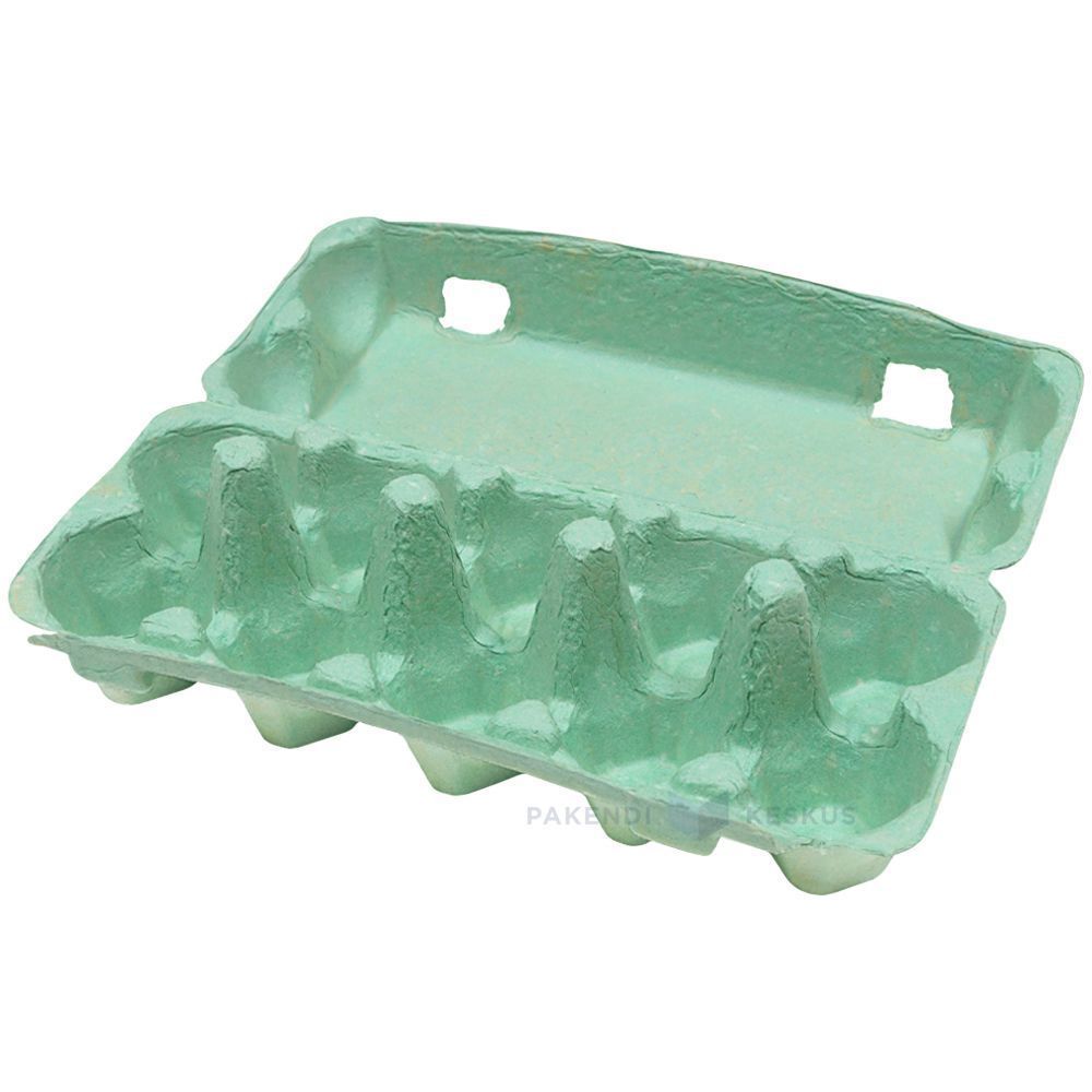
Green Egg Cartons

  • Shade range from pale sage through mid green to deep forest
  • Pigment blended into the slurry, so color survives scuffing and shipping
  • The shade most associated with organic, pasture raised, and free range lines
  • Forest green holds embossed detail sharply, close to navy performance
  • Compostable and plastic free, with no surface coating
  • Available across every cell count from 4 through 20
  • OEM and ODM sizing accepted; retained shade standards kept for reorders

Общественная плесень

Упаковочные решения

3D-дизайн

Подгонянная прессформа

Green egg cartons in molded pulp holding brown eggs with the lid open

Описание товара

Технические характеристики Подробности
Название бренда BonitoPak
Номер модели EC-GRN series
Название продукта Green Egg Cartons / Green Pigmented Pulp Cartons
Материал Recycled paper pulp with slurry-blended pigment
Техника Molded pulp forming (wet-pressed), wet end pigmentation
Количество клеток 4, 6, 10, 12, 18, or 20 cells
Shade Range Pale sage, mid green, deep forest; custom shades matched
Color Method Pigment blended into slurry before forming, not surface coated
Lightfastness Good across the range; forest most stable
Print Contrast Strong with white on forest; black or cream on sage
Печать логотипа Тиснение, углубленная печать или флексографская печать
Промышленное использование Organic producers, pasture raised brands, farm direct, specialty grocery
Приложение Organic and free range lines, farm brand identity, seasonal ranges
Преимущества Biodegradable, home compostable, plastic free, no coating
Индивидуальный заказ Принято
MOQ Confirm with sales; stock green carries a lower minimum than custom shades

Галерея Green Egg Cartons запчасти

Эта галерея демонстрирует исключительное качество и внимание к деталям, которые мы воплощаем в каждом проекте. От сложных конструкций до безупречной отделки - каждое изображение отражает наше стремление к совершенству в Green Egg Cartons .

40%

Экономия средств и времени

Передовые упаковочные решения оптимизируют ваши затраты и время, обеспечивая эффективность процессов и максимальную окупаемость инвестиций.

50%

Более устойчивый

Создайте экологичную упаковку из экологически чистых материалов, сократите количество отходов и повысьте экологическую ответственность за весь ассортимент продукции.

25%

Увеличение продаж

Повысьте привлекательность вашей продукции на полке с помощью инновационных дизайнов, которые повышают видимость и продажи как в розничной торговле, так и на онлайн-рынках.

100%

Надежнее

Доверьтесь приверженности BonitoPak к качеству, гарантирующему, что каждый продукт соответствует нашим высоким стандартам и обеспечивает постоянное и надежное обслуживание.

The shade that carries a meaning

Every carton color is a design decision. Green is the only one that is also a claim, and that creates both an opportunity and a compliance question.

Shoppers read green packaging as a signal about how the product was produced. In eggs specifically, it maps onto organic, free range, and pasture raised, because those are the categories the color has been used for across decades of food retail.

For a producer who genuinely holds those credentials, green does work that no other shade does. It communicates the positioning before the shopper reads a word, which is the whole point of packaging color.

For a producer who does not hold them, green risks implying a claim the product cannot support. Several jurisdictions treat implied environmental and welfare claims through packaging design as within the scope of advertising regulation, not outside it. The color alone is unlikely to trigger action, but green plus suggestive imagery plus vague wording has drawn attention in multiple markets.

Our advice is straightforward: use green if the claim is true and stated, and choose a different shade if it is not. We are not in a position to assess your certification, and we supply the carton either way, but the risk sits with the producer and it is worth naming.

Three shades and what each is for

Pale sage is muted and soft, closer to a gray-green than a bright one. It reads as understated and premium rather than as an environmental signal, which makes it the safest green for producers who want the tone without the implied claim. It also sits well against natural pulp in a mixed range.

Mid green is the clearest organic signal in the palette. It is what most buyers mean when they ask for green, and it is the shade that does the communicating work described above.

Deep forest behaves more like navy than like green. Strong emboss performance, good white print contrast, and a premium rather than natural reading. Heritage and estate brands use it more than organic producers do.

Shell color interaction

Green is the most forgiving shade in the range for shell color, which is a practical advantage for producers running mixed flocks.

Brown eggs against green is the combination most buyers picture, and it works because the two sit on opposite sides of the color wheel without clashing. It looks agricultural in the intended sense.

White eggs against forest green produce strong contrast and a clean, graphic result.

Blue and olive shells against sage produce a tonal effect similar to the pale blue option, since olive shells carry a green cast themselves. Producers with Olive Egger flocks often specify sage for exactly this.

There is no shell color that looks poor in a green carton, which cannot be said of pink or pale blue.

Print and emboss behavior

Forest green holds embossed detail nearly as well as navy, for the same reason: tonal depth lets the shadow stay dark at the edge of the mark.

Sage is light enough that embossing reads softly, and it needs a dark ink for printed contrast. Black on sage is clean. Cream or off-white on sage is a softer combination that heritage brands use.

Mid green sits in the same awkward middle that mid blue does, too dark for strong black contrast and too light for white to read cleanly. Buyers specifying mid green for its signal value should plan on a printed label or a bold single color design rather than relying on subtle emboss.

Green against the rest of a range

Green is the shade most often ordered as part of a two color system rather than alone, and the pairings that work are worth knowing.

Sage with natural pulp is the most common. The two sit close enough to read as a family, which lets a producer run an organic line and a standard line that look related rather than unrelated.

Forest with cream or white gives a stronger separation for producers who want their premium tier to be visibly distinct.

The pairing to avoid is mid green with sage, where the two are close enough that shoppers read them as the same product in inconsistent packaging rather than as two tiers.

Where green sells hardest

Organic and pasture raised retail is the obvious channel, and green is close to a default there.

Farmers markets are the second, where green reads as agricultural and sits comfortably against produce on an adjacent stall.

Specialty grocery uses sage and forest for premium lines, where the understated end of the range signals quality rather than category.

The channel where green works least is commodity retail, where it competes against established national brands that already own the color in the shopper’s memory.

Pairing with format

Green works across the whole range. For organic lines the molded pulp dozen egg carton is the volume anchor, with the molded pulp 6 egg carton for premium and smaller packs.

Sage on molded pulp vintage egg cartons is one of the most requested combinations we run, since the muted shade and the retro profile reinforce each other for farm direct sellers.

For the full pigment and shade control detail see molded pulp colored egg cartons, and for print specifications see яичные лотки с индивидуальной печатью.

The shade that carries a meaning

Every carton color is a design decision. Green is the only one that is also a claim, and that creates both an opportunity and a compliance question.

Shoppers read green packaging as a signal about how the product was produced. In eggs specifically, it maps onto organic, free range, and pasture raised, because those are the categories the color has been used for across decades of food retail.

For a producer who genuinely holds those credentials, green does work that no other shade does. It communicates the positioning before the shopper reads a word, which is the whole point of packaging color.

For a producer who does not hold them, green risks implying a claim the product cannot support. Several jurisdictions treat implied environmental and welfare claims through packaging design as within the scope of advertising regulation, not outside it. The color alone is unlikely to trigger action, but green plus suggestive imagery plus vague wording has drawn attention in multiple markets.

Our advice is straightforward: use green if the claim is true and stated, and choose a different shade if it is not. We are not in a position to assess your certification, and we supply the carton either way, but the risk sits with the producer and it is worth naming.

Three shades and what each is for

Pale sage is muted and soft, closer to a gray-green than a bright one. It reads as understated and premium rather than as an environmental signal, which makes it the safest green for producers who want the tone without the implied claim. It also sits well against natural pulp in a mixed range.

Mid green is the clearest organic signal in the palette. It is what most buyers mean when they ask for green, and it is the shade that does the communicating work described above.

Deep forest behaves more like navy than like green. Strong emboss performance, good white print contrast, and a premium rather than natural reading. Heritage and estate brands use it more than organic producers do.

Shell color interaction

Green is the most forgiving shade in the range for shell color, which is a practical advantage for producers running mixed flocks.

Brown eggs against green is the combination most buyers picture, and it works because the two sit on opposite sides of the color wheel without clashing. It looks agricultural in the intended sense.

White eggs against forest green produce strong contrast and a clean, graphic result.

Blue and olive shells against sage produce a tonal effect similar to the pale blue option, since olive shells carry a green cast themselves. Producers with Olive Egger flocks often specify sage for exactly this.

There is no shell color that looks poor in a green carton, which cannot be said of pink or pale blue.

Print and emboss behavior

Forest green holds embossed detail nearly as well as navy, for the same reason: tonal depth lets the shadow stay dark at the edge of the mark.

Sage is light enough that embossing reads softly, and it needs a dark ink for printed contrast. Black on sage is clean. Cream or off-white on sage is a softer combination that heritage brands use.

Mid green sits in the same awkward middle that mid blue does, too dark for strong black contrast and too light for white to read cleanly. Buyers specifying mid green for its signal value should plan on a printed label or a bold single color design rather than relying on subtle emboss.

Green against the rest of a range

Green is the shade most often ordered as part of a two color system rather than alone, and the pairings that work are worth knowing.

Sage with natural pulp is the most common. The two sit close enough to read as a family, which lets a producer run an organic line and a standard line that look related rather than unrelated.

Forest with cream or white gives a stronger separation for producers who want their premium tier to be visibly distinct.

The pairing to avoid is mid green with sage, where the two are close enough that shoppers read them as the same product in inconsistent packaging rather than as two tiers.

Where green sells hardest

Organic and pasture raised retail is the obvious channel, and green is close to a default there.

Farmers markets are the second, where green reads as agricultural and sits comfortably against produce on an adjacent stall.

Specialty grocery uses sage and forest for premium lines, where the understated end of the range signals quality rather than category.

The channel where green works least is commodity retail, where it competes against established national brands that already own the color in the shopper’s memory.

Pairing with format

Green works across the whole range. For organic lines the molded pulp dozen egg carton is the volume anchor, with the molded pulp 6 egg carton for premium and smaller packs.

Sage on molded pulp vintage egg cartons is one of the most requested combinations we run, since the muted shade and the retro profile reinforce each other for farm direct sellers.

For the full pigment and shade control detail see molded pulp colored egg cartons, and for print specifications see яичные лотки с индивидуальной печатью.

Материалы для Green Egg Cartons Детали

Ведущие компании и инженеры полагаются на BonitoPak для быстрых итераций и прочных, высококачественных деталей. Будь то прототипирование или полномасштабное производство, наш широкий ассортимент материалов позволяет удовлетворить уникальные требования любого Green Egg Cartons проект с точностью и скоростью.

Compostable kraft paper is the strongest fiber we form. Made from virgin

Colored pulp is not a separate fiber. It is any of our

Bleached pulp is the material to specify when the part has to

Natural plant fiber covers the non-wood cellulose sources we blend outside the

Corrugated paper as a molded pulp material means recovered cardboard boxes repulped

Straw fiber is made from the stalks left after grain harvest, material

Пользовательские Экологичный Надежный

Индивидуальная, экологически чистая упаковка

Полностью настраиваемый

Настройте свою упаковку, используя индивидуальные стили, размеры, цвета и отделку для удовлетворения конкретных потребностей.

Экспертная поддержка

Компания Bonitopak предоставляет экспертные консультации по дизайну и логистике, чтобы максимально повысить эффективность упаковки и увеличить рентабельность инвестиций.

Экорешения

Выбирайте экологичную упаковку, чтобы снизить воздействие на окружающую среду и поддержать "зеленые" цели вашего бренда.

Обеспечение качества

Bonitopak гарантирует высокое качество обслуживания и превосходство продукции в каждом упаковочном решении.

Часто задаваемые вопросы

Green Egg Cartons

  • Is green available in the vintage flat top profile?

    Yes, and sage in particular is one of the combinations we run most often. The muted shade suits the period profile better than a bright green does, since mid century cartons were produced in natural fiber tones rather than saturated colors.

  • Can you match the green used by a specific brand?

    We match to a Pantone reference or a physical sample as closely as pigmented fiber allows, and we send a formed sample for approval before production. Exact ink matching is not achievable in pulp. If the reference is a competitor’s carton rather than a printed standard, send us the physical carton and we will match against it directly.

  • Will green fade faster than other shades?

     It sits better than blue and worse than black. Green pigments rated for compostable use have moderate lightfastness, so forest holds up well and sage shows lightening soonest under sustained direct sun. In refrigerated retail none of the range is affected.

  • Which green do most organic producers choose?

     Mid green, because it is the shade that carries the category signal most clearly. Producers positioning above the category on quality rather than on method more often choose sage or forest, which read as premium rather than as organic.

  • Does a green carton help an organic certification claim?

    No. Certification is granted on production practice and audited independently, and packaging color has no bearing on it. What green does is communicate a claim you already hold more quickly at the shelf. The certification mark itself still has to appear on the pack according to your certifier’s rules.

Биоразлагаемый результат

0 дней

7 дней

14 дней

30 дней

Специализированные отрасли

Произведя миллионы деталей, компания BonitoPak обладает глубокими знаниями в многочисленных областях применения. Мы особенно преуспели в отраслях, требующих точного и сложного изготовления деталей. Доверьтесь нам, мы обеспечим опыт и качество, независимо от сложности.

Упаковочные решения OEM и ODM

Компания Bonitopak предлагает как индивидуальные (OEM), так и предварительно разработанные (ODM) упаковочные решения. Независимо от того, нужна ли вам полностью индивидуальная конструкция или готовая к использованию упаковка, мы предлагаем высококачественные, эффективные и гибкие варианты, отвечающие потребностям вашего бренда.

Услуги OEM

OEM-упаковочные решения позволяют создавать полностью индивидуальные продукты, разработанные и изготовленные в соответствии с вашими специфическими требованиями. Компания Bonitopak предлагает всестороннюю поддержку на протяжении всего процесса разработки, создания прототипов и производства, гарантируя, что упаковка будет отражать уникальный стиль вашего бренда. Наши возможности точного производства гарантируют высокое качество и последовательность изготовления, независимо от сложности дизайна. Мы предоставляем комплексное обслуживание на всех этапах - от разработки концепции до поставки, помогая вам оптимизировать процесс производства упаковки.

Услуги ODM

Упаковочные решения ODM предлагают заранее разработанные продукты, которые могут быть адаптированы к требованиям вашего бренда. Благодаря инновационному опыту Bonitopak в области дизайна и эффективному производственному процессу, вы можете выбрать из широкого спектра готовых к использованию вариантов упаковки. Мы обеспечиваем гибкую настройку, позволяя вам добавлять свой брендинг и выбирать из различных вариантов отделки, цветов и размеров. Это решение позволяет сэкономить время и средства, обеспечивая при этом высокое качество упаковки, отвечающее стандартам вашего бренда.
Готовы ли вы повысить уровень своего проекта?

Воплощайте свои проекты в жизнь с BonitoPak

Испытайте на себе прецизионное проектирование с BonitoPak. От детальных прототипов до крупносерийного производства - мы готовы воплотить ваши концепции в реальность. Свяжитесь с нами сегодня, чтобы обсудить потребности вашего проекта!

Наши категории продуктов

Откройте для себя разнообразный ассортимент упаковочных решений Bonitopak, включая формованные лотки для целлюлозы, упаковку для пищевых продуктов, индивидуальные конструкции и экологичные варианты. Каждая категория создана для обеспечения долговечности, функциональности и экологической ответственности, с учетом ваших конкретных потребностей.

The shade that carries a meaning

Every carton color is a design decision. Green is the only one that is also a claim, and that creates both an opportunity and a compliance question.

Shoppers read green packaging as a signal about how the product was produced. In eggs specifically, it maps onto organic, free range, and pasture raised, because those are the categories the color has been used for across decades of food retail.

For a producer who genuinely holds those credentials, green does work that no other shade does. It communicates the positioning before the shopper reads a word, which is the whole point of packaging color.

For a producer who does not hold them, green risks implying a claim the product cannot support. Several jurisdictions treat implied environmental and welfare claims through packaging design as within the scope of advertising regulation, not outside it. The color alone is unlikely to trigger action, but green plus suggestive imagery plus vague wording has drawn attention in multiple markets.

Our advice is straightforward: use green if the claim is true and stated, and choose a different shade if it is not. We are not in a position to assess your certification, and we supply the carton either way, but the risk sits with the producer and it is worth naming.

Three shades and what each is for

Pale sage is muted and soft, closer to a gray-green than a bright one. It reads as understated and premium rather than as an environmental signal, which makes it the safest green for producers who want the tone without the implied claim. It also sits well against natural pulp in a mixed range.

Mid green is the clearest organic signal in the palette. It is what most buyers mean when they ask for green, and it is the shade that does the communicating work described above.

Deep forest behaves more like navy than like green. Strong emboss performance, good white print contrast, and a premium rather than natural reading. Heritage and estate brands use it more than organic producers do.

Shell color interaction

Green is the most forgiving shade in the range for shell color, which is a practical advantage for producers running mixed flocks.

Brown eggs against green is the combination most buyers picture, and it works because the two sit on opposite sides of the color wheel without clashing. It looks agricultural in the intended sense.

White eggs against forest green produce strong contrast and a clean, graphic result.

Blue and olive shells against sage produce a tonal effect similar to the pale blue option, since olive shells carry a green cast themselves. Producers with Olive Egger flocks often specify sage for exactly this.

There is no shell color that looks poor in a green carton, which cannot be said of pink or pale blue.

Print and emboss behavior

Forest green holds embossed detail nearly as well as navy, for the same reason: tonal depth lets the shadow stay dark at the edge of the mark.

Sage is light enough that embossing reads softly, and it needs a dark ink for printed contrast. Black on sage is clean. Cream or off-white on sage is a softer combination that heritage brands use.

Mid green sits in the same awkward middle that mid blue does, too dark for strong black contrast and too light for white to read cleanly. Buyers specifying mid green for its signal value should plan on a printed label or a bold single color design rather than relying on subtle emboss.

Green against the rest of a range

Green is the shade most often ordered as part of a two color system rather than alone, and the pairings that work are worth knowing.

Sage with natural pulp is the most common. The two sit close enough to read as a family, which lets a producer run an organic line and a standard line that look related rather than unrelated.

Forest with cream or white gives a stronger separation for producers who want their premium tier to be visibly distinct.

The pairing to avoid is mid green with sage, where the two are close enough that shoppers read them as the same product in inconsistent packaging rather than as two tiers.

Where green sells hardest

Organic and pasture raised retail is the obvious channel, and green is close to a default there.

Farmers markets are the second, where green reads as agricultural and sits comfortably against produce on an adjacent stall.

Specialty grocery uses sage and forest for premium lines, where the understated end of the range signals quality rather than category.

The channel where green works least is commodity retail, where it competes against established national brands that already own the color in the shopper’s memory.

Pairing with format

Green works across the whole range. For organic lines the molded pulp dozen egg carton is the volume anchor, with the molded pulp 6 egg carton for premium and smaller packs.

Sage on molded pulp vintage egg cartons is one of the most requested combinations we run, since the muted shade and the retro profile reinforce each other for farm direct sellers.

For the full pigment and shade control detail see molded pulp colored egg cartons, and for print specifications see яичные лотки с индивидуальной печатью.

Похожие статьи и статьи

В нашем блоге вы найдете самые свежие новости о тенденциях в области экологичной упаковки, отраслевые идеи и советы экспертов. Изучайте инновационные идеи и решения, чтобы расширить свои знания об упаковке.

Автор: Лео Чан | Автор статей, BonitoPak | Более 20 лет опыта в сфере упаковки из формованной целлюлозы. Водка — это

Автор: Лео Чан | Автор статей, BonitoPak | Более 20 лет опыта в сфере упаковки из формованной целлюлозы. Практически каждый

Автор: Лео Чан | Автор статей, BonitoPak | Более 20 лет опыта в сфере упаковки из формованной целлюлозы. Поиск по этой теме

Часто задаваемые вопросы

Green Egg Cartons

  • Is green available in the vintage flat top profile?

    Yes, and sage in particular is one of the combinations we run most often. The muted shade suits the period profile better than a bright green does, since mid century cartons were produced in natural fiber tones rather than saturated colors.

  • Can you match the green used by a specific brand?

    We match to a Pantone reference or a physical sample as closely as pigmented fiber allows, and we send a formed sample for approval before production. Exact ink matching is not achievable in pulp. If the reference is a competitor’s carton rather than a printed standard, send us the physical carton and we will match against it directly.

  • Will green fade faster than other shades?

     It sits better than blue and worse than black. Green pigments rated for compostable use have moderate lightfastness, so forest holds up well and sage shows lightening soonest under sustained direct sun. In refrigerated retail none of the range is affected.

  • Which green do most organic producers choose?

     Mid green, because it is the shade that carries the category signal most clearly. Producers positioning above the category on quality rather than on method more often choose sage or forest, which read as premium rather than as organic.

  • Does a green carton help an organic certification claim?

    No. Certification is granted on production practice and audited independently, and packaging color has no bearing on it. What green does is communicate a claim you already hold more quickly at the shelf. The certification mark itself still has to appear on the pack according to your certifier’s rules.

Заполните эту подробную форму