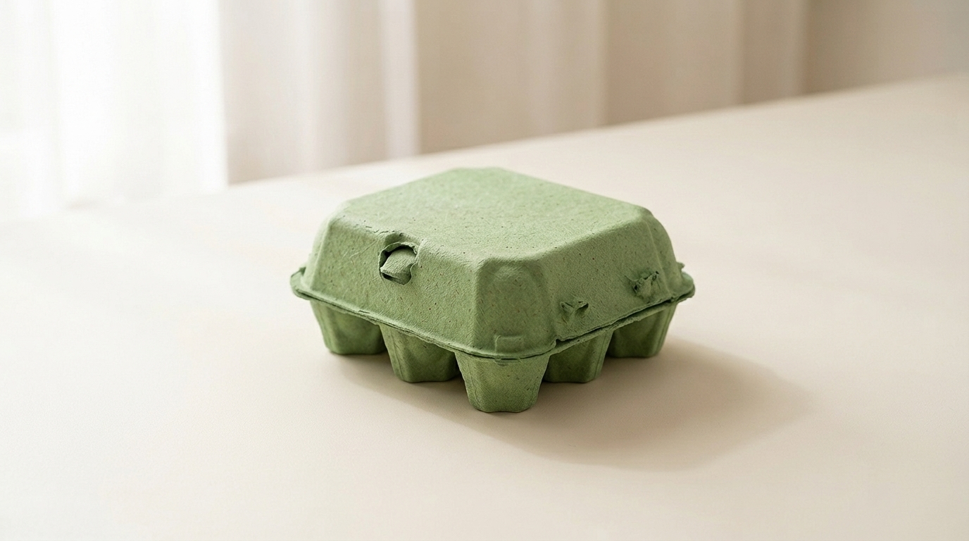
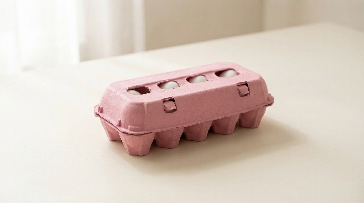
Yes, and sage in particular is one of the combinations we run most often. The muted shade suits the period profile better than a bright green does, since mid century cartons were produced in natural fiber tones rather than saturated colors.
バガス、竹、再生紙などの生分解性素材を使用したウェットプレス加工は、滑らかな仕上がり、保護、クッション性、省スペースで環境に優しいパッケージを提供する。
プラスチックや発泡スチロールに代わる成型パルプ製品は、リサイクル可能で生分解性のオプションを提供します。特注の形状、色、環境に優しい表面加工も可能です。社内で試作と製造を行い、手頃な価格で持続可能なパッケージを提供します。
バガス、わら、竹から作られた植物繊維食器は、生分解性、堆肥化可能、防水性、耐油性、電子レンジ対応。認定を受け、リサイクル可能で、環境にやさしいスタッキングもできます。
100%の再生材料から作られたドライプレス紙パルプトレーは、プラスチックに代わる環境にやさしく、費用対効果の高い製品です。クッション性、耐熱性、積み重ねが可能で、最大20%のスペースを節約できます。
ボニトパックは、95%の色精度で、ホワイト、ナチュラル、ブラックを含む6色の成形パルプを提供しています。環境にやさしい方法で、安全な漂白を実現しています。ナチュラルとホワイトは食品に最適で、その他はトレイ包装に適しています。
Every carton color is a design decision. Green is the only one that is also a claim, and that creates both an opportunity and a compliance question.
Shoppers read green packaging as a signal about how the product was produced. In eggs specifically, it maps onto organic, free range, and pasture raised, because those are the categories the color has been used for across decades of food retail.
For a producer who genuinely holds those credentials, green does work that no other shade does. It communicates the positioning before the shopper reads a word, which is the whole point of packaging color.
For a producer who does not hold them, green risks implying a claim the product cannot support. Several jurisdictions treat implied environmental and welfare claims through packaging design as within the scope of advertising regulation, not outside it. The color alone is unlikely to trigger action, but green plus suggestive imagery plus vague wording has drawn attention in multiple markets.
Our advice is straightforward: use green if the claim is true and stated, and choose a different shade if it is not. We are not in a position to assess your certification, and we supply the carton either way, but the risk sits with the producer and it is worth naming.
淡いセージ色 is muted and soft, closer to a gray-green than a bright one. It reads as understated and premium rather than as an environmental signal, which makes it the safest green for producers who want the tone without the implied claim. It also sits well against natural pulp in a mixed range.
ミッドグリーン is the clearest organic signal in the palette. It is what most buyers mean when they ask for green, and it is the shade that does the communicating work described above.
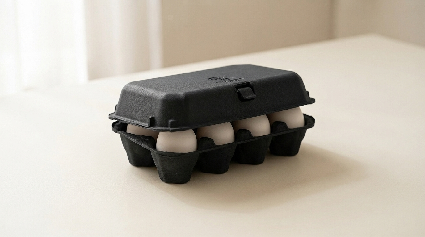
深い森 behaves more like navy than like green. Strong emboss performance, good white print contrast, and a premium rather than natural reading. Heritage and estate brands use it more than organic producers do.
Green is the most forgiving shade in the range for shell color, which is a practical advantage for producers running mixed flocks.
Brown eggs against green is the combination most buyers picture, and it works because the two sit on opposite sides of the color wheel without clashing. It looks agricultural in the intended sense.
White eggs against forest green produce strong contrast and a clean, graphic result.
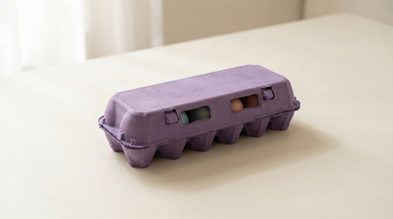
Blue and olive shells against sage produce a tonal effect similar to the pale blue option, since olive shells carry a green cast themselves. Producers with Olive Egger flocks often specify sage for exactly this.
There is no shell color that looks poor in a green carton, which cannot be said of pink or pale blue.
Forest green holds embossed detail nearly as well as navy, for the same reason: tonal depth lets the shadow stay dark at the edge of the mark.
Sage is light enough that embossing reads softly, and it needs a dark ink for printed contrast. Black on sage is clean. Cream or off-white on sage is a softer combination that heritage brands use.
Mid green sits in the same awkward middle that mid blue does, too dark for strong black contrast and too light for white to read cleanly. Buyers specifying mid green for its signal value should plan on a printed label or a bold single color design rather than relying on subtle emboss.
Green is the shade most often ordered as part of a two color system rather than alone, and the pairings that work are worth knowing.
Sage with natural pulp is the most common. The two sit close enough to read as a family, which lets a producer run an organic line and a standard line that look related rather than unrelated.
Forest with cream or white gives a stronger separation for producers who want their premium tier to be visibly distinct.
The pairing to avoid is mid green with sage, where the two are close enough that shoppers read them as the same product in inconsistent packaging rather than as two tiers.
Organic and pasture raised retail is the obvious channel, and green is close to a default there.
Farmers markets are the second, where green reads as agricultural and sits comfortably against produce on an adjacent stall.
Specialty grocery uses sage and forest for premium lines, where the understated end of the range signals quality rather than category.
The channel where green works least is commodity retail, where it competes against established national brands that already own the color in the shopper’s memory.
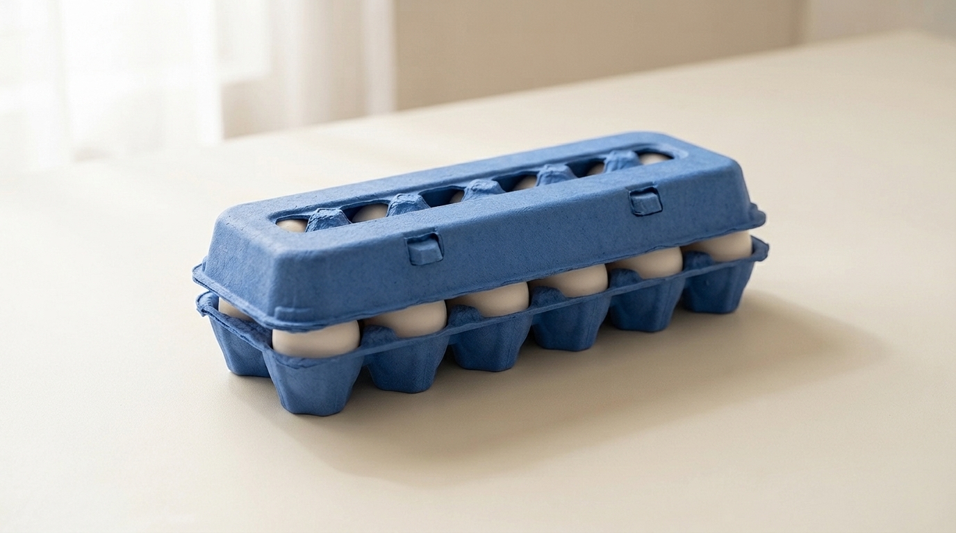
Green works across the whole range. For organic lines the molded pulp dozen egg carton is the volume anchor, with the molded pulp 6 egg carton for premium and smaller packs.
Sage on molded pulp vintage egg cartons is one of the most requested combinations we run, since the muted shade and the retro profile reinforce each other for farm direct sellers.
For the full pigment and shade control detail see molded pulp colored egg cartons, and for print specifications see オーダーメイドの卵パック.

Every carton color is a design decision. Green is the only one that is also a claim, and that creates both an opportunity and a compliance question.
Shoppers read green packaging as a signal about how the product was produced. In eggs specifically, it maps onto organic, free range, and pasture raised, because those are the categories the color has been used for across decades of food retail.
For a producer who genuinely holds those credentials, green does work that no other shade does. It communicates the positioning before the shopper reads a word, which is the whole point of packaging color.
For a producer who does not hold them, green risks implying a claim the product cannot support. Several jurisdictions treat implied environmental and welfare claims through packaging design as within the scope of advertising regulation, not outside it. The color alone is unlikely to trigger action, but green plus suggestive imagery plus vague wording has drawn attention in multiple markets.
Our advice is straightforward: use green if the claim is true and stated, and choose a different shade if it is not. We are not in a position to assess your certification, and we supply the carton either way, but the risk sits with the producer and it is worth naming.
淡いセージ色 is muted and soft, closer to a gray-green than a bright one. It reads as understated and premium rather than as an environmental signal, which makes it the safest green for producers who want the tone without the implied claim. It also sits well against natural pulp in a mixed range.
ミッドグリーン is the clearest organic signal in the palette. It is what most buyers mean when they ask for green, and it is the shade that does the communicating work described above.
深い森 behaves more like navy than like green. Strong emboss performance, good white print contrast, and a premium rather than natural reading. Heritage and estate brands use it more than organic producers do.
Green is the most forgiving shade in the range for shell color, which is a practical advantage for producers running mixed flocks.
Brown eggs against green is the combination most buyers picture, and it works because the two sit on opposite sides of the color wheel without clashing. It looks agricultural in the intended sense.
White eggs against forest green produce strong contrast and a clean, graphic result.
Blue and olive shells against sage produce a tonal effect similar to the pale blue option, since olive shells carry a green cast themselves. Producers with Olive Egger flocks often specify sage for exactly this.
There is no shell color that looks poor in a green carton, which cannot be said of pink or pale blue.
Forest green holds embossed detail nearly as well as navy, for the same reason: tonal depth lets the shadow stay dark at the edge of the mark.
Sage is light enough that embossing reads softly, and it needs a dark ink for printed contrast. Black on sage is clean. Cream or off-white on sage is a softer combination that heritage brands use.
Mid green sits in the same awkward middle that mid blue does, too dark for strong black contrast and too light for white to read cleanly. Buyers specifying mid green for its signal value should plan on a printed label or a bold single color design rather than relying on subtle emboss.
Green is the shade most often ordered as part of a two color system rather than alone, and the pairings that work are worth knowing.
Sage with natural pulp is the most common. The two sit close enough to read as a family, which lets a producer run an organic line and a standard line that look related rather than unrelated.
Forest with cream or white gives a stronger separation for producers who want their premium tier to be visibly distinct.
The pairing to avoid is mid green with sage, where the two are close enough that shoppers read them as the same product in inconsistent packaging rather than as two tiers.
Organic and pasture raised retail is the obvious channel, and green is close to a default there.
Farmers markets are the second, where green reads as agricultural and sits comfortably against produce on an adjacent stall.
Specialty grocery uses sage and forest for premium lines, where the understated end of the range signals quality rather than category.
The channel where green works least is commodity retail, where it competes against established national brands that already own the color in the shopper’s memory.
Green works across the whole range. For organic lines the molded pulp dozen egg carton is the volume anchor, with the molded pulp 6 egg carton for premium and smaller packs.
Sage on molded pulp vintage egg cartons is one of the most requested combinations we run, since the muted shade and the retro profile reinforce each other for farm direct sellers.
For the full pigment and shade control detail see molded pulp colored egg cartons, and for print specifications see オーダーメイドの卵パック.

24時間以内に対応し、迅速で明確なコミュニケーション、オーダーメイドのソリューション、時間とコストを節約する効率的なサービスを提供します。
社内で設計、エンジニアリング、製造を行っているため、迅速な金型製作が可能で、サンプルは7日、生産用金型は8日で完成する。
当社の熟練したR&Dエンジニアは、設計、試作、金型製作に優れており、ブリスター、ブリキ缶、印刷箱など、完全なパッケージング・ソリューションを提供しています。
訓練を受けたスタッフが100%検査、抜き取り検査、品質管理を行い、高い水準を確保し、不良品を減らし、コストを削減する。
合理的な受注スケジュールを提供し、お客様と調整しながら問題を迅速に解決し、最善のソリューションを確保します。
経験豊富なアフターセールス・チームがスムーズなコミュニケーションを図り、交換や発送、配送に関する問題を解決し、クレームゼロを目指します。
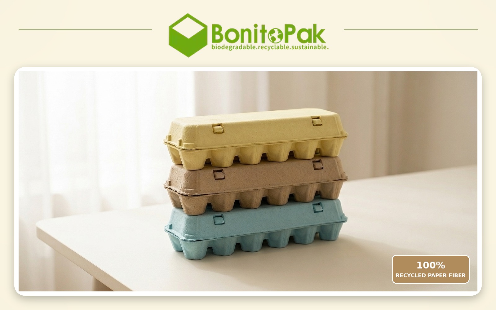
BonitoPak シニアパッケージングコンサルタント、レオ・チャン著。最終更新日:2026年11月。12個入りの卵パックには
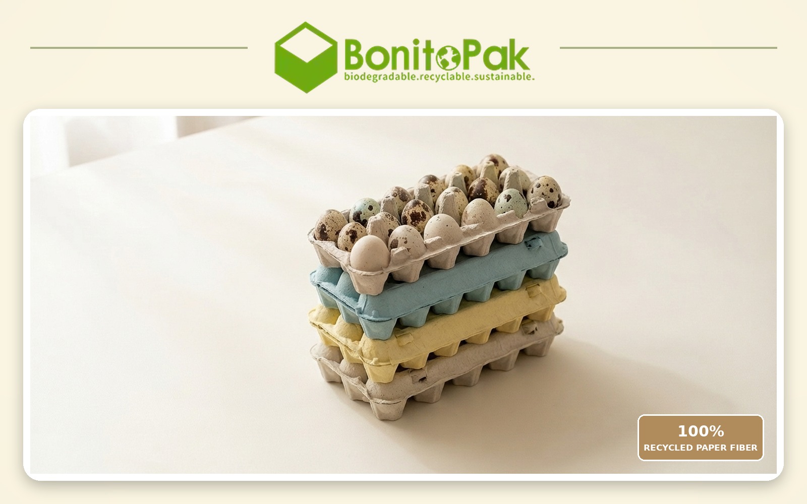
BonitoPak シニアパッケージングコンサルタント、レオ・チャン著。最終更新日:2026年11月。ウズラの卵用カートンは成形されています。
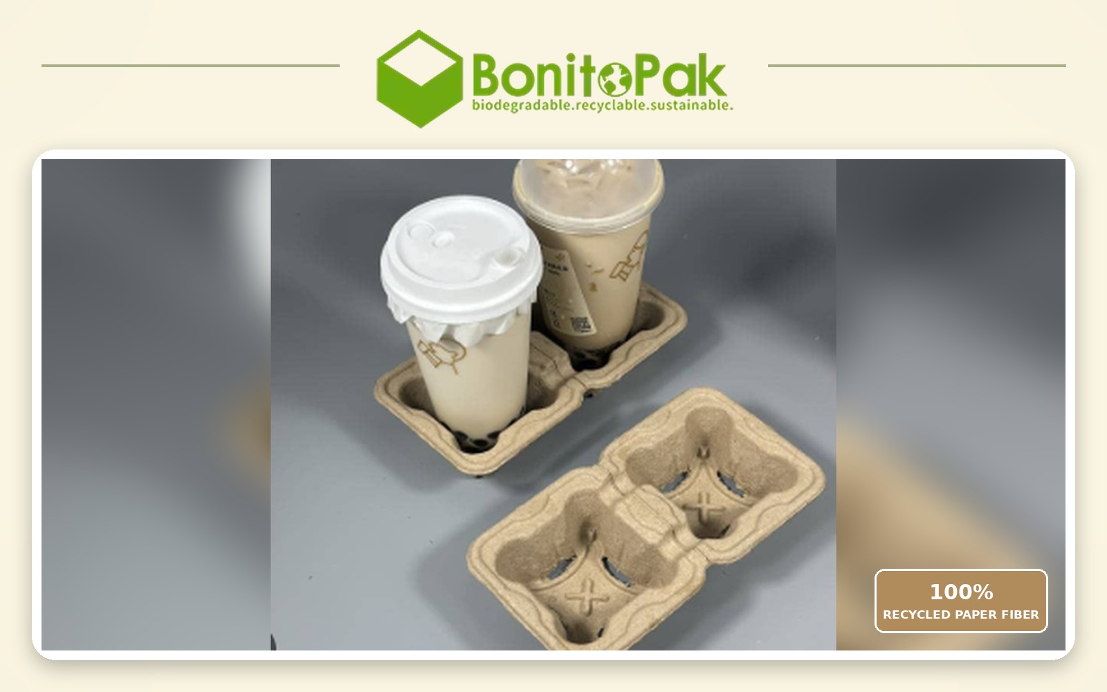
BonitoPak シニアパッケージングコンサルタント、レオ・チャン著。最終更新日:2026年11月。成形パルプ製カップ用キャリア
Is green available in the vintage flat top profile?
Yes, and sage in particular is one of the combinations we run most often. The muted shade suits the period profile better than a bright green does, since mid century cartons were produced in natural fiber tones rather than saturated colors.
Can you match the green used by a specific brand?
We match to a Pantone reference or a physical sample as closely as pigmented fiber allows, and we send a formed sample for approval before production. Exact ink matching is not achievable in pulp. If the reference is a competitor’s carton rather than a printed standard, send us the physical carton and we will match against it directly.
Will green fade faster than other shades?
It sits better than blue and worse than black. Green pigments rated for compostable use have moderate lightfastness, so forest holds up well and sage shows lightening soonest under sustained direct sun. In refrigerated retail none of the range is affected.
Which green do most organic producers choose?
Mid green, because it is the shade that carries the category signal most clearly. Producers positioning above the category on quality rather than on method more often choose sage or forest, which read as premium rather than as organic.
Does a green carton help an organic certification claim?
No. Certification is granted on production practice and audited independently, and packaging color has no bearing on it. What green does is communicate a claim you already hold more quickly at the shelf. The certification mark itself still has to appear on the pack according to your certifier’s rules.