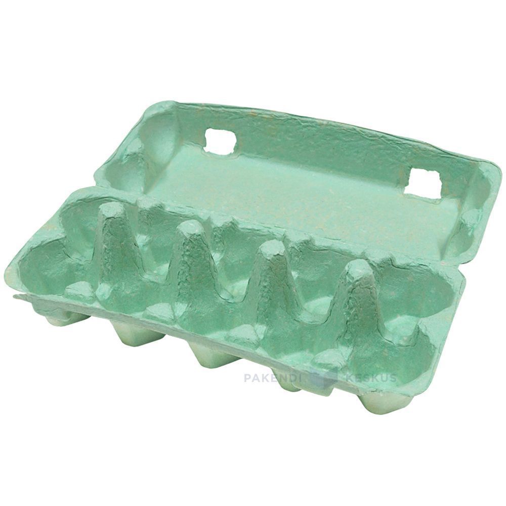
Green Egg Cartons

  • Shade range from pale sage through mid green to deep forest
  • Pigment blended into the slurry, so color survives scuffing and shipping
  • The shade most associated with organic, pasture raised, and free range lines
  • Forest green holds embossed detail sharply, close to navy performance
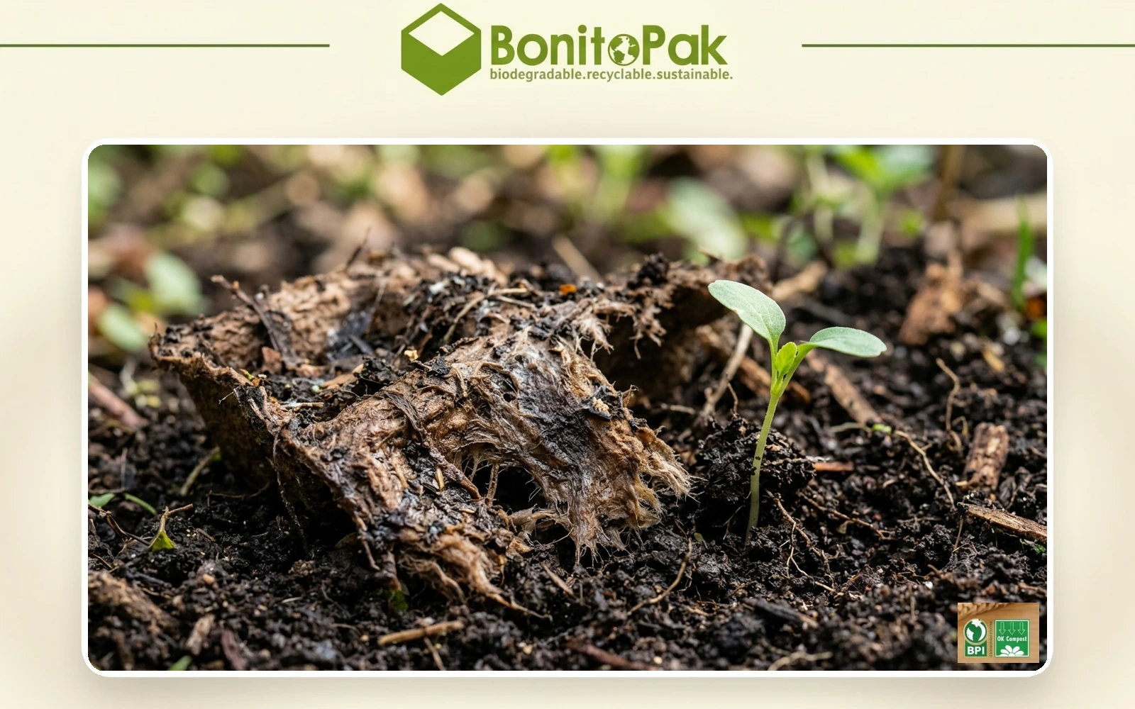
  • Compostable and plastic free, with no surface coating
  • Available across every cell count from 4 through 20
  • OEM and ODM sizing accepted; retained shade standards kept for reorders

公共金型

パッケージング・ソリューション

3Dデザイン

カスタマイズされた型

Green egg cartons in molded pulp holding brown eggs with the lid open

商品説明

仕様 詳細
ブランド名 ボニートパック
モデル番号 EC-GRN series
製品名 Green Egg Cartons / Green Pigmented Pulp Cartons
素材 スラリー混合顔料を配合した再生紙パルプ
テクニック 成形パルプ成形(湿式プレス)、湿式着色
細胞数 4, 6, 10, 12, 18, or 20 cells
シェードのバリエーション Pale sage, mid green, deep forest; custom shades matched
カラー法 成形前にスラリーに顔料を混ぜ込んでおり、表面コーティングは施されていません
Lightfastness Good across the range; forest most stable
印刷のコントラスト Strong with white on forest; black or cream on sage
ロゴ印刷 エンボス加工、デボス加工、またはフレキソ印刷
工業用 Organic producers, pasture raised brands, farm direct, specialty grocery
申し込み Organic and free range lines, farm brand identity, seasonal ranges
メリット 生分解性、家庭用コンポスト対応、プラスチック不使用、コーティングなし
カスタムオーダー 受理済み
MOQ Confirm with sales; stock green carries a lower minimum than custom shades

ギャラリー Green Egg Cartons 部品

このギャラリーは、私たちがすべてのプロジェクトで提供する卓越した品質と細部へのこだわりを紹介しています。複雑なデザインから完璧な仕上げまで、どの画像も私たちの卓越性へのこだわりを反映しています。 Green Egg Cartons .

40%

コストと時間の節約

お客様のコストと時間を最適化し、効率的なプロセスを実現し、ROIを最大化する最先端のパッケージングソリューションをご体験ください。

50%

より持続可能な

持続可能な素材で環境に優しいパッケージを実現し、廃棄物を削減し、製品ライン全体で環境への責任を推進します。

25%

売上の増加

小売市場でもオンライン市場でも、視認性と売上を高める革新的なデザインで、商品の棚へのアピールを強化しましょう。

100%

より高い信頼性

BonitoPakの品質へのコミットメントを信頼し、すべての製品が一貫した信頼できるサービスで当社の高い基準を満たすことを保証します。

The shade that carries a meaning

Every carton color is a design decision. Green is the only one that is also a claim, and that creates both an opportunity and a compliance question.

Shoppers read green packaging as a signal about how the product was produced. In eggs specifically, it maps onto organic, free range, and pasture raised, because those are the categories the color has been used for across decades of food retail.

For a producer who genuinely holds those credentials, green does work that no other shade does. It communicates the positioning before the shopper reads a word, which is the whole point of packaging color.

For a producer who does not hold them, green risks implying a claim the product cannot support. Several jurisdictions treat implied environmental and welfare claims through packaging design as within the scope of advertising regulation, not outside it. The color alone is unlikely to trigger action, but green plus suggestive imagery plus vague wording has drawn attention in multiple markets.

Our advice is straightforward: use green if the claim is true and stated, and choose a different shade if it is not. We are not in a position to assess your certification, and we supply the carton either way, but the risk sits with the producer and it is worth naming.

Three shades and what each is for

Pale sage is muted and soft, closer to a gray-green than a bright one. It reads as understated and premium rather than as an environmental signal, which makes it the safest green for producers who want the tone without the implied claim. It also sits well against natural pulp in a mixed range.

Mid green is the clearest organic signal in the palette. It is what most buyers mean when they ask for green, and it is the shade that does the communicating work described above.

Deep forest behaves more like navy than like green. Strong emboss performance, good white print contrast, and a premium rather than natural reading. Heritage and estate brands use it more than organic producers do.

Shell color interaction

Green is the most forgiving shade in the range for shell color, which is a practical advantage for producers running mixed flocks.

Brown eggs against green is the combination most buyers picture, and it works because the two sit on opposite sides of the color wheel without clashing. It looks agricultural in the intended sense.

White eggs against forest green produce strong contrast and a clean, graphic result.

Blue and olive shells against sage produce a tonal effect similar to the pale blue option, since olive shells carry a green cast themselves. Producers with Olive Egger flocks often specify sage for exactly this.

There is no shell color that looks poor in a green carton, which cannot be said of pink or pale blue.

Print and emboss behavior

Forest green holds embossed detail nearly as well as navy, for the same reason: tonal depth lets the shadow stay dark at the edge of the mark.

Sage is light enough that embossing reads softly, and it needs a dark ink for printed contrast. Black on sage is clean. Cream or off-white on sage is a softer combination that heritage brands use.

Mid green sits in the same awkward middle that mid blue does, too dark for strong black contrast and too light for white to read cleanly. Buyers specifying mid green for its signal value should plan on a printed label or a bold single color design rather than relying on subtle emboss.

Green against the rest of a range

Green is the shade most often ordered as part of a two color system rather than alone, and the pairings that work are worth knowing.

Sage with natural pulp is the most common. The two sit close enough to read as a family, which lets a producer run an organic line and a standard line that look related rather than unrelated.

Forest with cream or white gives a stronger separation for producers who want their premium tier to be visibly distinct.

The pairing to avoid is mid green with sage, where the two are close enough that shoppers read them as the same product in inconsistent packaging rather than as two tiers.

Where green sells hardest

Organic and pasture raised retail is the obvious channel, and green is close to a default there.

Farmers markets are the second, where green reads as agricultural and sits comfortably against produce on an adjacent stall.

Specialty grocery uses sage and forest for premium lines, where the understated end of the range signals quality rather than category.

The channel where green works least is commodity retail, where it competes against established national brands that already own the color in the shopper’s memory.

Pairing with format

Green works across the whole range. For organic lines the molded pulp dozen egg carton is the volume anchor, with the molded pulp 6 egg carton for premium and smaller packs.

Sage on molded pulp vintage egg cartons is one of the most requested combinations we run, since the muted shade and the retro profile reinforce each other for farm direct sellers.

For the full pigment and shade control detail see molded pulp colored egg cartons, and for print specifications see custom printed egg cartons.

The shade that carries a meaning

Every carton color is a design decision. Green is the only one that is also a claim, and that creates both an opportunity and a compliance question.

Shoppers read green packaging as a signal about how the product was produced. In eggs specifically, it maps onto organic, free range, and pasture raised, because those are the categories the color has been used for across decades of food retail.

For a producer who genuinely holds those credentials, green does work that no other shade does. It communicates the positioning before the shopper reads a word, which is the whole point of packaging color.

For a producer who does not hold them, green risks implying a claim the product cannot support. Several jurisdictions treat implied environmental and welfare claims through packaging design as within the scope of advertising regulation, not outside it. The color alone is unlikely to trigger action, but green plus suggestive imagery plus vague wording has drawn attention in multiple markets.

Our advice is straightforward: use green if the claim is true and stated, and choose a different shade if it is not. We are not in a position to assess your certification, and we supply the carton either way, but the risk sits with the producer and it is worth naming.

Three shades and what each is for

Pale sage is muted and soft, closer to a gray-green than a bright one. It reads as understated and premium rather than as an environmental signal, which makes it the safest green for producers who want the tone without the implied claim. It also sits well against natural pulp in a mixed range.

Mid green is the clearest organic signal in the palette. It is what most buyers mean when they ask for green, and it is the shade that does the communicating work described above.

Deep forest behaves more like navy than like green. Strong emboss performance, good white print contrast, and a premium rather than natural reading. Heritage and estate brands use it more than organic producers do.

Shell color interaction

Green is the most forgiving shade in the range for shell color, which is a practical advantage for producers running mixed flocks.

Brown eggs against green is the combination most buyers picture, and it works because the two sit on opposite sides of the color wheel without clashing. It looks agricultural in the intended sense.

White eggs against forest green produce strong contrast and a clean, graphic result.

Blue and olive shells against sage produce a tonal effect similar to the pale blue option, since olive shells carry a green cast themselves. Producers with Olive Egger flocks often specify sage for exactly this.

There is no shell color that looks poor in a green carton, which cannot be said of pink or pale blue.

Print and emboss behavior

Forest green holds embossed detail nearly as well as navy, for the same reason: tonal depth lets the shadow stay dark at the edge of the mark.

Sage is light enough that embossing reads softly, and it needs a dark ink for printed contrast. Black on sage is clean. Cream or off-white on sage is a softer combination that heritage brands use.

Mid green sits in the same awkward middle that mid blue does, too dark for strong black contrast and too light for white to read cleanly. Buyers specifying mid green for its signal value should plan on a printed label or a bold single color design rather than relying on subtle emboss.

Green against the rest of a range

Green is the shade most often ordered as part of a two color system rather than alone, and the pairings that work are worth knowing.

Sage with natural pulp is the most common. The two sit close enough to read as a family, which lets a producer run an organic line and a standard line that look related rather than unrelated.

Forest with cream or white gives a stronger separation for producers who want their premium tier to be visibly distinct.

The pairing to avoid is mid green with sage, where the two are close enough that shoppers read them as the same product in inconsistent packaging rather than as two tiers.

Where green sells hardest

Organic and pasture raised retail is the obvious channel, and green is close to a default there.

Farmers markets are the second, where green reads as agricultural and sits comfortably against produce on an adjacent stall.

Specialty grocery uses sage and forest for premium lines, where the understated end of the range signals quality rather than category.

The channel where green works least is commodity retail, where it competes against established national brands that already own the color in the shopper’s memory.

Pairing with format

Green works across the whole range. For organic lines the molded pulp dozen egg carton is the volume anchor, with the molded pulp 6 egg carton for premium and smaller packs.

Sage on molded pulp vintage egg cartons is one of the most requested combinations we run, since the muted shade and the retro profile reinforce each other for farm direct sellers.

For the full pigment and shade control detail see molded pulp colored egg cartons, and for print specifications see custom printed egg cartons.

材料 Green Egg Cartons 部品

BonitoPakは、一流企業やエンジニアから、迅速な試作と耐久性のある高品質な部品として信頼を得ています。プロトタイピングであれ、本格的な生産であれ、当社の幅広い材料は、どのようなものでもユニークな要件を満たすことを保証します。 Green Egg Cartons プロジェクトを正確かつ迅速に実行する。

生分解性クラフト紙は、当社が製造する繊維製品の中で最も強度が高いものです。バージン

着色パルプは、独立した繊維ではありません。これは、当社の

部品が以下の条件を満たす必要がある場合は、漂白パルプを指定する必要があります。

天然植物繊維とは、当社がブレンドに用いる、木材以外のセルロース源を指します。

成形パルプ材料としての段ボール紙とは、回収された段ボール箱を再パルプ化したものを指す。

わら繊維は、穀物の収穫後に残る茎から作られる素材です。

カスタム エコフレンドリー 信頼性

環境に優しいカスタム包装

フルカスタマイズ

特定のニーズに合わせて、スタイル、サイズ、色、仕上げをカスタマイズできます。

エキスパート・サポート

ボニトパックはパッケージング効率を最大化し、ROIを高めるために、専門的なデザインとロジスティクスのアドバイスを提供します。

エコ・ソリューション

環境への影響を減らし、ブランドのグリーン目標をサポートするために、持続可能で環境に優しいパッケージを選びましょう。

品質保証

ボニトパックはすべてのパッケージング・ソリューションにおいて、最高品質のサービスと卓越した製品を保証します。

よくある質問

Green Egg Cartons

  • Is green available in the vintage flat top profile?

    Yes, and sage in particular is one of the combinations we run most often. The muted shade suits the period profile better than a bright green does, since mid century cartons were produced in natural fiber tones rather than saturated colors.

  • Can you match the green used by a specific brand?

    We match to a Pantone reference or a physical sample as closely as pigmented fiber allows, and we send a formed sample for approval before production. Exact ink matching is not achievable in pulp. If the reference is a competitor’s carton rather than a printed standard, send us the physical carton and we will match against it directly.

  • Will green fade faster than other shades?

     It sits better than blue and worse than black. Green pigments rated for compostable use have moderate lightfastness, so forest holds up well and sage shows lightening soonest under sustained direct sun. In refrigerated retail none of the range is affected.

  • Which green do most organic producers choose?

     Mid green, because it is the shade that carries the category signal most clearly. Producers positioning above the category on quality rather than on method more often choose sage or forest, which read as premium rather than as organic.

  • Does a green carton help an organic certification claim?

    No. Certification is granted on production practice and audited independently, and packaging color has no bearing on it. What green does is communicate a claim you already hold more quickly at the shelf. The certification mark itself still has to appear on the pack according to your certifier’s rules.

生分解性の結果

0日

7日

14日

30日

専門産業

数百万個の部品を製造してきたBonitoPakは、数多くの用途において深い知識を有しています。特に精密で複雑な部品加工を必要とする業界を得意としています。どのような複雑さであっても、専門知識と品質を提供する私たちを信頼してください。

OEMおよびODMパッケージング・ソリューション

Bonitopakはカスタム(OEM)とプレデザイン(ODM)の両方のパッケージングソリューションを提供しています。完全にオーダーメイドのデザインが必要な場合でも、すぐに使用できるパッケージが必要な場合でも、お客様のブランドのニーズを満たすために、高品質で効率的かつ柔軟なオプションを提供します。

OEMサービス

OEMパッケージング・ソリューションは、お客様の特定の要件を満たすように設計・製造された完全なカスタマイズ製品を作成することができます。ボニトパックでは、デザイン、プロトタイピング、製造プロセスを通して包括的なサポートを提供し、お客様のパッケージがブランドのユニークなアイデンティティを反映することを保証します。当社の精密製造能力は、デザインの複雑さにかかわらず、高品質で一貫した製造を保証します。エンド・ツー・エンドのサービスにより、コンセプトから納品まですべてを処理し、お客様のパッケージング・ニーズの合理化を支援します。

ODMサービス

ODMパッケージング・ソリューションは、お客様のブランド要件に合わせたデザイン済みの製品を提供します。Bonitopakの革新的なデザインの専門知識と効率的な生産プロセスにより、すぐに使用できる幅広いパッケージングオプションから選択することができます。当社は柔軟なカスタマイズを提供し、お客様のブランドを追加したり、さまざまな仕上げ、色、サイズから選択することができます。このソリューションにより、お客様のブランド基準を満たす高品質のパッケージングを確保しながら、時間とコストを節約することができます。
あなたのプロジェクトを向上させる準備はできていますか?

BonitoPakでデザインに命を吹き込もう

BonitoPakで精密なエンジニアリングを体験してください。詳細なプロトタイプから大量生産まで、お客様のコンセプトを現実にします。今すぐお問い合わせください!

製品カテゴリー

成型パルプトレイ、食品包装、カスタムデザイン、持続可能なオプションなど、Bonitopakの多様なパッケージングソリューションをご覧ください。各カテゴリーは、耐久性、機能性、環境への責任を考慮し、お客様の特定のニーズに合わせて作られています。

The shade that carries a meaning

Every carton color is a design decision. Green is the only one that is also a claim, and that creates both an opportunity and a compliance question.

Shoppers read green packaging as a signal about how the product was produced. In eggs specifically, it maps onto organic, free range, and pasture raised, because those are the categories the color has been used for across decades of food retail.

For a producer who genuinely holds those credentials, green does work that no other shade does. It communicates the positioning before the shopper reads a word, which is the whole point of packaging color.

For a producer who does not hold them, green risks implying a claim the product cannot support. Several jurisdictions treat implied environmental and welfare claims through packaging design as within the scope of advertising regulation, not outside it. The color alone is unlikely to trigger action, but green plus suggestive imagery plus vague wording has drawn attention in multiple markets.

Our advice is straightforward: use green if the claim is true and stated, and choose a different shade if it is not. We are not in a position to assess your certification, and we supply the carton either way, but the risk sits with the producer and it is worth naming.

Three shades and what each is for

Pale sage is muted and soft, closer to a gray-green than a bright one. It reads as understated and premium rather than as an environmental signal, which makes it the safest green for producers who want the tone without the implied claim. It also sits well against natural pulp in a mixed range.

Mid green is the clearest organic signal in the palette. It is what most buyers mean when they ask for green, and it is the shade that does the communicating work described above.

Deep forest behaves more like navy than like green. Strong emboss performance, good white print contrast, and a premium rather than natural reading. Heritage and estate brands use it more than organic producers do.

Shell color interaction

Green is the most forgiving shade in the range for shell color, which is a practical advantage for producers running mixed flocks.

Brown eggs against green is the combination most buyers picture, and it works because the two sit on opposite sides of the color wheel without clashing. It looks agricultural in the intended sense.

White eggs against forest green produce strong contrast and a clean, graphic result.

Blue and olive shells against sage produce a tonal effect similar to the pale blue option, since olive shells carry a green cast themselves. Producers with Olive Egger flocks often specify sage for exactly this.

There is no shell color that looks poor in a green carton, which cannot be said of pink or pale blue.

Print and emboss behavior

Forest green holds embossed detail nearly as well as navy, for the same reason: tonal depth lets the shadow stay dark at the edge of the mark.

Sage is light enough that embossing reads softly, and it needs a dark ink for printed contrast. Black on sage is clean. Cream or off-white on sage is a softer combination that heritage brands use.

Mid green sits in the same awkward middle that mid blue does, too dark for strong black contrast and too light for white to read cleanly. Buyers specifying mid green for its signal value should plan on a printed label or a bold single color design rather than relying on subtle emboss.

Green against the rest of a range

Green is the shade most often ordered as part of a two color system rather than alone, and the pairings that work are worth knowing.

Sage with natural pulp is the most common. The two sit close enough to read as a family, which lets a producer run an organic line and a standard line that look related rather than unrelated.

Forest with cream or white gives a stronger separation for producers who want their premium tier to be visibly distinct.

The pairing to avoid is mid green with sage, where the two are close enough that shoppers read them as the same product in inconsistent packaging rather than as two tiers.

Where green sells hardest

Organic and pasture raised retail is the obvious channel, and green is close to a default there.

Farmers markets are the second, where green reads as agricultural and sits comfortably against produce on an adjacent stall.

Specialty grocery uses sage and forest for premium lines, where the understated end of the range signals quality rather than category.

The channel where green works least is commodity retail, where it competes against established national brands that already own the color in the shopper’s memory.

Pairing with format

Green works across the whole range. For organic lines the molded pulp dozen egg carton is the volume anchor, with the molded pulp 6 egg carton for premium and smaller packs.

Sage on molded pulp vintage egg cartons is one of the most requested combinations we run, since the muted shade and the retro profile reinforce each other for farm direct sellers.

For the full pigment and shade control detail see molded pulp colored egg cartons, and for print specifications see custom printed egg cartons.

関連記事と洞察

持続可能なパッケージングのトレンド、業界の洞察、専門家のヒントに関する最新情報をブログでお届けします。革新的なアイデアやソリューションを探求し、パッケージングの知識を深めましょう。

レオ・チャン | BonitoPak ライター | 成形パルプ包装業界で20年以上の経験を持つ ウォッカとは

レオ・チャン | BonitoPak ライター | 成形パルプ包装業界で20年以上の経験 ほぼすべての

レオ・チャン | BonitoPak ライター | 成形パルプ包装分野で20年以上の経験 検索

よくある質問

Green Egg Cartons

  • Is green available in the vintage flat top profile?

    Yes, and sage in particular is one of the combinations we run most often. The muted shade suits the period profile better than a bright green does, since mid century cartons were produced in natural fiber tones rather than saturated colors.

  • Can you match the green used by a specific brand?

    We match to a Pantone reference or a physical sample as closely as pigmented fiber allows, and we send a formed sample for approval before production. Exact ink matching is not achievable in pulp. If the reference is a competitor’s carton rather than a printed standard, send us the physical carton and we will match against it directly.

  • Will green fade faster than other shades?

     It sits better than blue and worse than black. Green pigments rated for compostable use have moderate lightfastness, so forest holds up well and sage shows lightening soonest under sustained direct sun. In refrigerated retail none of the range is affected.

  • Which green do most organic producers choose?

     Mid green, because it is the shade that carries the category signal most clearly. Producers positioning above the category on quality rather than on method more often choose sage or forest, which read as premium rather than as organic.

  • Does a green carton help an organic certification claim?

    No. Certification is granted on production practice and audited independently, and packaging color has no bearing on it. What green does is communicate a claim you already hold more quickly at the shelf. The certification mark itself still has to appear on the pack according to your certifier’s rules.

詳細フォーム