Green Egg Cartons

  • Shade range from pale sage through mid green to deep forest
  • Pigment blended into the slurry, so color survives scuffing and shipping
  • The shade most associated with organic, pasture raised, and free range lines
  • Forest green holds embossed detail sharply, close to navy performance
  • Compostable and plastic free, with no surface coating
  • Available across every cell count from 4 through 20
  • OEM and ODM sizing accepted; retained shade standards kept for reorders

Public Mould

Packaging Solutions

3D Design

Customized Mould

Green egg cartons in molded pulp holding brown eggs with the lid open

Product Description

Specification Details
Brand Name BonitoPak
Model Number EC-GRN series
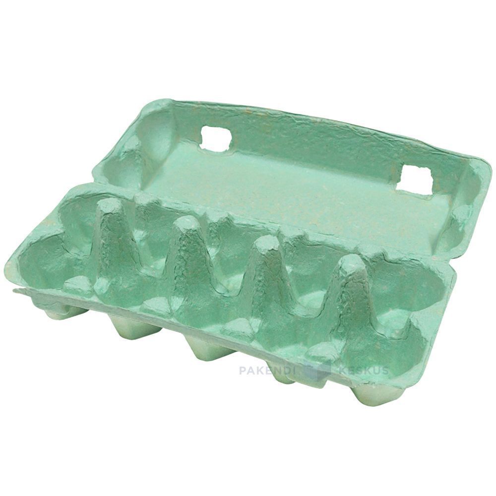
Product Name Green Egg Cartons / Green Pigmented Pulp Cartons
Material Recycled paper pulp with slurry-blended pigment
Technique Molded pulp forming (wet-pressed), wet end pigmentation
Cell Count 4, 6, 10, 12, 18, or 20 cells
Shade Range Pale sage, mid green, deep forest; custom shades matched
Color Method Pigment blended into slurry before forming, not surface coated
Lightfastness Good across the range; forest most stable
Print Contrast Strong with white on forest; black or cream on sage
Logo Printing Embossed, debossed, or flexographic print
Industrial Use Organic producers, pasture raised brands, farm direct, specialty grocery
Application Organic and free range lines, farm brand identity, seasonal ranges
Advantages Biodegradable, home compostable, plastic free, no coating
Custom Order Accepted
MOQ Confirm with sales; stock green carries a lower minimum than custom shades

Gallery of Green Egg Cartons parts

This gallery showcases the exceptional quality and attention to detail we deliver in every project. From complex designs to flawless finishes, each image reflects our commitment to excellence in Green Egg Cartons .

40%

Cost & Time Saved

Experience leading packaging solutions that optimize your costs and time, delivering efficient processes and maximizing your ROI.

50%

More sustainable

Achieve eco-friendly packaging with sustainable materials, reducing waste and promoting environmental responsibility across your product lines.

25%

Increase in Sales

Enhance your product’s shelf appeal with innovative designs that boost visibility and sales in both retail and online markets.

100%

More Reliable

Trust in BonitoPak’s commitment to quality, ensuring that every product meets our high standards with consistent, reliable service.

The shade that carries a meaning

Every carton color is a design decision. Green is the only one that is also a claim, and that creates both an opportunity and a compliance question.

Shoppers read green packaging as a signal about how the product was produced. In eggs specifically, it maps onto organic, free range, and pasture raised, because those are the categories the color has been used for across decades of food retail.

For a producer who genuinely holds those credentials, green does work that no other shade does. It communicates the positioning before the shopper reads a word, which is the whole point of packaging color.

For a producer who does not hold them, green risks implying a claim the product cannot support. Several jurisdictions treat implied environmental and welfare claims through packaging design as within the scope of advertising regulation, not outside it. The color alone is unlikely to trigger action, but green plus suggestive imagery plus vague wording has drawn attention in multiple markets.

Our advice is straightforward: use green if the claim is true and stated, and choose a different shade if it is not. We are not in a position to assess your certification, and we supply the carton either way, but the risk sits with the producer and it is worth naming.

Three shades and what each is for

Pale sage is muted and soft, closer to a gray-green than a bright one. It reads as understated and premium rather than as an environmental signal, which makes it the safest green for producers who want the tone without the implied claim. It also sits well against natural pulp in a mixed range.

Mid green is the clearest organic signal in the palette. It is what most buyers mean when they ask for green, and it is the shade that does the communicating work described above.

Deep forest behaves more like navy than like green. Strong emboss performance, good white print contrast, and a premium rather than natural reading. Heritage and estate brands use it more than organic producers do.

Shell color interaction

Green is the most forgiving shade in the range for shell color, which is a practical advantage for producers running mixed flocks.

Brown eggs against green is the combination most buyers picture, and it works because the two sit on opposite sides of the color wheel without clashing. It looks agricultural in the intended sense.

White eggs against forest green produce strong contrast and a clean, graphic result.

Blue and olive shells against sage produce a tonal effect similar to the pale blue option, since olive shells carry a green cast themselves. Producers with Olive Egger flocks often specify sage for exactly this.

There is no shell color that looks poor in a green carton, which cannot be said of pink or pale blue.

Print and emboss behavior

Forest green holds embossed detail nearly as well as navy, for the same reason: tonal depth lets the shadow stay dark at the edge of the mark.

Sage is light enough that embossing reads softly, and it needs a dark ink for printed contrast. Black on sage is clean. Cream or off-white on sage is a softer combination that heritage brands use.

Mid green sits in the same awkward middle that mid blue does, too dark for strong black contrast and too light for white to read cleanly. Buyers specifying mid green for its signal value should plan on a printed label or a bold single color design rather than relying on subtle emboss.

Green against the rest of a range

Green is the shade most often ordered as part of a two color system rather than alone, and the pairings that work are worth knowing.

Sage with natural pulp is the most common. The two sit close enough to read as a family, which lets a producer run an organic line and a standard line that look related rather than unrelated.

Forest with cream or white gives a stronger separation for producers who want their premium tier to be visibly distinct.

The pairing to avoid is mid green with sage, where the two are close enough that shoppers read them as the same product in inconsistent packaging rather than as two tiers.

Where green sells hardest

Organic and pasture raised retail is the obvious channel, and green is close to a default there.

Farmers markets are the second, where green reads as agricultural and sits comfortably against produce on an adjacent stall.

Specialty grocery uses sage and forest for premium lines, where the understated end of the range signals quality rather than category.

The channel where green works least is commodity retail, where it competes against established national brands that already own the color in the shopper’s memory.

Pairing with format

Green works across the whole range. For organic lines the molded pulp dozen egg carton is the volume anchor, with the molded pulp 6 egg carton for premium and smaller packs.

Sage on molded pulp vintage egg cartons is one of the most requested combinations we run, since the muted shade and the retro profile reinforce each other for farm direct sellers.

For the full pigment and shade control detail see molded pulp colored egg cartons, and for print specifications see custom printed egg cartons.

The shade that carries a meaning

Every carton color is a design decision. Green is the only one that is also a claim, and that creates both an opportunity and a compliance question.

Shoppers read green packaging as a signal about how the product was produced. In eggs specifically, it maps onto organic, free range, and pasture raised, because those are the categories the color has been used for across decades of food retail.

For a producer who genuinely holds those credentials, green does work that no other shade does. It communicates the positioning before the shopper reads a word, which is the whole point of packaging color.

For a producer who does not hold them, green risks implying a claim the product cannot support. Several jurisdictions treat implied environmental and welfare claims through packaging design as within the scope of advertising regulation, not outside it. The color alone is unlikely to trigger action, but green plus suggestive imagery plus vague wording has drawn attention in multiple markets.

Our advice is straightforward: use green if the claim is true and stated, and choose a different shade if it is not. We are not in a position to assess your certification, and we supply the carton either way, but the risk sits with the producer and it is worth naming.

Three shades and what each is for

Pale sage is muted and soft, closer to a gray-green than a bright one. It reads as understated and premium rather than as an environmental signal, which makes it the safest green for producers who want the tone without the implied claim. It also sits well against natural pulp in a mixed range.

Mid green is the clearest organic signal in the palette. It is what most buyers mean when they ask for green, and it is the shade that does the communicating work described above.

Deep forest behaves more like navy than like green. Strong emboss performance, good white print contrast, and a premium rather than natural reading. Heritage and estate brands use it more than organic producers do.

Shell color interaction

Green is the most forgiving shade in the range for shell color, which is a practical advantage for producers running mixed flocks.

Brown eggs against green is the combination most buyers picture, and it works because the two sit on opposite sides of the color wheel without clashing. It looks agricultural in the intended sense.

White eggs against forest green produce strong contrast and a clean, graphic result.

Blue and olive shells against sage produce a tonal effect similar to the pale blue option, since olive shells carry a green cast themselves. Producers with Olive Egger flocks often specify sage for exactly this.

There is no shell color that looks poor in a green carton, which cannot be said of pink or pale blue.

Print and emboss behavior

Forest green holds embossed detail nearly as well as navy, for the same reason: tonal depth lets the shadow stay dark at the edge of the mark.

Sage is light enough that embossing reads softly, and it needs a dark ink for printed contrast. Black on sage is clean. Cream or off-white on sage is a softer combination that heritage brands use.

Mid green sits in the same awkward middle that mid blue does, too dark for strong black contrast and too light for white to read cleanly. Buyers specifying mid green for its signal value should plan on a printed label or a bold single color design rather than relying on subtle emboss.

Green against the rest of a range

Green is the shade most often ordered as part of a two color system rather than alone, and the pairings that work are worth knowing.

Sage with natural pulp is the most common. The two sit close enough to read as a family, which lets a producer run an organic line and a standard line that look related rather than unrelated.

Forest with cream or white gives a stronger separation for producers who want their premium tier to be visibly distinct.

The pairing to avoid is mid green with sage, where the two are close enough that shoppers read them as the same product in inconsistent packaging rather than as two tiers.

Where green sells hardest

Organic and pasture raised retail is the obvious channel, and green is close to a default there.

Farmers markets are the second, where green reads as agricultural and sits comfortably against produce on an adjacent stall.

Specialty grocery uses sage and forest for premium lines, where the understated end of the range signals quality rather than category.

The channel where green works least is commodity retail, where it competes against established national brands that already own the color in the shopper’s memory.

Pairing with format

Green works across the whole range. For organic lines the molded pulp dozen egg carton is the volume anchor, with the molded pulp 6 egg carton for premium and smaller packs.

Sage on molded pulp vintage egg cartons is one of the most requested combinations we run, since the muted shade and the retro profile reinforce each other for farm direct sellers.

For the full pigment and shade control detail see molded pulp colored egg cartons, and for print specifications see custom printed egg cartons.

Materials for Green Egg Cartons Parts

Leading companies and engineers rely on BonitoPak for rapid iterations and durable, high-quality parts. Whether it’s for prototyping or full-scale production, our wide range of materials ensures we meet the unique requirements of any Green Egg Cartons project with precision and speed.

Compostable kraft paper is the strongest fiber we form. Made from virgin

Colored pulp is not a separate fiber. It is any of our

Bleached pulp is the material to specify when the part has to

Natural plant fiber covers the non-wood cellulose sources we blend outside the

Corrugated paper as a molded pulp material means recovered cardboard boxes repulped

Straw fiber is made from the stalks left after grain harvest, material

Custom Eco-Friendly Reliable

Custom, Eco-Friendly Packaging Excellence

Fully Customizable

Customize your packaging with tailored styles, sizes, colors, and finishes to meet specific needs.

Expert Support

Bonitopak provides expert design and logistics advice to maximize packaging efficiency and boost ROI.

Eco Solutions

Choose sustainable, eco-friendly packaging to reduce environmental impact and support your brand’s green goals.

Quality Assurance

Bonitopak guarantees top-quality service and product excellence with every packaging solution.

Frequently Asked Questions

Green Egg Cartons

  • Is green available in the vintage flat top profile?

    Yes, and sage in particular is one of the combinations we run most often. The muted shade suits the period profile better than a bright green does, since mid century cartons were produced in natural fiber tones rather than saturated colors.

  • Can you match the green used by a specific brand?

    We match to a Pantone reference or a physical sample as closely as pigmented fiber allows, and we send a formed sample for approval before production. Exact ink matching is not achievable in pulp. If the reference is a competitor’s carton rather than a printed standard, send us the physical carton and we will match against it directly.

  • Will green fade faster than other shades?

     It sits better than blue and worse than black. Green pigments rated for compostable use have moderate lightfastness, so forest holds up well and sage shows lightening soonest under sustained direct sun. In refrigerated retail none of the range is affected.

  • Which green do most organic producers choose?

     Mid green, because it is the shade that carries the category signal most clearly. Producers positioning above the category on quality rather than on method more often choose sage or forest, which read as premium rather than as organic.

  • Does a green carton help an organic certification claim?

    No. Certification is granted on production practice and audited independently, and packaging color has no bearing on it. What green does is communicate a claim you already hold more quickly at the shelf. The certification mark itself still has to appear on the pack according to your certifier’s rules.

Biodegradable Result

0 Days

7 Days

14 Days

30 Days

Specialist industries

Having produced millions of parts, BonitoPak holds deep knowledge in numerous applications. We excel particularly in industries requiring precise and intricate component fabrication. Trust us to deliver expertise and quality, no matter the complexity.

OEM and ODM Packaging Solutions

Bonitopak offers both custom (OEM) and pre-designed (ODM) packaging solutions. Whether you need fully tailored designs or ready-to-use packaging, we provide high-quality, efficient, and flexible options to meet your brand’s needs.

OEM Services

OEM packaging solutions allow you to create fully customized products designed and manufactured to meet your specific requirements. At Bonitopak, we offer comprehensive support throughout the design, prototyping, and manufacturing process, ensuring your packaging reflects your brand’s unique identity. Our precision manufacturing capabilities guarantee high-quality and consistent production, no matter the complexity of the design. With end-to-end service, we handle everything from concept to delivery, helping you streamline your packaging needs.

ODM Services

ODM packaging solutions offer pre-designed products that can be tailored to your brand’s requirements. With Bonitopak’s innovative design expertise and efficient production process, you can choose from a wide range of ready-to-use packaging options. We provide flexible customization, allowing you to add your branding and select from various finishes, colors, and sizes. This solution saves time and cost while ensuring high-quality packaging that meets your brand standards.
Ready to Elevate Your Project?

Bring Your Designs to Life with BonitoPak

Experience precision engineering with BonitoPak. From detailed prototypes to high-volume production, we’re here to turn your concepts into reality. Contact us today to discuss your project needs!

Our Product Categories

Discover Bonitopak’s diverse range of packaging solutions, including molded pulp trays, food packaging, custom designs, and sustainable options. Each category is crafted for durability, functionality, and environmental responsibility, tailored to meet your specific needs.

The shade that carries a meaning

Every carton color is a design decision. Green is the only one that is also a claim, and that creates both an opportunity and a compliance question.

Shoppers read green packaging as a signal about how the product was produced. In eggs specifically, it maps onto organic, free range, and pasture raised, because those are the categories the color has been used for across decades of food retail.

For a producer who genuinely holds those credentials, green does work that no other shade does. It communicates the positioning before the shopper reads a word, which is the whole point of packaging color.

For a producer who does not hold them, green risks implying a claim the product cannot support. Several jurisdictions treat implied environmental and welfare claims through packaging design as within the scope of advertising regulation, not outside it. The color alone is unlikely to trigger action, but green plus suggestive imagery plus vague wording has drawn attention in multiple markets.

Our advice is straightforward: use green if the claim is true and stated, and choose a different shade if it is not. We are not in a position to assess your certification, and we supply the carton either way, but the risk sits with the producer and it is worth naming.

Three shades and what each is for

Pale sage is muted and soft, closer to a gray-green than a bright one. It reads as understated and premium rather than as an environmental signal, which makes it the safest green for producers who want the tone without the implied claim. It also sits well against natural pulp in a mixed range.

Mid green is the clearest organic signal in the palette. It is what most buyers mean when they ask for green, and it is the shade that does the communicating work described above.

Deep forest behaves more like navy than like green. Strong emboss performance, good white print contrast, and a premium rather than natural reading. Heritage and estate brands use it more than organic producers do.

Shell color interaction

Green is the most forgiving shade in the range for shell color, which is a practical advantage for producers running mixed flocks.

Brown eggs against green is the combination most buyers picture, and it works because the two sit on opposite sides of the color wheel without clashing. It looks agricultural in the intended sense.

White eggs against forest green produce strong contrast and a clean, graphic result.

Blue and olive shells against sage produce a tonal effect similar to the pale blue option, since olive shells carry a green cast themselves. Producers with Olive Egger flocks often specify sage for exactly this.

There is no shell color that looks poor in a green carton, which cannot be said of pink or pale blue.

Print and emboss behavior

Forest green holds embossed detail nearly as well as navy, for the same reason: tonal depth lets the shadow stay dark at the edge of the mark.

Sage is light enough that embossing reads softly, and it needs a dark ink for printed contrast. Black on sage is clean. Cream or off-white on sage is a softer combination that heritage brands use.

Mid green sits in the same awkward middle that mid blue does, too dark for strong black contrast and too light for white to read cleanly. Buyers specifying mid green for its signal value should plan on a printed label or a bold single color design rather than relying on subtle emboss.

Green against the rest of a range

Green is the shade most often ordered as part of a two color system rather than alone, and the pairings that work are worth knowing.

Sage with natural pulp is the most common. The two sit close enough to read as a family, which lets a producer run an organic line and a standard line that look related rather than unrelated.

Forest with cream or white gives a stronger separation for producers who want their premium tier to be visibly distinct.

The pairing to avoid is mid green with sage, where the two are close enough that shoppers read them as the same product in inconsistent packaging rather than as two tiers.

Where green sells hardest

Organic and pasture raised retail is the obvious channel, and green is close to a default there.

Farmers markets are the second, where green reads as agricultural and sits comfortably against produce on an adjacent stall.

Specialty grocery uses sage and forest for premium lines, where the understated end of the range signals quality rather than category.

The channel where green works least is commodity retail, where it competes against established national brands that already own the color in the shopper’s memory.

Pairing with format

Green works across the whole range. For organic lines the molded pulp dozen egg carton is the volume anchor, with the molded pulp 6 egg carton for premium and smaller packs.

Sage on molded pulp vintage egg cartons is one of the most requested combinations we run, since the muted shade and the retro profile reinforce each other for farm direct sellers.

For the full pigment and shade control detail see molded pulp colored egg cartons, and for print specifications see custom printed egg cartons.

The shade that carries a meaning

Every carton color is a design decision. Green is the only one that is also a claim, and that creates both an opportunity and a compliance question.

Shoppers read green packaging as a signal about how the product was produced. In eggs specifically, it maps onto organic, free range, and pasture raised, because those are the categories the color has been used for across decades of food retail.

For a producer who genuinely holds those credentials, green does work that no other shade does. It communicates the positioning before the shopper reads a word, which is the whole point of packaging color.

For a producer who does not hold them, green risks implying a claim the product cannot support. Several jurisdictions treat implied environmental and welfare claims through packaging design as within the scope of advertising regulation, not outside it. The color alone is unlikely to trigger action, but green plus suggestive imagery plus vague wording has drawn attention in multiple markets.

Our advice is straightforward: use green if the claim is true and stated, and choose a different shade if it is not. We are not in a position to assess your certification, and we supply the carton either way, but the risk sits with the producer and it is worth naming.

Three shades and what each is for

Pale sage is muted and soft, closer to a gray-green than a bright one. It reads as understated and premium rather than as an environmental signal, which makes it the safest green for producers who want the tone without the implied claim. It also sits well against natural pulp in a mixed range.

Mid green is the clearest organic signal in the palette. It is what most buyers mean when they ask for green, and it is the shade that does the communicating work described above.

Deep forest behaves more like navy than like green. Strong emboss performance, good white print contrast, and a premium rather than natural reading. Heritage and estate brands use it more than organic producers do.

Shell color interaction

Green is the most forgiving shade in the range for shell color, which is a practical advantage for producers running mixed flocks.

Brown eggs against green is the combination most buyers picture, and it works because the two sit on opposite sides of the color wheel without clashing. It looks agricultural in the intended sense.

White eggs against forest green produce strong contrast and a clean, graphic result.

Blue and olive shells against sage produce a tonal effect similar to the pale blue option, since olive shells carry a green cast themselves. Producers with Olive Egger flocks often specify sage for exactly this.

There is no shell color that looks poor in a green carton, which cannot be said of pink or pale blue.

Print and emboss behavior

Forest green holds embossed detail nearly as well as navy, for the same reason: tonal depth lets the shadow stay dark at the edge of the mark.

Sage is light enough that embossing reads softly, and it needs a dark ink for printed contrast. Black on sage is clean. Cream or off-white on sage is a softer combination that heritage brands use.

Mid green sits in the same awkward middle that mid blue does, too dark for strong black contrast and too light for white to read cleanly. Buyers specifying mid green for its signal value should plan on a printed label or a bold single color design rather than relying on subtle emboss.

Green against the rest of a range

Green is the shade most often ordered as part of a two color system rather than alone, and the pairings that work are worth knowing.

Sage with natural pulp is the most common. The two sit close enough to read as a family, which lets a producer run an organic line and a standard line that look related rather than unrelated.

Forest with cream or white gives a stronger separation for producers who want their premium tier to be visibly distinct.

The pairing to avoid is mid green with sage, where the two are close enough that shoppers read them as the same product in inconsistent packaging rather than as two tiers.

Where green sells hardest

Organic and pasture raised retail is the obvious channel, and green is close to a default there.

Farmers markets are the second, where green reads as agricultural and sits comfortably against produce on an adjacent stall.

Specialty grocery uses sage and forest for premium lines, where the understated end of the range signals quality rather than category.

The channel where green works least is commodity retail, where it competes against established national brands that already own the color in the shopper’s memory.

Pairing with format

Green works across the whole range. For organic lines the molded pulp dozen egg carton is the volume anchor, with the molded pulp 6 egg carton for premium and smaller packs.

Sage on molded pulp vintage egg cartons is one of the most requested combinations we run, since the muted shade and the retro profile reinforce each other for farm direct sellers.

For the full pigment and shade control detail see molded pulp colored egg cartons, and for print specifications see custom printed egg cartons.

Related Articles and Insights

Stay informed with the latest updates on sustainable packaging trends, industry insights, and expert tips through our blog. Explore innovative ideas and solutions to enhance your packaging knowledge.

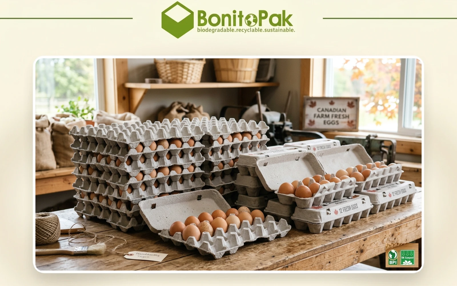
Canada has a smaller domestic moulded pulp sector than the United States, but it has

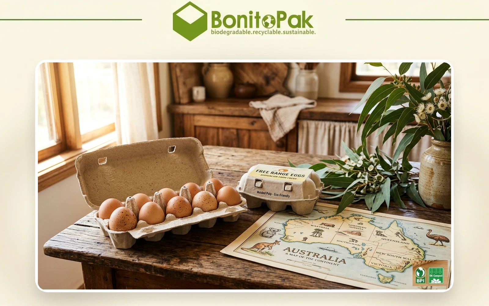
Australia has one domestic moulded fibre egg carton manufacturer. Huhtamaki Australia describes itself as the

British egg packaging is sold differently from the American market. Where US suppliers talk in

Frequently Asked Questions

Green Egg Cartons

  • Is green available in the vintage flat top profile?

    Yes, and sage in particular is one of the combinations we run most often. The muted shade suits the period profile better than a bright green does, since mid century cartons were produced in natural fiber tones rather than saturated colors.

  • Can you match the green used by a specific brand?

    We match to a Pantone reference or a physical sample as closely as pigmented fiber allows, and we send a formed sample for approval before production. Exact ink matching is not achievable in pulp. If the reference is a competitor’s carton rather than a printed standard, send us the physical carton and we will match against it directly.

  • Will green fade faster than other shades?

     It sits better than blue and worse than black. Green pigments rated for compostable use have moderate lightfastness, so forest holds up well and sage shows lightening soonest under sustained direct sun. In refrigerated retail none of the range is affected.

  • Which green do most organic producers choose?

     Mid green, because it is the shade that carries the category signal most clearly. Producers positioning above the category on quality rather than on method more often choose sage or forest, which read as premium rather than as organic.

  • Does a green carton help an organic certification claim?

    No. Certification is granted on production practice and audited independently, and packaging color has no bearing on it. What green does is communicate a claim you already hold more quickly at the shelf. The certification mark itself still has to appear on the pack according to your certifier’s rules.

Fill This Detailed Form