Walk a supermarket egg aisle and count the colors. Natural fiber dominates, white and gray follow, then green for organic lines, and occasionally blue or black at the premium end.
Purple is almost absent. That absence is the entire commercial argument for it.
A producer choosing purple is not competing for recognition against anyone. There is no incumbent brand that owns the color in the shopper’s memory, no category association to work around, and no risk of being mistaken for a competitor at distance.
The cost is that purple carries no inherited meaning either. Green tells a shopper something before they read the pack. Purple tells them nothing except that this producer made a choice. For a brand willing to do the work of building its own association, that is a blank slate rather than a disadvantage.
Why purple is harder to produce than it looks
Purple sits with pink among the shades that demand tight process control, and the reason is the same.
Purple pigments rated for compostable packaging are limited in number and tend toward the blue end rather than the red end. Reaching a true purple rather than a blue-violet requires balancing two pigment components against each other, and that balance shifts if the base fiber color moves.
A grayer incoming batch pulls the result toward slate. A warmer batch pulls it toward mauve. Both read as off rather than as a slightly different purple, because the eye is unusually sensitive to hue shifts in this part of the spectrum.
We manage it by reading base pulp brightness before dosing and matching formed samples against a retained physical standard. Buyers building a brand on purple should approve and retain a standard at first production, because this is not a shade that reproduces reliably from a recipe alone.
Three shades and what each is for
Pale lavender is the softest and the most seasonal. It runs in spring and Easter ranges alongside pink, yellow, and pale blue. It is also the shade that fades fastest, since it carries the least pigment.
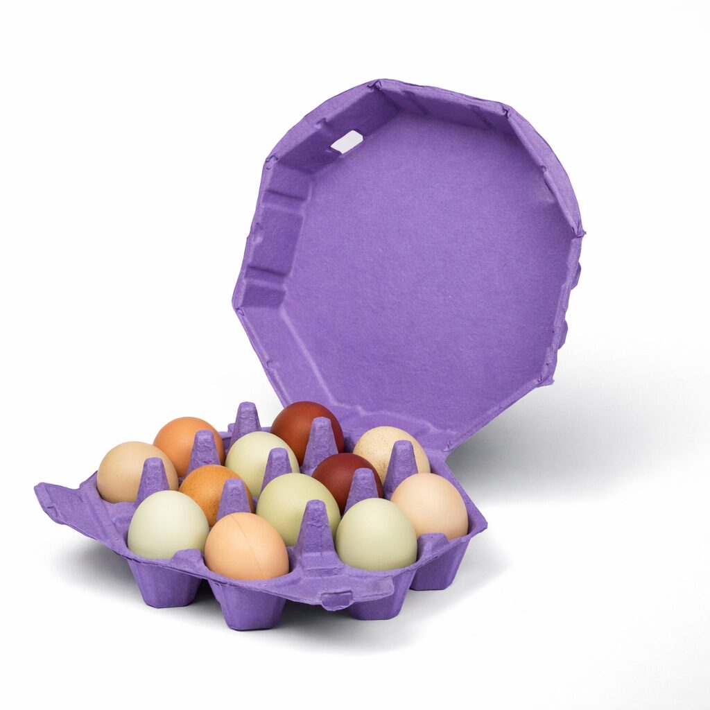
Mid purple is the clearest differentiator and the shade most producers mean when they ask for purple. It is unmistakable at distance across a market table, which is where it earns its cost.
Deep plum behaves like the dark end of our other colors. Strong emboss performance, good white and metallic print contrast, and a reading that is premium rather than playful. Gift and specialty channels use it most.
Shell color interaction
Purple works well against brown and cream shells, which is the majority of specialty egg production.
White eggs against mid or deep purple give strong graphic contrast, though some buyers find the combination reads closer to novelty than to premium.
Blue and olive shells against lavender produce a soft, slightly unexpected pairing that works for producers whose eggs are the distinctive part of the product.
The combination to avoid is pale lavender with white eggs, where the tonal values sit too close and the eggs stop registering against the carton.
Fade behavior and where to use it
Lavender is, with pale pink, the shade most vulnerable to sustained direct sunlight. Plum is considerably more stable.
The practical boundary is the same as for our other light tints. Refrigerated retail and covered market stalls are unaffected. Stock sitting in direct sun across weeks will lighten, with lavender showing it first.
Producers selling at outdoor markets who want purple should specify toward plum, or keep stock covered between market days. It is a storage habit rather than a reason to choose a different color.
Where purple earns its place
Two situations make purple the right call.
A producer entering a crowded local market where every other stall uses natural pulp. Purple is the fastest way to become the one shoppers remember by sight, which matters more than any label at a market where customers return weekly.
A gift or seasonal line where the carton is part of a presented product. Plum on an unusual format reads as deliberate in a way that a standard shade does not.
Where purple is the wrong call is commodity retail competing on price, where an unfamiliar color reads as unfamiliar rather than as distinctive.
Pairing with format
Plum on molded pulp octagon egg cartons is the strongest gift presentation in the purple range, pairing an unusual shade with an unusual shape.
Mid purple on a molded pulp dozen egg carton works as a permanent brand identity, and on a molded pulp 6 egg carton for premium half dozen lines.
For shade control detail across batches and molds see molded pulp colored egg cartons, and for print specifications see custom printed egg cartons.