Cajas de huevos moradas

  • Shade range from pale lavender through mid purple to deep plum
  • Pigment blended into the slurry, so color survives scuffing and shipping
  • The least used shade in egg retail, which makes it the strongest differentiator
  • Plum holds embossed detail sharply, close to navy and forest performance
  • Compostable and plastic free, with no surface coating
  • Disponible en todos los rangos de recuento celular, desde 4 hasta 20
  • OEM and ODM sizing accepted; retained shade standards kept for reorders

Molde público

Soluciones de envasado

Diseño 3D

Molde a medida

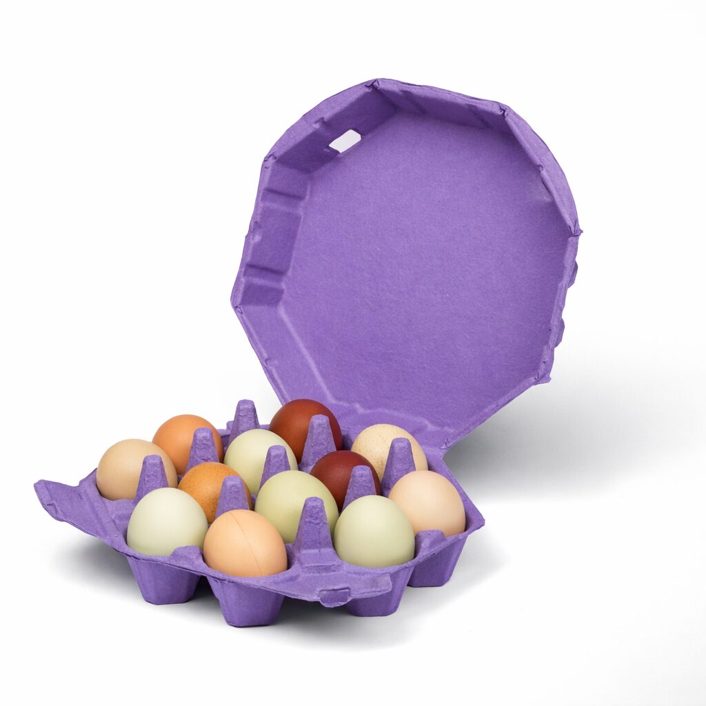
Cajas de huevos moradas de pulpa moldeada que contienen huevos marrones, con la tapa abierta

Descripción del producto

Especificación Detalles
Marca BonitoPak
Número de modelo EC-PUR series
Nombre del producto Purple Egg Cartons / Purple Pigmented Pulp Cartons
Material Pasta de papel reciclada con pigmento mezclado en suspensión
Técnica Moldeado de pulpa (prensado en húmedo), pigmentación en la fase húmeda
Recuento celular 4, 6, 10, 12, 18, or 20 cells
Shade Range Pale lavender, mid purple, deep plum; custom shades matched
Método del color El pigmento se mezcla en la pasta antes del moldeado, no se aplica como recubrimiento superficial
Lightfastness Lavender lowest; plum most stable
Print Contrast Strong with white on plum; black on lavender
Impresión de logotipos Impresión en relieve, en hueco o flexográfica
Uso industrial Farm brands, specialty retail, seasonal lines, gift packing
Aplicación Brand differentiation, spring and Easter ranges, premium positioning
Ventajas Biodegradable, compostable en casa, sin plástico, sin recubrimiento
Pedido a medida Aceptado
MOQ Confirm with sales; stock purple carries a lower minimum than custom shades

Galería de Cajas de huevos moradas piezas

Esta galería muestra la excepcional calidad y atención al detalle que ofrecemos en cada proyecto. Desde diseños complejos hasta acabados impecables, cada imagen refleja nuestro compromiso con la excelencia en Cajas de huevos moradas .

40%

Ahorro de tiempo y dinero

Experimente soluciones de envasado líderes que optimizan sus costes y tiempo, proporcionando procesos eficientes y maximizando su ROI.

50%

Más sostenible

Consiga envases ecológicos con materiales sostenibles, reduciendo los residuos y fomentando la responsabilidad medioambiental en todas sus líneas de productos.

25%

Aumento de las ventas

Aumente el atractivo de su producto en las estanterías con diseños innovadores que impulsen la visibilidad y las ventas tanto en los mercados minoristas como en línea.

100%

Más fiable

Confíe en el compromiso de BonitoPak con la calidad, garantizando que cada producto cumple nuestros elevados estándares con un servicio constante y fiable.

The least Contested Color in Egg Retail

Walk a supermarket egg aisle and count the colors. Natural fiber dominates, white and gray follow, then green for organic lines, and occasionally blue or black at the premium end.

Purple is almost absent. That absence is the entire commercial argument for it.

A producer choosing purple is not competing for recognition against anyone. There is no incumbent brand that owns the color in the shopper’s memory, no category association to work around, and no risk of being mistaken for a competitor at distance.

The cost is that purple carries no inherited meaning either. Green tells a shopper something before they read the pack. Purple tells them nothing except that this producer made a choice. For a brand willing to do the work of building its own association, that is a blank slate rather than a disadvantage.

Why purple is harder to produce than it looks

Purple sits with pink among the shades that demand tight process control, and the reason is the same.

Purple pigments rated for compostable packaging are limited in number and tend toward the blue end rather than the red end. Reaching a true purple rather than a blue-violet requires balancing two pigment components against each other, and that balance shifts if the base fiber color moves.

A grayer incoming batch pulls the result toward slate. A warmer batch pulls it toward mauve. Both read as off rather than as a slightly different purple, because the eye is unusually sensitive to hue shifts in this part of the spectrum.

We manage it by reading base pulp brightness before dosing and matching formed samples against a retained physical standard. Buyers building a brand on purple should approve and retain a standard at first production, because this is not a shade that reproduces reliably from a recipe alone.

Tres tonos y para qué sirve cada uno

Pale lavender is the softest and the most seasonal. It runs in spring and Easter ranges alongside pink, yellow, and pale blue. It is also the shade that fades fastest, since it carries the least pigment.

Mid purple is the clearest differentiator and the shade most producers mean when they ask for purple. It is unmistakable at distance across a market table, which is where it earns its cost.

Deep plum behaves like the dark end of our other colors. Strong emboss performance, good white and metallic print contrast, and a reading that is premium rather than playful. Gift and specialty channels use it most.

Interacción entre los colores de la concha

Purple works well against brown and cream shells, which is the majority of specialty egg production.

White eggs against mid or deep purple give strong graphic contrast, though some buyers find the combination reads closer to novelty than to premium.

Blue and olive shells against lavender produce a soft, slightly unexpected pairing that works for producers whose eggs are the distinctive part of the product.

The combination to avoid is pale lavender with white eggs, where the tonal values sit too close and the eggs stop registering against the carton.

Fade behavior and where to use it

Lavender is, with pale pink, the shade most vulnerable to sustained direct sunlight. Plum is considerably more stable.

The practical boundary is the same as for our other light tints. Refrigerated retail and covered market stalls are unaffected. Stock sitting in direct sun across weeks will lighten, with lavender showing it first.

Producers selling at outdoor markets who want purple should specify toward plum, or keep stock covered between market days. It is a storage habit rather than a reason to choose a different color.

Where purple earns its place

Two situations make purple the right call.

A producer entering a crowded local market where every other stall uses natural pulp. Purple is the fastest way to become the one shoppers remember by sight, which matters more than any label at a market where customers return weekly.

A gift or seasonal line where the carton is part of a presented product. Plum on an unusual format reads as deliberate in a way that a standard shade does not.

Where purple is the wrong call is commodity retail competing on price, where an unfamiliar color reads as unfamiliar rather than as distinctive.

Combinación con el formato

Plum on molded pulp octagon egg cartons is the strongest gift presentation in the purple range, pairing an unusual shade with an unusual shape.

Mid purple on a caja de cartón moldeado para una docena de huevos works as a permanent brand identity, and on a caja para 6 huevos de pulpa moldeada for premium half dozen lines.

For shade control detail across batches and molds see cajas de huevos de pulpa moldeada de colores, y para consultar las especificaciones de impresión, véase cajas de huevos con impresión personalizada.

The least Contested Color in Egg Retail

Walk a supermarket egg aisle and count the colors. Natural fiber dominates, white and gray follow, then green for organic lines, and occasionally blue or black at the premium end.

Purple is almost absent. That absence is the entire commercial argument for it.

A producer choosing purple is not competing for recognition against anyone. There is no incumbent brand that owns the color in the shopper’s memory, no category association to work around, and no risk of being mistaken for a competitor at distance.

The cost is that purple carries no inherited meaning either. Green tells a shopper something before they read the pack. Purple tells them nothing except that this producer made a choice. For a brand willing to do the work of building its own association, that is a blank slate rather than a disadvantage.

Why purple is harder to produce than it looks

Purple sits with pink among the shades that demand tight process control, and the reason is the same.

Purple pigments rated for compostable packaging are limited in number and tend toward the blue end rather than the red end. Reaching a true purple rather than a blue-violet requires balancing two pigment components against each other, and that balance shifts if the base fiber color moves.

A grayer incoming batch pulls the result toward slate. A warmer batch pulls it toward mauve. Both read as off rather than as a slightly different purple, because the eye is unusually sensitive to hue shifts in this part of the spectrum.

We manage it by reading base pulp brightness before dosing and matching formed samples against a retained physical standard. Buyers building a brand on purple should approve and retain a standard at first production, because this is not a shade that reproduces reliably from a recipe alone.

Tres tonos y para qué sirve cada uno

Pale lavender is the softest and the most seasonal. It runs in spring and Easter ranges alongside pink, yellow, and pale blue. It is also the shade that fades fastest, since it carries the least pigment.

Mid purple is the clearest differentiator and the shade most producers mean when they ask for purple. It is unmistakable at distance across a market table, which is where it earns its cost.

Deep plum behaves like the dark end of our other colors. Strong emboss performance, good white and metallic print contrast, and a reading that is premium rather than playful. Gift and specialty channels use it most.

Interacción entre los colores de la concha

Purple works well against brown and cream shells, which is the majority of specialty egg production.

White eggs against mid or deep purple give strong graphic contrast, though some buyers find the combination reads closer to novelty than to premium.

Blue and olive shells against lavender produce a soft, slightly unexpected pairing that works for producers whose eggs are the distinctive part of the product.

The combination to avoid is pale lavender with white eggs, where the tonal values sit too close and the eggs stop registering against the carton.

Fade behavior and where to use it

Lavender is, with pale pink, the shade most vulnerable to sustained direct sunlight. Plum is considerably more stable.

The practical boundary is the same as for our other light tints. Refrigerated retail and covered market stalls are unaffected. Stock sitting in direct sun across weeks will lighten, with lavender showing it first.

Producers selling at outdoor markets who want purple should specify toward plum, or keep stock covered between market days. It is a storage habit rather than a reason to choose a different color.

Where purple earns its place

Two situations make purple the right call.

A producer entering a crowded local market where every other stall uses natural pulp. Purple is the fastest way to become the one shoppers remember by sight, which matters more than any label at a market where customers return weekly.

A gift or seasonal line where the carton is part of a presented product. Plum on an unusual format reads as deliberate in a way that a standard shade does not.

Where purple is the wrong call is commodity retail competing on price, where an unfamiliar color reads as unfamiliar rather than as distinctive.

Combinación con el formato

Plum on molded pulp octagon egg cartons is the strongest gift presentation in the purple range, pairing an unusual shade with an unusual shape.

Mid purple on a caja de cartón moldeado para una docena de huevos works as a permanent brand identity, and on a caja para 6 huevos de pulpa moldeada for premium half dozen lines.

For shade control detail across batches and molds see cajas de huevos de pulpa moldeada de colores, y para consultar las especificaciones de impresión, véase cajas de huevos con impresión personalizada.

Materiales para Cajas de huevos moradas Piezas

Las principales empresas e ingenieros confían en BonitoPak para obtener iteraciones rápidas y piezas duraderas de alta calidad. Tanto si se trata de prototipos como de producción a gran escala, nuestra amplia gama de materiales garantiza que cumplimos los requisitos exclusivos de cualquier empresa. Cajas de huevos moradas proyecto con precisión y rapidez.

El papel kraft compostable es la fibra más resistente que fabricamos. Está elaborado a partir de materia prima virgen

La pulpa de color no es una fibra independiente. Se trata de cualquiera de nuestras

La pasta blanqueada es el material que hay que especificar cuando la pieza tiene que

El término «fibra vegetal natural» engloba las fuentes de celulosa no madereras que incorporamos a nuestra mezcla, aparte de la

El papel ondulado, como material de pulpa moldeada, se refiere a las cajas de cartón recuperadas que se han vuelto a convertir en pulpa.

La fibra de paja se obtiene de los tallos que quedan tras la cosecha de cereales, un material

Personalizado Respetuoso con el medio ambiente Fiable

Excelencia en envases personalizados y ecológicos

Totalmente personalizable

Personalice sus envases con estilos, tamaños, colores y acabados a medida para satisfacer necesidades específicas.

Asistencia experta

Bonitopak ofrece asesoramiento experto en diseño y logística para maximizar la eficiencia de los envases y aumentar la rentabilidad de la inversión.

Soluciones ecológicas

Elija envases sostenibles y ecológicos para reducir el impacto ambiental y apoyar los objetivos ecológicos de su marca.

Garantía de calidad

Bonitopak garantiza un servicio de máxima calidad y la excelencia del producto con cada solución de envasado.

Preguntas frecuentes

Cajas de huevos moradas

  • Is lavender a good choice for an Easter range?

    It is one of the standard four alongside pink, pale blue, and yellow, and buyers usually order the set together. Order them from one pigment campaign where volumes allow, so the four shades read as a coordinated family rather than as four separately matched colors.

  • Does purple cost more than your other stock colors?

    Slightly, for the same reason pink does. Two pigment components have to be balanced against a variable base, so more batches fall outside shade tolerance and get diverted. Stock purple costs less than a custom matched shade, since we run it continuously and avoid most of the changeover.

  • Can you produce a true violet rather than a blue-purple?

    We can move the balance toward the red end within the limits of compostable-rated pigments, and we send a formed sample so you can judge it physically. A highly saturated violet is outside what the available palette reaches, since the pigments that achieve it are not rated for compostable packaging. We will tell you plainly where a target shade sits outside our range.

  • How different will my reorder look from my first order?

    With a retained physical standard on file, close enough that cartons from different runs look the same side by side. Without one, purple drifts more visibly than most shades because the eye detects hue shifts sharply in this range. Approving and retaining a standard at first production is the single most useful step for a purple buyer.

  • Why is purple less common in egg packaging than other colors?

    Mostly inherited habit rather than any technical barrier. Egg packaging colors settled around natural, white, and green decades ago and the category has not moved much since. Purple is harder to hold consistently than mid-range shades, which discourages large converters running high volume, but for a specialty producer that difficulty is exactly what keeps the color uncontested.

Biodegradable Resultado

0 días

7 días

14 días

30 días

Industrias especializadas

Tras haber fabricado millones de piezas, BonitoPak posee profundos conocimientos en numerosas aplicaciones. Destacamos especialmente en sectores que requieren la fabricación de componentes precisos e intrincados. Confíe en nuestra experiencia y calidad, sea cual sea la complejidad.

Soluciones de envasado OEM y ODM

Bonitopak ofrece soluciones de envasado personalizadas (OEM) y prediseñadas (ODM). Tanto si necesita diseños totalmente a medida como envases listos para usar, le ofrecemos opciones de alta calidad, eficientes y flexibles para satisfacer las necesidades de su marca.

Servicios OEM

Las soluciones de envasado OEM le permiten crear productos totalmente personalizados, diseñados y fabricados para satisfacer sus requisitos específicos. En Bonitopak, le ofrecemos un apoyo integral a lo largo de todo el proceso de diseño, creación de prototipos y fabricación, garantizando que su envase refleje la identidad única de su marca. Nuestra capacidad de fabricación de precisión garantiza una producción coherente y de alta calidad, independientemente de la complejidad del diseño. Con un servicio integral, nos encargamos de todo, desde el concepto hasta la entrega, ayudándole a racionalizar sus necesidades de envasado.

Servicios ODM

Las soluciones de envasado ODM ofrecen productos prediseñados que pueden adaptarse a los requisitos de su marca. Con la innovadora experiencia en diseño y el eficiente proceso de producción de Bonitopak, puede elegir entre una amplia gama de opciones de envases listos para usar. Ofrecemos una personalización flexible, que le permite añadir su marca y seleccionar entre varios acabados, colores y tamaños. Esta solución ahorra tiempo y costes, al tiempo que garantiza un envase de alta calidad que cumple los estándares de su marca.
¿Listo para elevar su proyecto?

Dé vida a sus diseños con BonitoPak

Experimente la ingeniería de precisión con BonitoPak. Desde prototipos detallados hasta la producción de grandes volúmenes, estamos aquí para convertir sus conceptos en realidad. Póngase en contacto con nosotros hoy mismo para hablar de las necesidades de su proyecto.

Nuestras categorías de productos

Descubra la variada gama de soluciones de envasado de Bonitopak, que incluye bandejas de pulpa moldeada, envases alimentarios, diseños personalizados y opciones sostenibles. Cada categoría está diseñada para ofrecer durabilidad, funcionalidad y responsabilidad medioambiental, y se adapta a sus necesidades específicas.

The least Contested Color in Egg Retail

Walk a supermarket egg aisle and count the colors. Natural fiber dominates, white and gray follow, then green for organic lines, and occasionally blue or black at the premium end.

Purple is almost absent. That absence is the entire commercial argument for it.

A producer choosing purple is not competing for recognition against anyone. There is no incumbent brand that owns the color in the shopper’s memory, no category association to work around, and no risk of being mistaken for a competitor at distance.

The cost is that purple carries no inherited meaning either. Green tells a shopper something before they read the pack. Purple tells them nothing except that this producer made a choice. For a brand willing to do the work of building its own association, that is a blank slate rather than a disadvantage.

Why purple is harder to produce than it looks

Purple sits with pink among the shades that demand tight process control, and the reason is the same.

Purple pigments rated for compostable packaging are limited in number and tend toward the blue end rather than the red end. Reaching a true purple rather than a blue-violet requires balancing two pigment components against each other, and that balance shifts if the base fiber color moves.

A grayer incoming batch pulls the result toward slate. A warmer batch pulls it toward mauve. Both read as off rather than as a slightly different purple, because the eye is unusually sensitive to hue shifts in this part of the spectrum.

We manage it by reading base pulp brightness before dosing and matching formed samples against a retained physical standard. Buyers building a brand on purple should approve and retain a standard at first production, because this is not a shade that reproduces reliably from a recipe alone.

Tres tonos y para qué sirve cada uno

Pale lavender is the softest and the most seasonal. It runs in spring and Easter ranges alongside pink, yellow, and pale blue. It is also the shade that fades fastest, since it carries the least pigment.

Mid purple is the clearest differentiator and the shade most producers mean when they ask for purple. It is unmistakable at distance across a market table, which is where it earns its cost.

Deep plum behaves like the dark end of our other colors. Strong emboss performance, good white and metallic print contrast, and a reading that is premium rather than playful. Gift and specialty channels use it most.

Interacción entre los colores de la concha

Purple works well against brown and cream shells, which is the majority of specialty egg production.

White eggs against mid or deep purple give strong graphic contrast, though some buyers find the combination reads closer to novelty than to premium.

Blue and olive shells against lavender produce a soft, slightly unexpected pairing that works for producers whose eggs are the distinctive part of the product.

The combination to avoid is pale lavender with white eggs, where the tonal values sit too close and the eggs stop registering against the carton.

Fade behavior and where to use it

Lavender is, with pale pink, the shade most vulnerable to sustained direct sunlight. Plum is considerably more stable.

The practical boundary is the same as for our other light tints. Refrigerated retail and covered market stalls are unaffected. Stock sitting in direct sun across weeks will lighten, with lavender showing it first.

Producers selling at outdoor markets who want purple should specify toward plum, or keep stock covered between market days. It is a storage habit rather than a reason to choose a different color.

Where purple earns its place

Two situations make purple the right call.

A producer entering a crowded local market where every other stall uses natural pulp. Purple is the fastest way to become the one shoppers remember by sight, which matters more than any label at a market where customers return weekly.

A gift or seasonal line where the carton is part of a presented product. Plum on an unusual format reads as deliberate in a way that a standard shade does not.

Where purple is the wrong call is commodity retail competing on price, where an unfamiliar color reads as unfamiliar rather than as distinctive.

Combinación con el formato

Plum on molded pulp octagon egg cartons is the strongest gift presentation in the purple range, pairing an unusual shade with an unusual shape.

Mid purple on a caja de cartón moldeado para una docena de huevos works as a permanent brand identity, and on a caja para 6 huevos de pulpa moldeada for premium half dozen lines.

For shade control detail across batches and molds see cajas de huevos de pulpa moldeada de colores, y para consultar las especificaciones de impresión, véase cajas de huevos con impresión personalizada.

Artículos relacionados

Manténgase informado con las últimas actualizaciones sobre tendencias en envases sostenibles, perspectivas del sector y consejos de expertos a través de nuestro blog. Explore ideas y soluciones innovadoras para mejorar sus conocimientos sobre envasado.

Por Leo Chan | Redactor, BonitoPak | Más de 20 años de experiencia en envases de pulpa moldeada. El vodka es

Por Leo Chan | Redactor, BonitoPak | Más de 20 años de experiencia en embalajes de pulpa moldeada. Casi todos los

Por Leo Chan | Redactor, BonitoPak | Más de 20 años de experiencia en embalajes de pulpa moldeada. Buscar esto

Preguntas frecuentes

Cajas de huevos moradas

  • Is lavender a good choice for an Easter range?

    It is one of the standard four alongside pink, pale blue, and yellow, and buyers usually order the set together. Order them from one pigment campaign where volumes allow, so the four shades read as a coordinated family rather than as four separately matched colors.

  • Does purple cost more than your other stock colors?

    Slightly, for the same reason pink does. Two pigment components have to be balanced against a variable base, so more batches fall outside shade tolerance and get diverted. Stock purple costs less than a custom matched shade, since we run it continuously and avoid most of the changeover.

  • Can you produce a true violet rather than a blue-purple?

    We can move the balance toward the red end within the limits of compostable-rated pigments, and we send a formed sample so you can judge it physically. A highly saturated violet is outside what the available palette reaches, since the pigments that achieve it are not rated for compostable packaging. We will tell you plainly where a target shade sits outside our range.

  • How different will my reorder look from my first order?

    With a retained physical standard on file, close enough that cartons from different runs look the same side by side. Without one, purple drifts more visibly than most shades because the eye detects hue shifts sharply in this range. Approving and retaining a standard at first production is the single most useful step for a purple buyer.

  • Why is purple less common in egg packaging than other colors?

    Mostly inherited habit rather than any technical barrier. Egg packaging colors settled around natural, white, and green decades ago and the category has not moved much since. Purple is harder to hold consistently than mid-range shades, which discourages large converters running high volume, but for a specialty producer that difficulty is exactly what keeps the color uncontested.

Rellene este formulario detallado