Purple Egg Cartons

  • Shade range from pale lavender through mid purple to deep plum
  • Pigment blended into the slurry, so color survives scuffing and shipping
  • The least used shade in egg retail, which makes it the strongest differentiator
  • Plum holds embossed detail sharply, close to navy and forest performance
  • Compostable and plastic free, with no surface coating
  • Available across every cell count from 4 through 20
  • OEM and ODM sizing accepted; retained shade standards kept for reorders

القالب العام

حلول التعبئة والتغليف

تصميم ثلاثي الأبعاد

قالب مخصص حسب الطلب

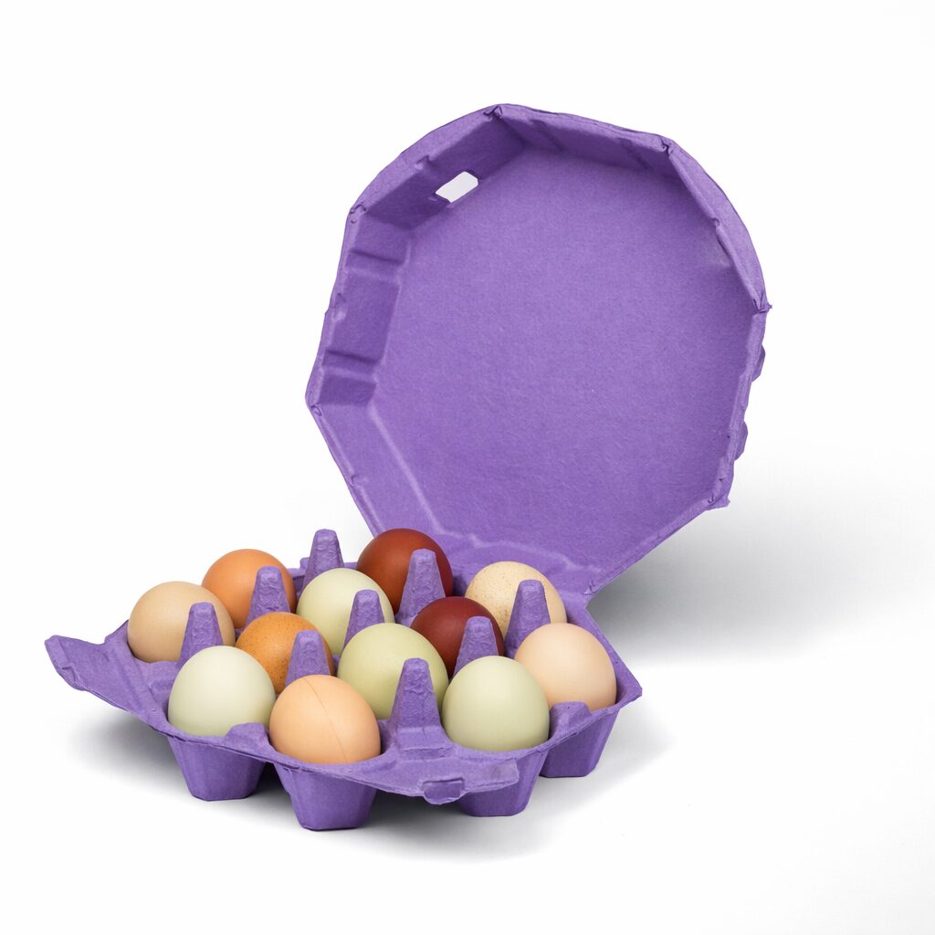
Purple egg cartons in molded pulp holding brown eggs with the lid open

وصف المنتج

المواصفات التفاصيل
اسم العلامة التجارية بونيتوباك
رقم الموديل EC-PUR series
اسم المنتج Purple Egg Cartons / Purple Pigmented Pulp Cartons
المواد Recycled paper pulp with slurry-blended pigment
التقنية Molded pulp forming (wet-pressed), wet end pigmentation
Cell Count 4, 6, 10, 12, 18, or 20 cells
Shade Range Pale lavender, mid purple, deep plum; custom shades matched
Color Method Pigment blended into slurry before forming, not surface coated
Lightfastness Lavender lowest; plum most stable
Print Contrast Strong with white on plum; black on lavender
طباعة الشعار Embossed, debossed, or flexographic print
الاستخدام الصناعي Farm brands, specialty retail, seasonal lines, gift packing
التطبيق Brand differentiation, spring and Easter ranges, premium positioning
المزايا Biodegradable, home compostable, plastic free, no coating
طلب مخصص مقبولة
موك Confirm with sales; stock purple carries a lower minimum than custom shades

معرض الصور Purple Egg Cartons الأجزاء

يعرض هذا المعرض الجودة الاستثنائية والاهتمام بالتفاصيل التي نقدمها في كل مشروع. من التصاميم المعقدة إلى اللمسات النهائية الخالية من العيوب، تعكس كل صورة التزامنا بالتميز في Purple Egg Cartons .

40%

التكلفة والوقت الموفر

اختبر حلول التعبئة والتغليف الرائدة التي تعمل على تحسين التكاليف والوقت وتقديم عمليات فعالة وتعظيم العائد على الاستثمار.

50%

أكثر استدامة

حقق تغليفاً صديقاً للبيئة باستخدام مواد مستدامة، مما يقلل من النفايات ويعزز المسؤولية البيئية في جميع خطوط إنتاجك.

25%

الزيادة في المبيعات

عزز من جاذبية منتجاتك على الرفوف بتصميمات مبتكرة تعزز من ظهورها ومبيعاتها في أسواق التجزئة والأسواق الإلكترونية.

100%

أكثر موثوقية

ثق في التزام BonitoPak بالجودة، مما يضمن أن كل منتج يفي بمعاييرنا العالية مع خدمة متسقة وموثوقة.

The least Contested Color in Egg Retail

Walk a supermarket egg aisle and count the colors. Natural fiber dominates, white and gray follow, then green for organic lines, and occasionally blue or black at the premium end.

Purple is almost absent. That absence is the entire commercial argument for it.

A producer choosing purple is not competing for recognition against anyone. There is no incumbent brand that owns the color in the shopper’s memory, no category association to work around, and no risk of being mistaken for a competitor at distance.

The cost is that purple carries no inherited meaning either. Green tells a shopper something before they read the pack. Purple tells them nothing except that this producer made a choice. For a brand willing to do the work of building its own association, that is a blank slate rather than a disadvantage.

Why purple is harder to produce than it looks

Purple sits with pink among the shades that demand tight process control, and the reason is the same.

Purple pigments rated for compostable packaging are limited in number and tend toward the blue end rather than the red end. Reaching a true purple rather than a blue-violet requires balancing two pigment components against each other, and that balance shifts if the base fiber color moves.

A grayer incoming batch pulls the result toward slate. A warmer batch pulls it toward mauve. Both read as off rather than as a slightly different purple, because the eye is unusually sensitive to hue shifts in this part of the spectrum.

We manage it by reading base pulp brightness before dosing and matching formed samples against a retained physical standard. Buyers building a brand on purple should approve and retain a standard at first production, because this is not a shade that reproduces reliably from a recipe alone.

Three shades and what each is for

Pale lavender is the softest and the most seasonal. It runs in spring and Easter ranges alongside pink, yellow, and pale blue. It is also the shade that fades fastest, since it carries the least pigment.

Mid purple is the clearest differentiator and the shade most producers mean when they ask for purple. It is unmistakable at distance across a market table, which is where it earns its cost.

Deep plum behaves like the dark end of our other colors. Strong emboss performance, good white and metallic print contrast, and a reading that is premium rather than playful. Gift and specialty channels use it most.

Shell color interaction

Purple works well against brown and cream shells, which is the majority of specialty egg production.

White eggs against mid or deep purple give strong graphic contrast, though some buyers find the combination reads closer to novelty than to premium.

Blue and olive shells against lavender produce a soft, slightly unexpected pairing that works for producers whose eggs are the distinctive part of the product.

The combination to avoid is pale lavender with white eggs, where the tonal values sit too close and the eggs stop registering against the carton.

Fade behavior and where to use it

Lavender is, with pale pink, the shade most vulnerable to sustained direct sunlight. Plum is considerably more stable.

The practical boundary is the same as for our other light tints. Refrigerated retail and covered market stalls are unaffected. Stock sitting in direct sun across weeks will lighten, with lavender showing it first.

Producers selling at outdoor markets who want purple should specify toward plum, or keep stock covered between market days. It is a storage habit rather than a reason to choose a different color.

Where purple earns its place

Two situations make purple the right call.

A producer entering a crowded local market where every other stall uses natural pulp. Purple is the fastest way to become the one shoppers remember by sight, which matters more than any label at a market where customers return weekly.

A gift or seasonal line where the carton is part of a presented product. Plum on an unusual format reads as deliberate in a way that a standard shade does not.

Where purple is the wrong call is commodity retail competing on price, where an unfamiliar color reads as unfamiliar rather than as distinctive.

Pairing with format

Plum on molded pulp octagon egg cartons is the strongest gift presentation in the purple range, pairing an unusual shade with an unusual shape.

Mid purple on a molded pulp dozen egg carton works as a permanent brand identity, and on a molded pulp 6 egg carton for premium half dozen lines.

For shade control detail across batches and molds see molded pulp colored egg cartons, and for print specifications see custom printed egg cartons.

The least Contested Color in Egg Retail

Walk a supermarket egg aisle and count the colors. Natural fiber dominates, white and gray follow, then green for organic lines, and occasionally blue or black at the premium end.

Purple is almost absent. That absence is the entire commercial argument for it.

A producer choosing purple is not competing for recognition against anyone. There is no incumbent brand that owns the color in the shopper’s memory, no category association to work around, and no risk of being mistaken for a competitor at distance.

The cost is that purple carries no inherited meaning either. Green tells a shopper something before they read the pack. Purple tells them nothing except that this producer made a choice. For a brand willing to do the work of building its own association, that is a blank slate rather than a disadvantage.

Why purple is harder to produce than it looks

Purple sits with pink among the shades that demand tight process control, and the reason is the same.

Purple pigments rated for compostable packaging are limited in number and tend toward the blue end rather than the red end. Reaching a true purple rather than a blue-violet requires balancing two pigment components against each other, and that balance shifts if the base fiber color moves.

A grayer incoming batch pulls the result toward slate. A warmer batch pulls it toward mauve. Both read as off rather than as a slightly different purple, because the eye is unusually sensitive to hue shifts in this part of the spectrum.

We manage it by reading base pulp brightness before dosing and matching formed samples against a retained physical standard. Buyers building a brand on purple should approve and retain a standard at first production, because this is not a shade that reproduces reliably from a recipe alone.

Three shades and what each is for

Pale lavender is the softest and the most seasonal. It runs in spring and Easter ranges alongside pink, yellow, and pale blue. It is also the shade that fades fastest, since it carries the least pigment.

Mid purple is the clearest differentiator and the shade most producers mean when they ask for purple. It is unmistakable at distance across a market table, which is where it earns its cost.

Deep plum behaves like the dark end of our other colors. Strong emboss performance, good white and metallic print contrast, and a reading that is premium rather than playful. Gift and specialty channels use it most.

Shell color interaction

Purple works well against brown and cream shells, which is the majority of specialty egg production.

White eggs against mid or deep purple give strong graphic contrast, though some buyers find the combination reads closer to novelty than to premium.

Blue and olive shells against lavender produce a soft, slightly unexpected pairing that works for producers whose eggs are the distinctive part of the product.

The combination to avoid is pale lavender with white eggs, where the tonal values sit too close and the eggs stop registering against the carton.

Fade behavior and where to use it

Lavender is, with pale pink, the shade most vulnerable to sustained direct sunlight. Plum is considerably more stable.

The practical boundary is the same as for our other light tints. Refrigerated retail and covered market stalls are unaffected. Stock sitting in direct sun across weeks will lighten, with lavender showing it first.

Producers selling at outdoor markets who want purple should specify toward plum, or keep stock covered between market days. It is a storage habit rather than a reason to choose a different color.

Where purple earns its place

Two situations make purple the right call.

A producer entering a crowded local market where every other stall uses natural pulp. Purple is the fastest way to become the one shoppers remember by sight, which matters more than any label at a market where customers return weekly.

A gift or seasonal line where the carton is part of a presented product. Plum on an unusual format reads as deliberate in a way that a standard shade does not.

Where purple is the wrong call is commodity retail competing on price, where an unfamiliar color reads as unfamiliar rather than as distinctive.

Pairing with format

Plum on molded pulp octagon egg cartons is the strongest gift presentation in the purple range, pairing an unusual shade with an unusual shape.

Mid purple on a molded pulp dozen egg carton works as a permanent brand identity, and on a molded pulp 6 egg carton for premium half dozen lines.

For shade control detail across batches and molds see molded pulp colored egg cartons, and for print specifications see custom printed egg cartons.

مواد ل Purple Egg Cartons قطع الغيار

تعتمد الشركات الرائدة والمهندسون الرائدون على BonitoPak في التكرارات السريعة والأجزاء المتينة عالية الجودة. سواء كان ذلك للنماذج الأولية أو للإنتاج على نطاق واسع، فإن مجموعتنا الواسعة من المواد تضمن تلبية المتطلبات الفريدة لأي Purple Egg Cartons المشروع بدقة وسرعة.

Compostable kraft paper is the strongest fiber we form. Made from virgin

Colored pulp is not a separate fiber. It is any of our

Bleached pulp is the material to specify when the part has to

Natural plant fiber covers the non-wood cellulose sources we blend outside the

Corrugated paper as a molded pulp material means recovered cardboard boxes repulped

Straw fiber is made from the stalks left after grain harvest, material

صديقة للبيئة وموثوقة ومخصصة وموثوقة

تعبئة وتغليف مخصص وصديق للبيئة بامتياز

قابل للتخصيص بالكامل

خصص عبواتك بأنماط وأحجام وألوان ولمسات نهائية مصممة خصيصًا لتلبية احتياجاتك الخاصة.

دعم الخبراء

تقدم بونيتوباك مشورة الخبراء في مجال التصميم والخدمات اللوجستية لزيادة كفاءة التعبئة والتغليف إلى أقصى حد وتعزيز العائد على الاستثمار.

الحلول البيئية

اختر عبوات مستدامة وصديقة للبيئة لتقليل الأثر البيئي ودعم أهداف علامتك التجارية الخضراء.

ضمان الجودة

تضمن بونيتوباك خدمة عالية الجودة ومنتجات متميزة مع كل حل من حلول التعبئة والتغليف.

الأسئلة المتكررة

Purple Egg Cartons

  • Is lavender a good choice for an Easter range?

    It is one of the standard four alongside pink, pale blue, and yellow, and buyers usually order the set together. Order them from one pigment campaign where volumes allow, so the four shades read as a coordinated family rather than as four separately matched colors.

  • Does purple cost more than your other stock colors?

    Slightly, for the same reason pink does. Two pigment components have to be balanced against a variable base, so more batches fall outside shade tolerance and get diverted. Stock purple costs less than a custom matched shade, since we run it continuously and avoid most of the changeover.

  • Can you produce a true violet rather than a blue-purple?

    We can move the balance toward the red end within the limits of compostable-rated pigments, and we send a formed sample so you can judge it physically. A highly saturated violet is outside what the available palette reaches, since the pigments that achieve it are not rated for compostable packaging. We will tell you plainly where a target shade sits outside our range.

  • How different will my reorder look from my first order?

    With a retained physical standard on file, close enough that cartons from different runs look the same side by side. Without one, purple drifts more visibly than most shades because the eye detects hue shifts sharply in this range. Approving and retaining a standard at first production is the single most useful step for a purple buyer.

  • Why is purple less common in egg packaging than other colors?

    Mostly inherited habit rather than any technical barrier. Egg packaging colors settled around natural, white, and green decades ago and the category has not moved much since. Purple is harder to hold consistently than mid-range shades, which discourages large converters running high volume, but for a specialty producer that difficulty is exactly what keeps the color uncontested.

نتيجة قابلة للتحلل الحيوي

0 يوم

7 أيام

14 يوماً

30 يوماً

الصناعات المتخصصة

بعد إنتاج ملايين القطع، تمتلك BonitoPak معرفة عميقة في العديد من التطبيقات. نحن نتفوق بشكل خاص في الصناعات التي تتطلب تصنيع مكونات دقيقة ومعقدة. ثق بنا لتقديم الخبرة والجودة، بغض النظر عن مدى تعقيدها.

حلول التعبئة والتغليف OEM و ODM

تقدم بونيتوباك حلول تغليف مخصصة (OEM) ومصممة مسبقًا (ODM). سواء كنت بحاجة إلى تصميمات مصممة بالكامل أو عبوات جاهزة للاستخدام، فإننا نقدم خيارات عالية الجودة وفعالة ومرنة لتلبية احتياجات علامتك التجارية.

خدمات تصنيع المعدات الأصلية

تتيح لك حلول التعبئة والتغليف لمصنعي المعدات الأصلية إنشاء منتجات مخصصة بالكامل مصممة ومصنعة لتلبية متطلباتك الخاصة. نحن في بونيتوباك نقدم دعمًا شاملاً طوال عملية التصميم والنماذج الأولية والتصنيع، مما يضمن أن تعكس عبواتك الهوية الفريدة لعلامتك التجارية. تضمن قدراتنا التصنيعية الدقيقة إنتاجاً عالي الجودة ومتسقاً، بغض النظر عن مدى تعقيد التصميم. ومن خلال الخدمة المتكاملة، نتعامل مع كل شيء بدءاً من الفكرة وحتى التسليم، مما يساعدك على تبسيط احتياجاتك من التغليف.

خدمات ODM

تقدم حلول التعبئة والتغليف ODM منتجات مصممة مسبقًا يمكن تصميمها وفقًا لمتطلبات علامتك التجارية. بفضل خبرة بونيتوباك في التصميم المبتكر وعملية الإنتاج الفعالة، يمكنك الاختيار من بين مجموعة كبيرة من خيارات التغليف الجاهزة للاستخدام. نحن نوفر تخصيصاً مرناً، مما يسمح لك بإضافة علامتك التجارية والاختيار من بين مختلف التشطيبات والألوان والأحجام. يوفر هذا الحل الوقت والتكلفة مع ضمان تغليف عالي الجودة يلبي معايير علامتك التجارية.
هل أنت مستعد للارتقاء بمشروعك؟

اجعل تصميماتك تنبض بالحياة مع BonitoPak

اختبر الهندسة الدقيقة مع BonitoPak. من النماذج الأولية التفصيلية إلى الإنتاج بكميات كبيرة، نحن هنا لتحويل مفاهيمك إلى واقع ملموس. اتصل بنا اليوم لمناقشة احتياجات مشروعك!

فئات منتجاتنا

اكتشف مجموعة بونيتوباك المتنوعة من حلول التعبئة والتغليف، بما في ذلك صواني اللب المقولبة، وتغليف المواد الغذائية، والتصميمات المخصصة، والخيارات المستدامة. صُممت كل فئة من هذه الفئات من أجل المتانة والأداء الوظيفي والمسؤولية البيئية، وهي مصممة خصيصًا لتلبية احتياجاتك الخاصة.

The least Contested Color in Egg Retail

Walk a supermarket egg aisle and count the colors. Natural fiber dominates, white and gray follow, then green for organic lines, and occasionally blue or black at the premium end.

Purple is almost absent. That absence is the entire commercial argument for it.

A producer choosing purple is not competing for recognition against anyone. There is no incumbent brand that owns the color in the shopper’s memory, no category association to work around, and no risk of being mistaken for a competitor at distance.

The cost is that purple carries no inherited meaning either. Green tells a shopper something before they read the pack. Purple tells them nothing except that this producer made a choice. For a brand willing to do the work of building its own association, that is a blank slate rather than a disadvantage.

Why purple is harder to produce than it looks

Purple sits with pink among the shades that demand tight process control, and the reason is the same.

Purple pigments rated for compostable packaging are limited in number and tend toward the blue end rather than the red end. Reaching a true purple rather than a blue-violet requires balancing two pigment components against each other, and that balance shifts if the base fiber color moves.

A grayer incoming batch pulls the result toward slate. A warmer batch pulls it toward mauve. Both read as off rather than as a slightly different purple, because the eye is unusually sensitive to hue shifts in this part of the spectrum.

We manage it by reading base pulp brightness before dosing and matching formed samples against a retained physical standard. Buyers building a brand on purple should approve and retain a standard at first production, because this is not a shade that reproduces reliably from a recipe alone.

Three shades and what each is for

Pale lavender is the softest and the most seasonal. It runs in spring and Easter ranges alongside pink, yellow, and pale blue. It is also the shade that fades fastest, since it carries the least pigment.

Mid purple is the clearest differentiator and the shade most producers mean when they ask for purple. It is unmistakable at distance across a market table, which is where it earns its cost.

Deep plum behaves like the dark end of our other colors. Strong emboss performance, good white and metallic print contrast, and a reading that is premium rather than playful. Gift and specialty channels use it most.

Shell color interaction

Purple works well against brown and cream shells, which is the majority of specialty egg production.

White eggs against mid or deep purple give strong graphic contrast, though some buyers find the combination reads closer to novelty than to premium.

Blue and olive shells against lavender produce a soft, slightly unexpected pairing that works for producers whose eggs are the distinctive part of the product.

The combination to avoid is pale lavender with white eggs, where the tonal values sit too close and the eggs stop registering against the carton.

Fade behavior and where to use it

Lavender is, with pale pink, the shade most vulnerable to sustained direct sunlight. Plum is considerably more stable.

The practical boundary is the same as for our other light tints. Refrigerated retail and covered market stalls are unaffected. Stock sitting in direct sun across weeks will lighten, with lavender showing it first.

Producers selling at outdoor markets who want purple should specify toward plum, or keep stock covered between market days. It is a storage habit rather than a reason to choose a different color.

Where purple earns its place

Two situations make purple the right call.

A producer entering a crowded local market where every other stall uses natural pulp. Purple is the fastest way to become the one shoppers remember by sight, which matters more than any label at a market where customers return weekly.

A gift or seasonal line where the carton is part of a presented product. Plum on an unusual format reads as deliberate in a way that a standard shade does not.

Where purple is the wrong call is commodity retail competing on price, where an unfamiliar color reads as unfamiliar rather than as distinctive.

Pairing with format

Plum on molded pulp octagon egg cartons is the strongest gift presentation in the purple range, pairing an unusual shade with an unusual shape.

Mid purple on a molded pulp dozen egg carton works as a permanent brand identity, and on a molded pulp 6 egg carton for premium half dozen lines.

For shade control detail across batches and molds see molded pulp colored egg cartons, and for print specifications see custom printed egg cartons.

مقالات ورؤى ذات صلة

ابق على اطلاع بآخر التحديثات حول اتجاهات التغليف المستدام ورؤى الصناعة ونصائح الخبراء من خلال مدونتنا. استكشف الأفكار والحلول المبتكرة لتعزيز معرفتك بالتعبئة والتغليف.

بقلم ليو تشان | كاتب في BonitoPak | أكثر من 20 عامًا من الخبرة في مجال التغليف المصنوع من اللب المقولب. الفودكا هي

بقلم ليو تشان | كاتب في BonitoPak | أكثر من 20 عامًا من الخبرة في مجال التغليف المصنوع من اللب المقولب تقريبًا كل

بقلم ليو تشان | كاتب في BonitoPak | أكثر من 20 عامًا من الخبرة في مجال التغليف المصنوع من اللب المقولب ابحث في هذا

الأسئلة المتكررة

Purple Egg Cartons

  • Is lavender a good choice for an Easter range?

    It is one of the standard four alongside pink, pale blue, and yellow, and buyers usually order the set together. Order them from one pigment campaign where volumes allow, so the four shades read as a coordinated family rather than as four separately matched colors.

  • Does purple cost more than your other stock colors?

    Slightly, for the same reason pink does. Two pigment components have to be balanced against a variable base, so more batches fall outside shade tolerance and get diverted. Stock purple costs less than a custom matched shade, since we run it continuously and avoid most of the changeover.

  • Can you produce a true violet rather than a blue-purple?

    We can move the balance toward the red end within the limits of compostable-rated pigments, and we send a formed sample so you can judge it physically. A highly saturated violet is outside what the available palette reaches, since the pigments that achieve it are not rated for compostable packaging. We will tell you plainly where a target shade sits outside our range.

  • How different will my reorder look from my first order?

    With a retained physical standard on file, close enough that cartons from different runs look the same side by side. Without one, purple drifts more visibly than most shades because the eye detects hue shifts sharply in this range. Approving and retaining a standard at first production is the single most useful step for a purple buyer.

  • Why is purple less common in egg packaging than other colors?

    Mostly inherited habit rather than any technical barrier. Egg packaging colors settled around natural, white, and green decades ago and the category has not moved much since. Purple is harder to hold consistently than mid-range shades, which discourages large converters running high volume, but for a specialty producer that difficulty is exactly what keeps the color uncontested.

املأ هذا النموذج المفصل